Category: [SUCCESS]

  • [SURVEY OF THE MONTH] SCDOT Engages Thousands for Isle of Palms Bridge Survey

    [SURVEY OF THE MONTH] SCDOT Engages Thousands for Isle of Palms Bridge Survey

    The Survey of the Month series is a monthly blog where we highlight the extraordinary work our customers are doing! We feature well-designed surveys and share relevant takeaways for anyone interested in making the most out of online engagement using MetroQuest’s survey platform. To see more in the series, visit the blogs here.

    Head down south with us to Charleston as we showcase a survey from the South Carolina Department of Transportation (SCDOT)! SCDOT has been a long-time MetroQuest customer, and we were thrilled when their Isle of Palms Connector Bridge survey amassed nearly 4,000 responses in just a few days.

    Keep reading to learn what led to this immediate community response, highlights of the survey design, and key takeaways.

    What’s the story? Grassroots Engagement Reaches Commuters

    In January 2023, SCDOT, in collaboration with civil engineering team, RK&K, efficiently designed a MetroQuest survey to gather feedback on how the Isle of Palms Connector Bridge could be improved.

    The Isle of Palms Connector Bridge spans nearly four miles, linking the town of Mount Pleasant (a suburb in Charleston County) to the long narrow strip of an island known as the Isle of Palms. Boasting large sand beaches, vacation homes, resorts, and plenty of recreational opportunities, it is not hard to imagine that many venture out to the shore via this bridge.
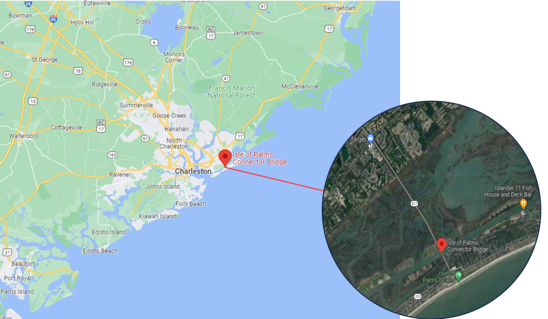
    Google Maps view of the Isle of Palms Connector Bridge.

    The project team designed a MetroQuest survey that presented five bridge layout concepts, including the current design. With it being important to maintain access for all modes of travel, the concepts included various ways to accommodate cyclists and pedestrians.

    Knowing what design factors mattered most to the community and stakeholders, the team took a very focused approach to the survey design. They asked questions they knew would be important to the community and those who frequent this bridge. This method resulted in receiving high-quality feedback from thousands and is precisely the survey approach we like to see!

    You will rarely receive quality feedback if you ask everything imaginable. If your survey is infrastructure-related like this one, don’t ask about every single design detail; instead gather feedback on the aspects you know will be most relevant and of interest to your audience.

    Engaging Over 1k in One Day

    What set this survey apart was the immediate response it received upon launch. Following the initial promotion, the survey collected feedback from nearly 2,000 individuals in just two days. As shown in the graphic below, over 1,000 people took the survey on Wednesday, January 18. This is particularly impressive given that this occurred right after the busy holiday season. Steady engagement continued until the survey closed in mid-February 2023.
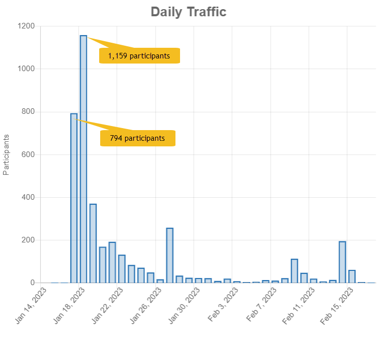
    Graph showing the immediate spike in participants during the start of the survey.

    The project team shared the news about the survey via social media as well as through connections with local organizations. This grassroots effort helped spread the word rapidly throughout the area, mostly through digital channels. Additionally, SCDOT staff notified stakeholders about the survey before the launch, building awareness ahead of the engagement period. Clearly, this approach resulted in a very immediate response.

    When surveying thousands of participants, it is critical to ensure that the concepts and questions are easily comprehensible. The over 61,000 data points collected for this survey demonstrates why it is essential to design a survey that gathers the input needed for your project. You don’t want to spend time filtering through irrelevant data.

    Anatomy of a Bridge Survey: Cross-sections Illustrate Concepts

    The Isle of Palms Connector survey followed a methodical approach to gathering feedback. Initially, participants were asked to rank four overarching goals of the project. Then, they were asked to indicate the condition of the current bridge, how they envision the future of the bridge and finally, rate five alternative concepts.

    To view each Screen in detail, open this demo link in a separate tab.

    As we move through the survey, notice how simple and concise Screens 2 to 5 are. Some participants may initially skim the survey to see what they are getting into. Keeping it quick helps retain those who may otherwise exit the survey if they see an extensive list of questions.

    Screen 1: Welcome

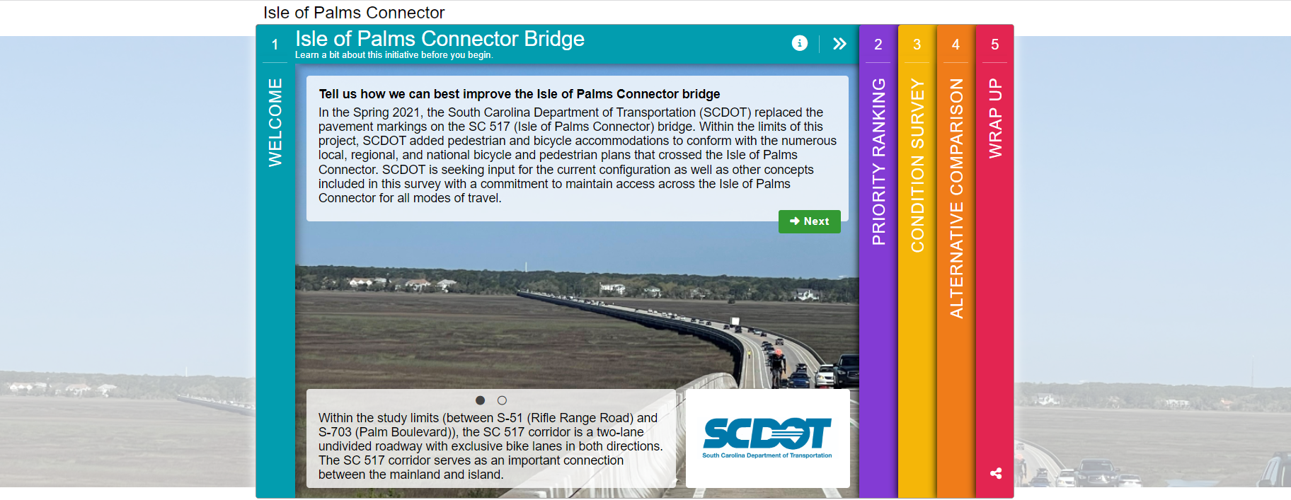
    The Welcome Screen provided background context on the project. In this case, the project team did not use a project website so having a bit more detail on the Welcome Screen was necessary. With that, the ask was still clear, simply: “Tell us how we can best improve the Isle of Palms Connector bridge”.
    Screen 2: Priority Ranking

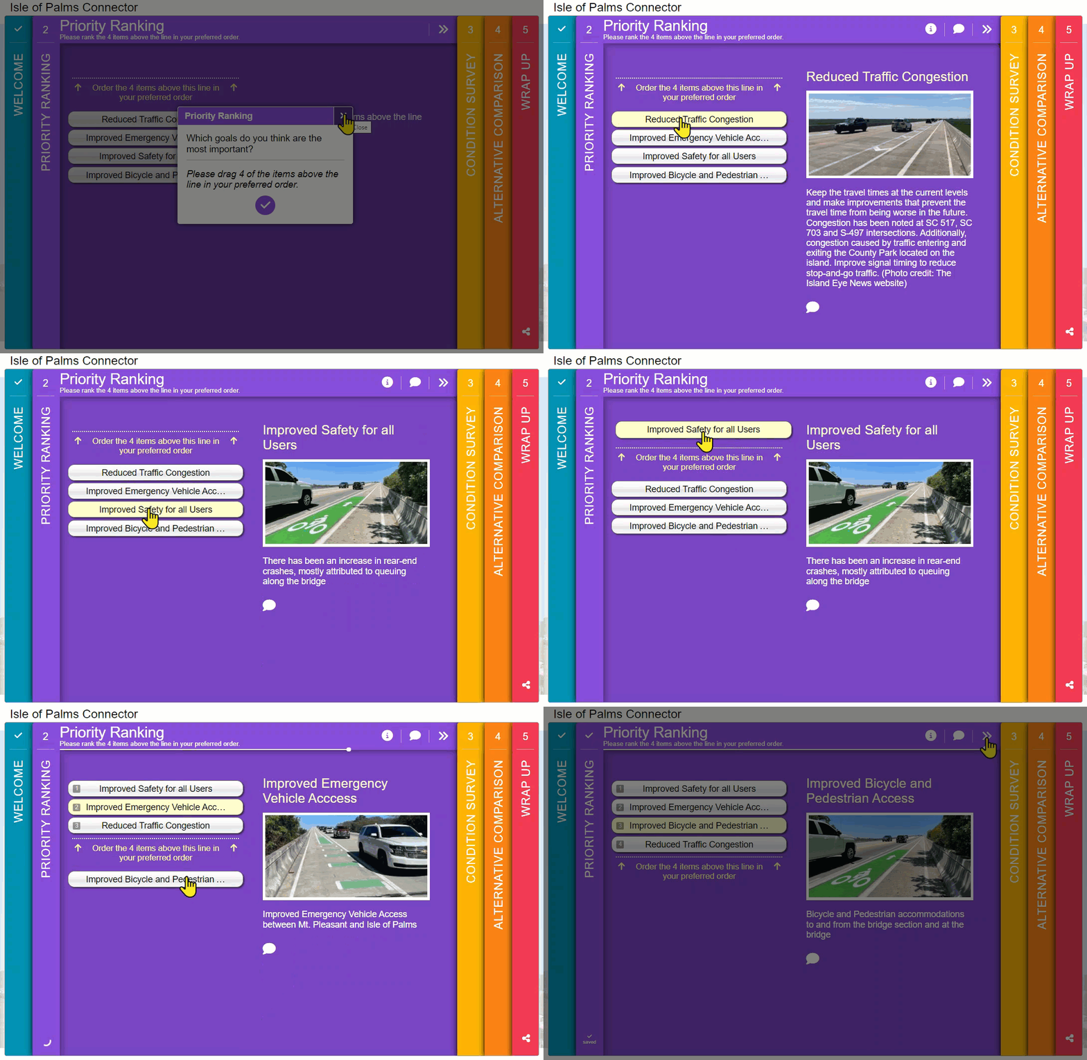
    Almost every Survey of the Month we feature includes a Priority Ranking Screen, usually on Screen 2. What is unique here is that they minimized it to ranking four options. In general, the fewer options provided, the more accurate ranking values will be. Additionally, seeing where participants rank vehicle access compared to pedestrian and bicyclist access shows how they plan to use the bridge.
    Screen 3: Standard Survey

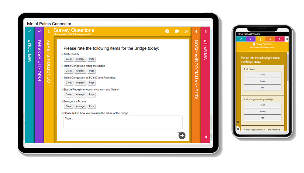
    Next, the project team made use of the Standard Survey Screen to run through a series of quick rating questions that would only take a matter of seconds to complete. At the end, they left room for an open-ended comment about “how you envision the future of the bridge”. Additionally, using three simple response options (great, average, poor) for the rating questions left less room for misinterpretation.

    These quick quantitative questions elicited precise, informative data for the project team, supplemented by more context in the open-ended responses.
    Screen 4: Image Rating

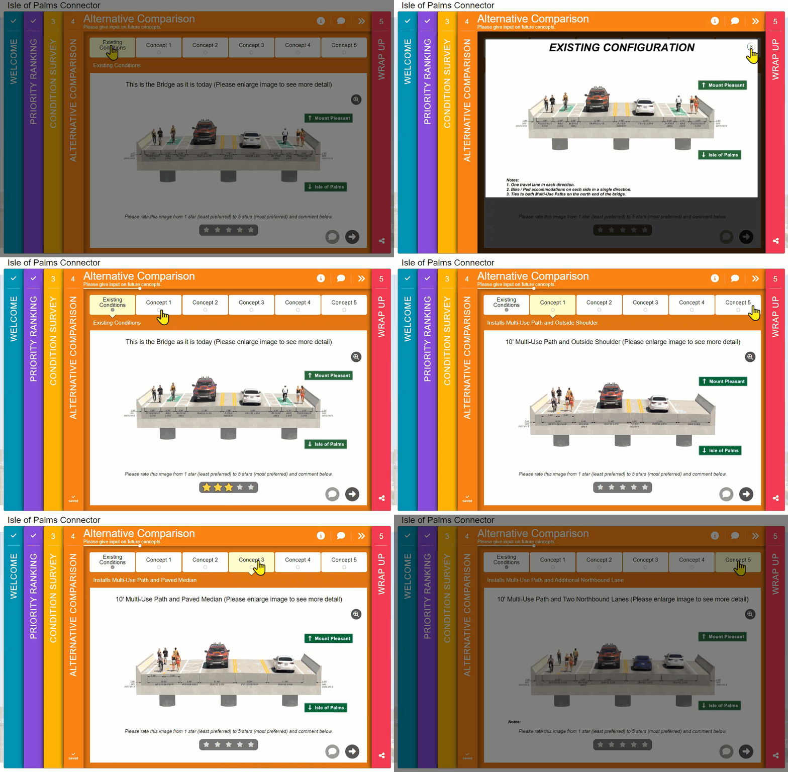
    Screen 4 is the core of the survey, where participants are presented with five bridge concepts. By now, those taking the survey have had a chance to warm up and get into the headspace for providing key input. Yet at the same time, the briefness of the earlier Screens means they can dedicate more time to reviewing and contemplating the proposed concepts.

    When showcasing design concepts, always use a visual that someone non-technical can understand. We particularly like the realistic cross-sections on this Screen. The consistency between images facilitates effortless comparison between tabs and highlights the critical differences between these key concepts.
    Screen 5: Wrap Up

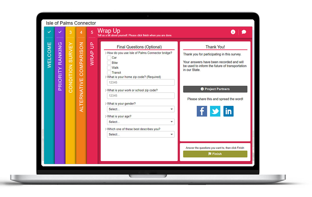
    As usual, the final Screen concludes the survey with a few quick questions. By asking participants to select how they currently use the Isle of Palms Connector bridge, the project team could easily see which concepts were preferred by certain user groups. Gathering demographic information around location, gender and age also helped frame the data that came in and ensured the project team was engaging a relevant yet diverse group of people.
    5 Tips from the Isle of Palms Connector Bridge Survey:

    There are many best practices to remember from this survey. To wrap up, these are our five primary takeaways:

    1. Utilize community networks to spread the word: As detailed earlier, the project team took a grassroots approach to notify community stakeholders and organizations. Informing a range of local organizations and encouraging them to share the survey ensured a wide array of individuals were aware. Outreach even before the survey launched also helped build awareness and anticipation for the survey once it was live.
    2. Ease into things: If there is a particular portion of your survey that is most crucial, instead of jumping immediately into it, provide a few initial questions or exercises that help educate yet also warm up your participants to the subject matter before you present them with the portion of the survey that may require the most thought or time. It is vital to start simple and build on the content.
    3. Prepare but preserve attention for the key ask: Similar to the last point, consider which parts of your survey you want participants to spend the most time on, and design other complementary portions to take minimal time. Screens 2 and 3 of this survey are a great example of this as they allowed participants to skim through the survey quickly until they hit the key exercise on Screen 4.
    4. Spend time on your visuals: Make sure the visuals in your survey are not an afterthought, especially if they are being used to inform feedback. Keep all visuals simple and realistic, supplementing with text captions and labels.
    5. Consider the data output: With quantitative questions, providing many different response options can be tempting. There is a balance between offering enough choices and gathering succinct data. This survey’s use of four priority ranking options and simple three-choice questions on the Standard Survey Screen ensured data in the back end would be straightforward to analyze.

    Don’t forget to go through the demo survey and try out the questions to experience the simple, effortless design of this survey.

    We were thrilled to finally showcase a survey from SCDOT. Their team has been using MetroQuest for a number of years with much success! With the recent addition of a regional agency license, we are looking forward to seeing more and more surveys out of South Carolina.


    For more great tips on how to make the most out of MetroQuest, reach out for more information, or, if you are an existing subscriber, contact our  Manager of Client Services Team, Woo-Ree Cho.


    Check out our latest webinar recording!

    Phase-by-Phase: Unbundling MnDOT’s Winning Virtual Public Engagement Strategy

  • [SURVEY OF THE MONTH] Visuals Pave the Way for Feedback on Tennessee Corridor Study

    [SURVEY OF THE MONTH] Visuals Pave the Way for Feedback on Tennessee Corridor Study

    The Survey of the Month series is a monthly blog where we highlight the extraordinary work our customers are doing! We feature well-designed surveys and share relevant takeaways for anyone interested in making the most out of online engagement using MetroQuest’s survey platform. To see more in the series, visit the blogs here.

    After a couple of months focusing on active transportation, this month, we transition to showcasing a corridor study, another topic where MetroQuest is commonly used to gather input.  

    MetroQuest subscriber, the Tennessee Department of Transportation (TDOT), along with Jefferson City, and the Lakeway Area Metropolitan Transportation Planning Organization (LAMTPO), worked with CDM Smith, a consulting firm that frequently designs MetroQuest surveys. This collaborative effort led to a survey with over 20 visuals to communicate key design ideas and improvements rather than substantial text.  

    The project team made several successful design choices, resulting in an effective online survey!

    What’s the story? Exploring Corridor Improvements

    Jefferson City is located in northeast Tennessee, just over 25 miles northeast of Knoxville. The city was initially known as Mossy Creek when founded in 1788. Later in 1901, it amalgamated with several other neighboring communities and became what we know today as Jefferson City. 

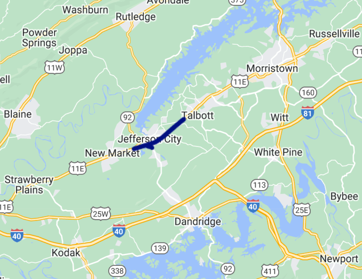
    For this study, the project team was looking to determine improvements for safety, traffic flow, and the overall operation of US Highway 11E along the SR 34 corridor (shown below).

    The project area extended from W Andrew Johnson Hwy to E Andrew Johnson Hwy and SR 92 from US 11E to George Avenue.
    The project area extended from W Andrew Johnson Hwy to E Andrew Johnson Hwy and SR 92 from US 11E to George Avenue.

    Community Response

    Corridor study surveys often see quite a bit of traction compared to more theoretical future studies. Due to their typically imminent nature and definitive location, community members often are more engaged with specific ideas on what they wish to see. Imagining improvements to one specific zone can be much easier than a statewide area.  

    The Jefferson City – US 11E Corridor survey ran from January 15 to February 15, 2023, gathering input from over 400 individuals and collecting over 9,000 data points. Similar to last month’s survey in Lebanon, New Hampshire, this survey saw a large response considering that the 2020 Census cited just over 8,000 residents in Jefferson City. Of course, it’s worth noting that this throughfare impacts many who live outside of Jefferson City, so residents in adjacent areas likely weighed in as well.   

    Notably, the word about the survey spread fast following coverage in local newspapers and online media such as the Jefferson County Post. Survey coverage also included a QR code linking to the survey, making it efficient to access the survey.

    Anatomy of a Corridor Survey: Using Images and Maps to Communicate Concepts

    Since every Screen of this survey followed best practices we love to see, we will go through each one in detail! 

    Try out the exercises and questions yourself at this demo link. 

    Screen 1: Welcome 

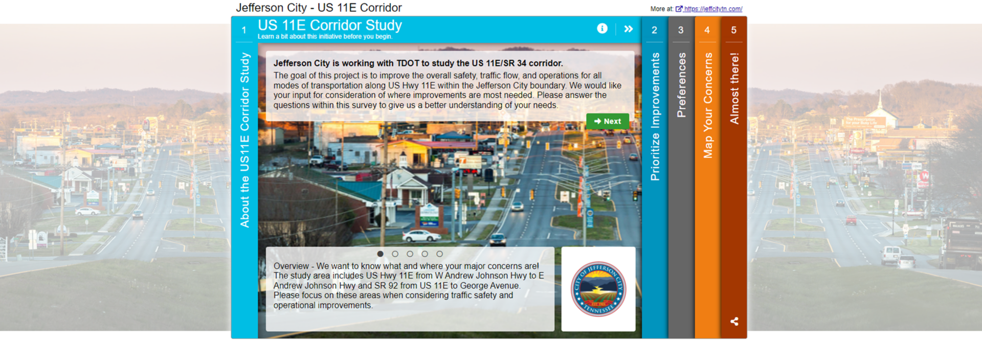
    The Welcome Screen features a striking image of the corridor during golden hour. The landscape orientation allows it to extend across the browser window.

    The introduction gets to the point succinctly, clearly stating the goal of the survey. The content tone is directed at the participant with phrases such as: 

    We would like your input for consideration of where improvements are most needed.” 

    “We want to know what and where your major concerns are!” 

    This communication style ensures you are speaking directly to those taking your survey, and it is more likely that the message will resonate. 

    Another minor detail that has a significant impact is the cohesiveness between the logo, survey colors and image. Everything blends together and instantly looks more appealing.

    Screen 2: Priority Ranking 

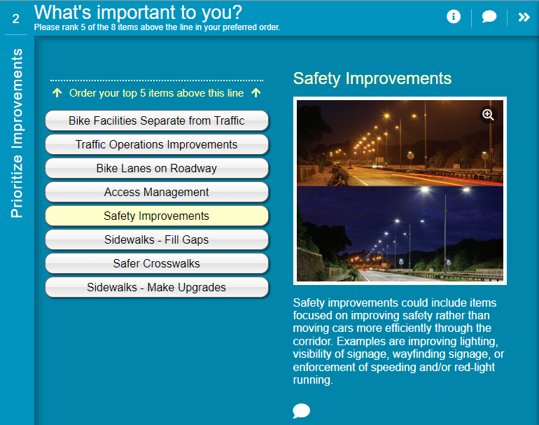
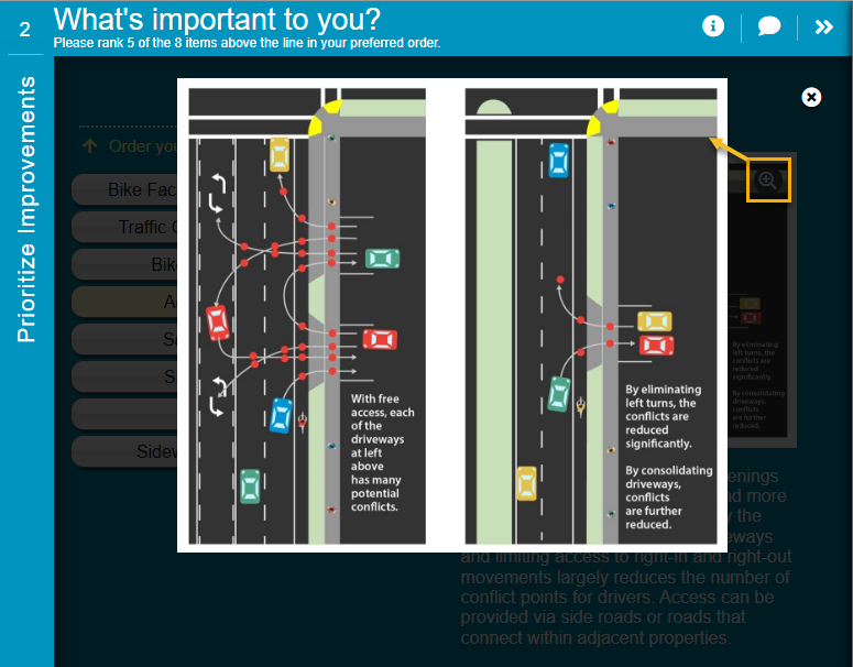
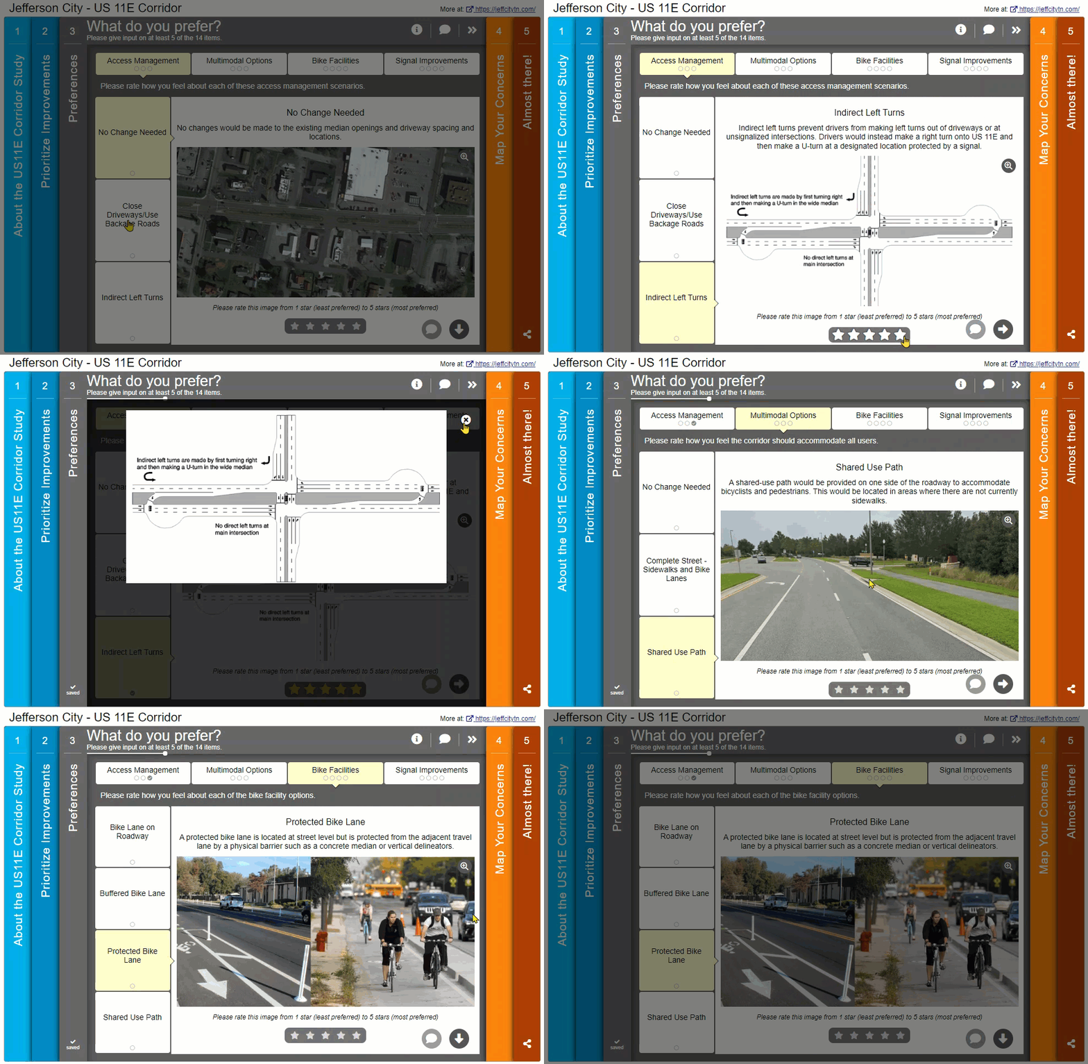
    The survey starts with our most popular second Screen: Priority Ranking. Large images and descriptions complement eight types of corridor improvement options. The team used the image enlargement option for a more detailed look. Notice the specificity of the descriptions; the less interpretation required, the more accurate data will be.

    What's Important to you?
    Notice how the lighting image shows a before and after view to represent the types of safety improvements that are being proposed.
    Using the image zoom function allowed the team to share images with more details like this one.

    Screen 3: Image Rating 

    Image Rating Screens have a wide range of use cases; the format allows you to ask for feedback on concepts best described visually. In this survey, the proposed improvements are specific, such as closing off driveways to the main road, adding protected bike lanes, and adjusting traffic signal timing. During our daily lives, we observe many types of road infrastructure, but unless you are an engineer or planner, you may not be familiar with the technical jargon. This is where images come in as a handy reminder. 

    As shown in the GIF below, the images on this Screen help demonstrate each concept, leading to better-informed feedback!

    Screen 4: Map Marker 

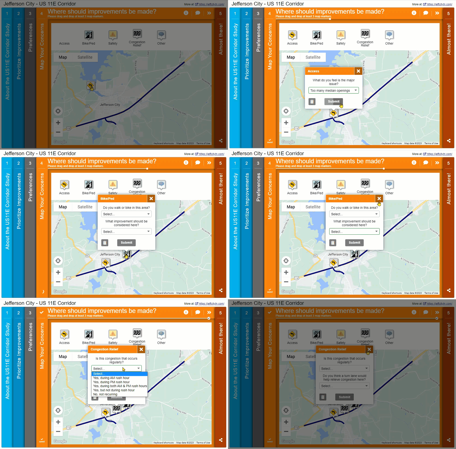
    Next, we navigate to a very clearly laid out Map Marker Screen. The corridor under discussion is indicated through the KML layer that blends seamlessly into the map. The Map Marker dropdown questions help generate ideas with phrases to fill in. In survey design, always remember that your participants have limited time. Including prompts and dropdowns helps speed up the survey for participants and quantifies the data for you.

    Screen 5: Wrap Up 

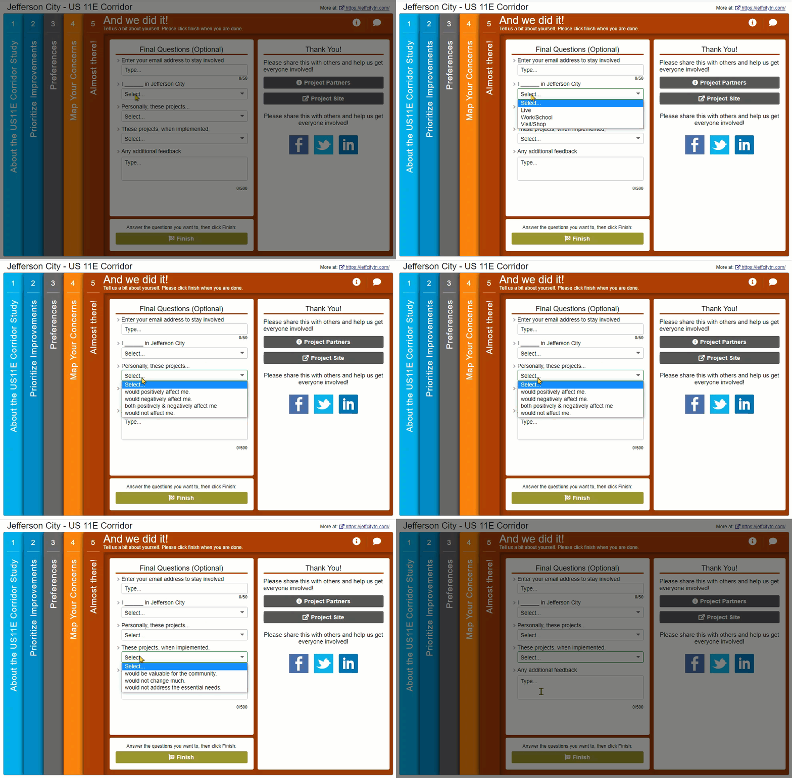
    The survey concludes with a very well-designed Wrap Up Screen. Here, the team asked a set of questions that were particularly informative for the project but didn’t require much more time from participants. The use of fill-in-the-blank dropdown options, such as “Personally, these projects_____” and “These projects, when implemented_____” provided precise data that indicated overall sentiment.

    While most questions were quantitative, participants had an opportunity at the end to share any additional feedback.  

    The simplicity of this Wrap Up Screen led to a large percentage of participants completing these final questions. Based on the data collected through this Screen, it was evident that most respondents thought the projects would positively affect them and be valuable for the community. These types of insights can significantly help inform future council decisions.  

    For your next survey, consider whether it would be suitable to ask some general sentiment type questions, in addition to more detailed feedback on each aspect of the project.

    5 Tips from the Jefferson City – US 11E Corridor Survey:

    Make sure to check out the demo survey for yourself to see the visual and precise approach of this survey. 

    In summary, here are our five key takeaways from this survey:

    1. Let the visuals do the talking: Often, surveys rely on text content to get the message across. Yet, with technical concepts such as proposed road layouts or how bike lanes will be designed, images can be much more effective. Just be careful to select images that are representative and easy to interpret. Here, the Image Rating Screen provided a format for their team to ask a series of rating questions complemented by relevant images. 
    2. When it does come to your text, make it engaging yet direct: Since many survey participants will be skimming text quickly, keep it simple and be specific about the task at hand. Background information can be helpful, but the Welcome Screen should really focus on the purpose of the survey, what type of feedback is needed, and specific details such as how long the survey may take and the deadline for input.
    3. Provide helpful prompts: While you never want to put words in your participant’s mouth, at the same time, only asking vague, open-ended questions can sometimes make it difficult for participants to brainstorm. By utilizing questions with dropdown options or multiple checkboxes, you instantly make the survey faster for each participant and, in turn, receive easily quantifiable data. Of course, it is always good to supplement with opportunities for additional comments.
    4. Keep the Map Marker simple: The Map Marker Screen can be a new style of surveying for participants who may be used to form-style surveys. It performs best with simple, quick dropdown questions and a clearly delineated feedback area.
    5. Be creative with your final questions: While the Wrap Up Screen is predominantly designed for demographic questions, it can also be utilized to ask for some final thoughts more generally. By this time, participants have had a chance to get familiar with the project and form opinions. Asking a few summary-type questions toward the end can assist you in determining the overall community opinion.

    We hope you will keep these tips in mind for your next survey. 

    Kudos to everyone involved in designing this superb survey! It followed MetroQuest best practices with a simple format, inviting questions and applicable images. We’ve covered some fantastic Tennessee-based surveys on this blog and look forward to more in the future. 


    For more great tips on how to make the most out of MetroQuest, reach out for more information, or, if you are an existing subscriber, contact our Manager of Client Services Team, Woo-Ree Cho.

    Check out our latest webinar recording!

    Phase-by-Phase: Unbundling MnDOT’s Winning Virtual Public Engagement Strategy

  • [SURVEY OF THE MONTH] Walk, Bike, Ride, Leb – Planning Safe and Connected Routes in Lebanon, NH

    [SURVEY OF THE MONTH] Walk, Bike, Ride, Leb – Planning Safe and Connected Routes in Lebanon, NH

    The Survey of the Month series is a monthly blog where we highlight the extraordinary work our customers are doing! We feature well-designed surveys and share relevant takeaways for anyone interested in making the most out of online engagement using MetroQuest’s survey platform. To see more in the series, visit the blogs here.

    Continuing with our active transportation theme from last month, we are featuring a succinctly designed survey developed by the Upper Valley Lake Sunapee Regional Planning Commission (UVLSRPC). UVLSRPC is one of nine regional planning commissions with access to the New Hampshire Department of Transportation (NHDOT) MetroQuest subscription. 

    The survey is concise and simple, resulting in it effectively engaging hundreds. Further, the project team presented the project background and survey findings very interactively. So, let’s get into it!

    What’s the story? Walk, Bike, Ride, Leb – Planning for Active Transportation

    Walk, Bike, Ride, Leb is a planning initiative in Lebanon, New Hampshire, with the goal of creating a safe, comfortable, and connected walking and bicycling network. 

    The UVLSRPC, in conjunction with the City of Lebanon, developed the Walk, Bike, Ride, Leb Survey, which launched in early 2022. The MetroQuest survey was open for input for approximately one month and engaged over 400* people to determine where pedestrian and cycling infrastructure could benefit from improvement.

    *As of the 2020 Census, Lebanon, NH had a population of 14,282. Reaching over 400 people on the survey ensured the project team heard from a representative portion of the community, especially since 90 percent of survey participants stated they live or work in Lebanon. 

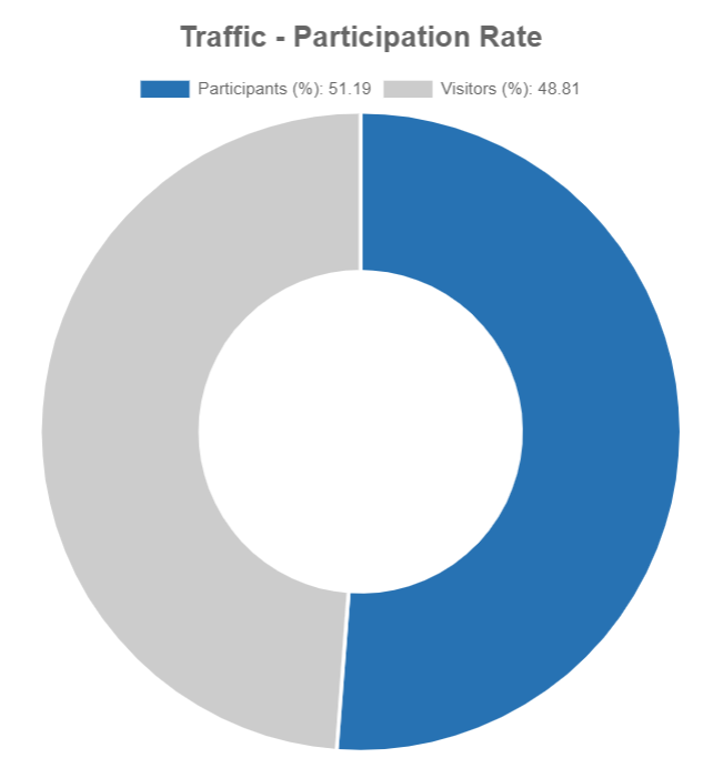
    Evidently, the community was very interested in this effort, as over half of those who initially visited (viewed) the survey provided input, as shown in the graphic below.  

    Survey participation rates can vary, but if you design a short, simple survey and promote it to the right audience, you can see great participation levels. In most cases, MetroQuest surveys see much higher participation rates compared to other more standard online survey tools due to our highly engaging, gamified activities. 

    Traffic Participation Rate
    Participation rate data showing that over 51% of people who visited the survey completed at least a portion. This is an excellent rate, showing the community was very engaged with the project.

    For this blog, we will dive into what led to this engaged community response! We will share how the project team successfully communicated about the initiative, and how they reported feedback following the survey.

    Project Branding

    As we often see with successful planning and engagement initiatives, a strong brand that can be carried through multiple planning phases is instrumental in gaining public traction.  

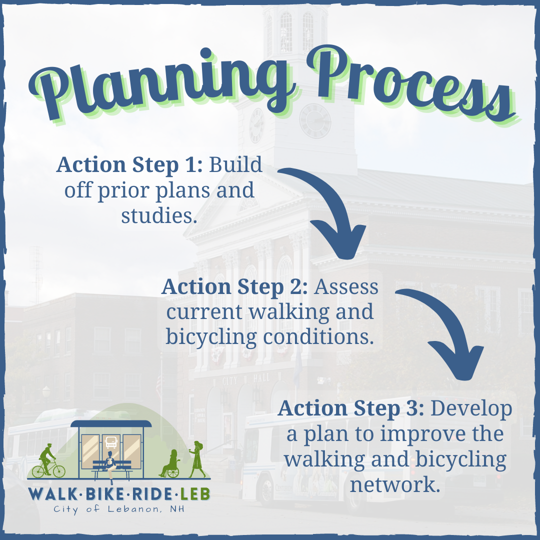
    Here, the team developed a fun and inviting project logo (bottom left of graphic) and designed the other project visuals to follow the same cohesive color tone and style. 

    MetroQuest the Planning Process by City of Lebanon NH

    Project Resources and Webpage 

    To outline the Walk, Bike, Ride, Leb planning process, the project team utilized an ArcGIS StoryMap, much like the one we saw from PlanRVA here 

    This StoryMap allowed the project team to lay out the entire planning and engagement process in a digitally interactive way, as is evident with the project timeline “infogram” displayed below.


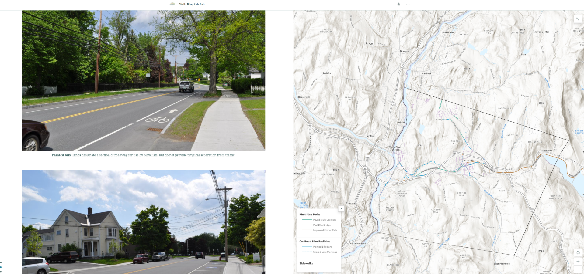
    The page takes visitors through the project story, including photos and maps of the area and existing infrastructure. Whether stakeholders wanted to gather some brief background on the project or read through it in detail, they could find an array of information from this interactive page.

    Excerpt from project StoryMap showing photos and a map of existing bike infrastructure.

    We highly recommend checking out the interactive StoryMap to see the full effect – it methodically goes through every project stage to tell the complete story from the beginning to present time, as the project team is currently working on a final active transportation plan, informed by the survey.

    Anatomy of an Active Transportation Survey: Brief and Specific 

    The Walk, Bike, Ride, Leb Survey followed a very structured and straightforward approach to gathering input. The survey was split into an upfront survey section that gathered overall impressions on walking and biking in Lebanon. Then, the latter half gathered input on proposed projects and allowed participants to provide map-based input on additional improvements they would like to see.  

    Try out the demo version survey for yourself here! 

    Rather than go into detail on every survey Screen, we want to highlight several key components that contributed to the survey’s success: 

    Simple and Direct Welcome Screen 

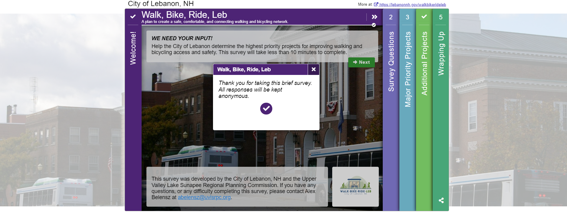
    As we always say, the Welcome Screen sets the tone of the survey. In this case, participants could see that the survey was intended to be brief since they noted: “This survey will take less than 10 minutes to complete”. The text content is to-the-point yet clearly explains the purpose of the survey. They also confirm that all responses are anonymous.

    Moreover, it’s advantageous to include a project member’s email or project email, as was done here, so participants know who to contact if they need assistance or have questions.  

    Overall, this simple Welcome Screen exemplifies what we like to see, concise yet with a specific ask! 

    Quick, Quantitative Questions 

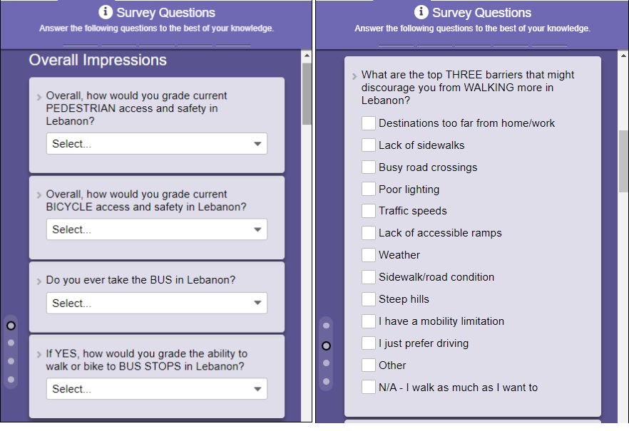
    Utilizing MetroQuest’s Standard Survey and Priority Ranking Screens, the majority of the survey gathered feedback through quantitative ranking, checkbox, and multiple-choice questions. The benefit here is twofold; questions are quick to respond to and provide quantifiable data.

    The team was able to dive deep into each respondent’s overall impressions of pedestrian and bicycling access and safety in Lebanon, as well as what they think are the top barriers for those who may otherwise walk or bike to destinations. They also incorporated questions about accessibility and key priority issues to address.   

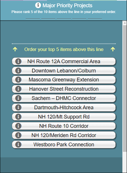
    Following these simple survey questions, the Priority Ranking Screen asked participants to rank their top five of ten priority projects that they wish to see completed.

    An Opportunity for Additional Map Input 

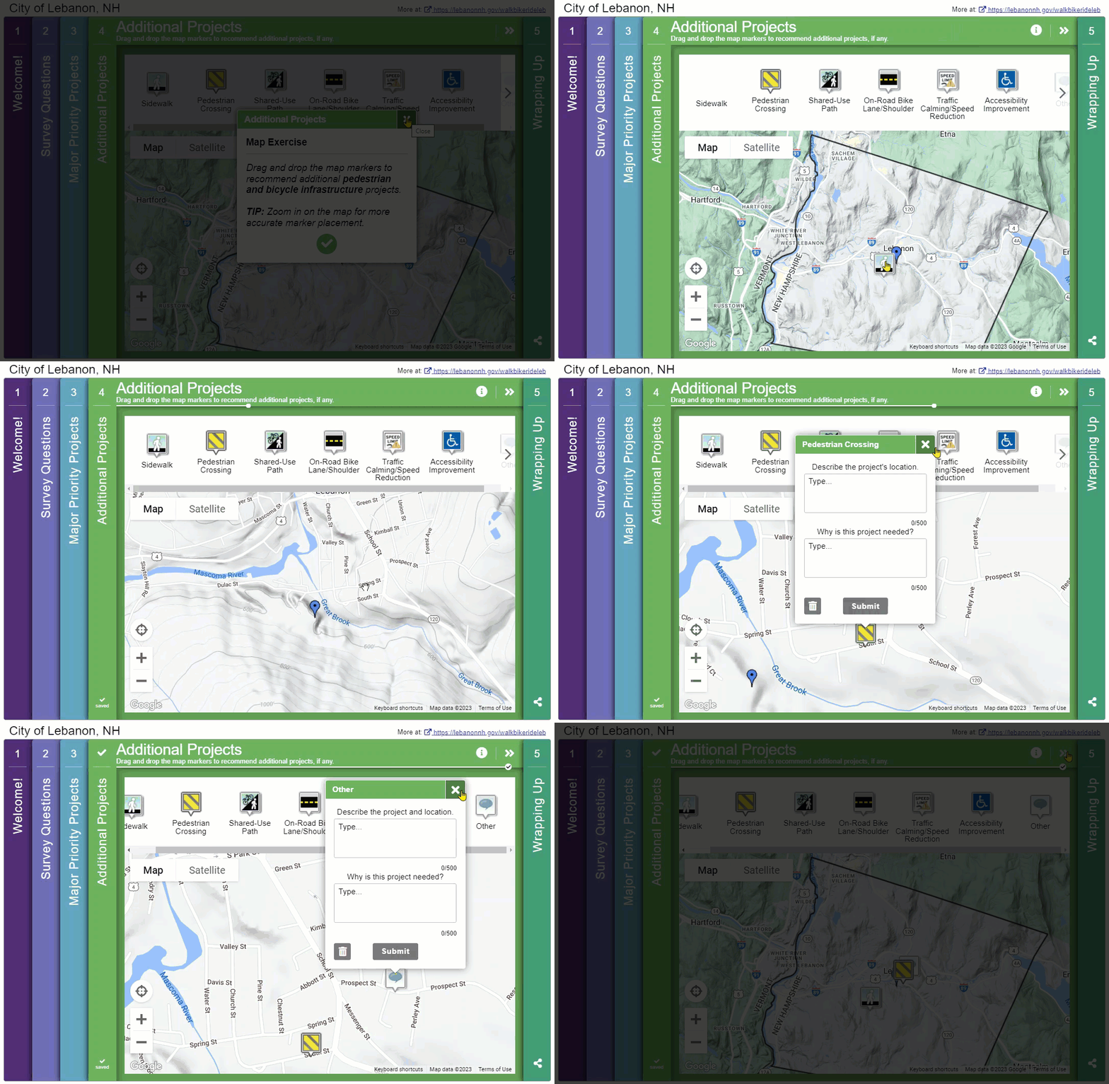
    Given the Priority Ranking Screen focused on ranking proposed projects, it made sense for the team to offer participants an opportunity to provide recommendations on other infrastructure they want to see improved. The Map Marker Screen was an excellent format for this input type and eliminated any uncertainty about the recommended location.  

    We like how the team utilized this as the fourth Screen; it’s usually best to work up to this more detailed map exercise rather than start with it upfront.

    Short Wrap-Up Screen 

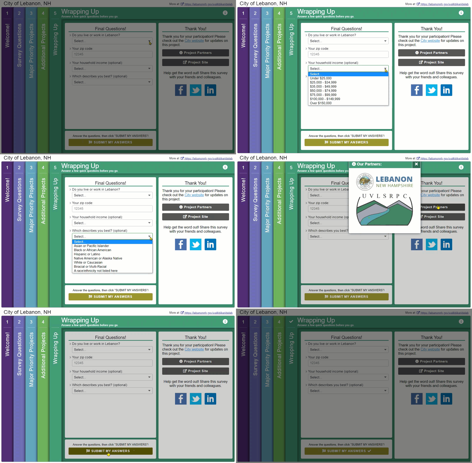
    It can be tempting to ask many questions on the final Screen, but when done right, the final Screen is best left short and sweet. This time, the team asked four simple questions to gather just enough about who they heard from:

    Sharing the Results Using a GIS Dashboard 

    As is evident with the survey design, it gathered a great deal of data to inform the future plan. Nearly 10,000 individual data points were gathered, including over 770 individual map markers dropped on Screen four.  

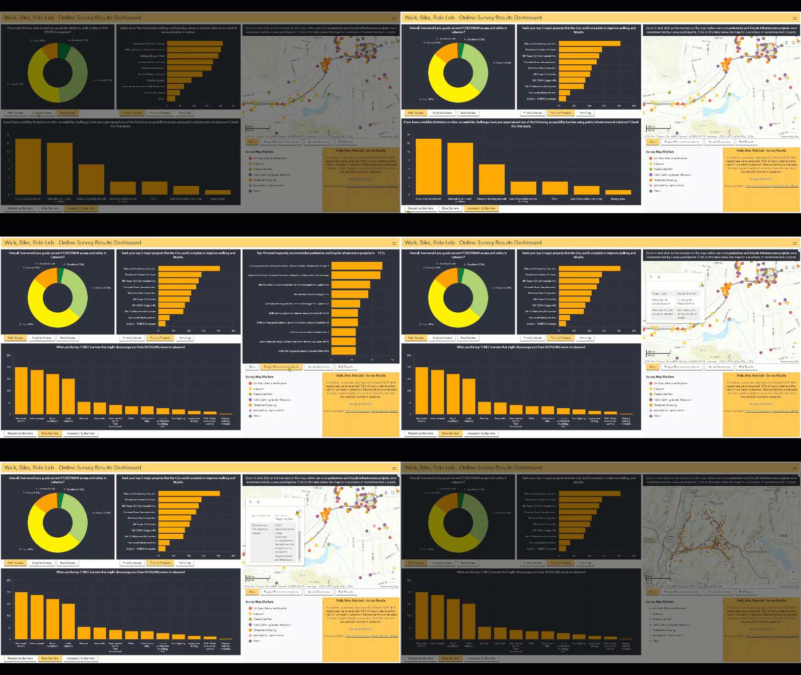
    To share the findings with the community, the project team developed an online survey results dashboard utilizing GIS software. This interactive dashboard presented graphs and map-based data, instantly allowing the community to see the high-level survey results and dive into detailed map data.

    Additionally, the project team developed a one-page executive summary of the survey results, which concluded:  

    “Our survey illuminated safety and accessibility concerns around pedestrian and bicycle mobility in Lebanon. The survey provided many insights into the types of investments the City should be making to improve community needs.” 

    We are always happy to see projects where the team takes the time to share feedback with the community; presenting it in an interactive, engaging way takes it one step further.  

    Stay tuned! MetroQuest will soon be releasing a survey insights dashboard which will allow you to create a customized page of your survey data graphs and findings. We look forward to sharing more on this soon with MetroQuest users as it comes to fruition! 

    5 Tips from the Walk, Bike, Ride, Leb Survey: Quick Surveying and Effective Reporting 

    As detailed above, this survey was particularly successful thanks to its short and straightforward approach. The questions were relevant and helpful for the project but also kept at a minimum to not require too much time.  

    To wrap up, here are a few quick tips to keep in mind for your next project: 

    1. Find an interactive and visual way to communicate the project story: We always recommend a project website to house your survey; the more visual, the better! Utilizing infographics, interactive elements, and eye-catching visuals will result in more people taking the time to study the information.
    2. Utilize consistent project and survey branding: Between your project website, survey, promotional materials, and any public meeting materials, having a consistent project brand adds to the legitimacy of your effort. Also, it allows stakeholders to familiarize themselves with your project.
    3. Communicate about the length of your survey: Have a colleague or friend take your survey and get a sense of how long it takes, ideally under 10 minutes. Communicating this upfront can lessen any visitor concerns about the survey taking a long time.
    4. Keep your “asks” brief: Following the above point, keep your survey language concise and questions limited. There are endless things you COULD ask, ask what you NEED to know.
    5. Utilize interactive graphics and maps to share your data: Decide how you will share your survey data, and where possible, utilize engaging graphics to communicate the results visually. We recommend taking a deeper look at how the project information and results were shared as this team took a very interactive approach. We also can’t wait to unveil our future survey insights dashboard, which will provide an interactive overview of your survey at a glance! 

    Thank you to the UVLSRPC team and to all that took the opportunity to participate in this survey. Surveys like this provide valuable information which is helpful to regional and state transportation planning initiatives.  

    I thoroughly enjoyed learning about this initiative and hope you did too! 

    For more great tips on how to make the most out of MetroQuest, reach out  for more information, or, if you are an existing subscriber, contact  our Manager of Client Services Team, Woo-Ree Cho.

    Join us at our upcoming webinar! 

    Phase-by-Phase: Unbundling MnDOT’s Winning Virtual Public Engagement Strategy

    MnDOTs Winning Virtual Public Engagement Strategy Webinar Image

  • [SURVEY OF THE MONTH] TxDOT Gathers Over 35k Data Points to Inform Bike Plans

    [SURVEY OF THE MONTH] TxDOT Gathers Over 35k Data Points to Inform Bike Plans

    The Survey of the Month series is a monthly blog where we highlight the extraordinary work our customers are doing! We feature well-designed surveys and share takeaways that are relevant for anyone interested in making the most out of online engagement using MetroQuest’s survey platform. To see more in the series, visit the blogs here.

    The transition into the spring season is welcomed by many, including enthusiasts of active modes of transportation, such as biking. Whether you are a dedicated year-round cyclist commuter, an avid road cyclist, or a “hop on a bike occasionally when the weather is nice” hobby biker, a growing number of people are utilizing bike infrastructure to get from A to B for exercise or leisure. 

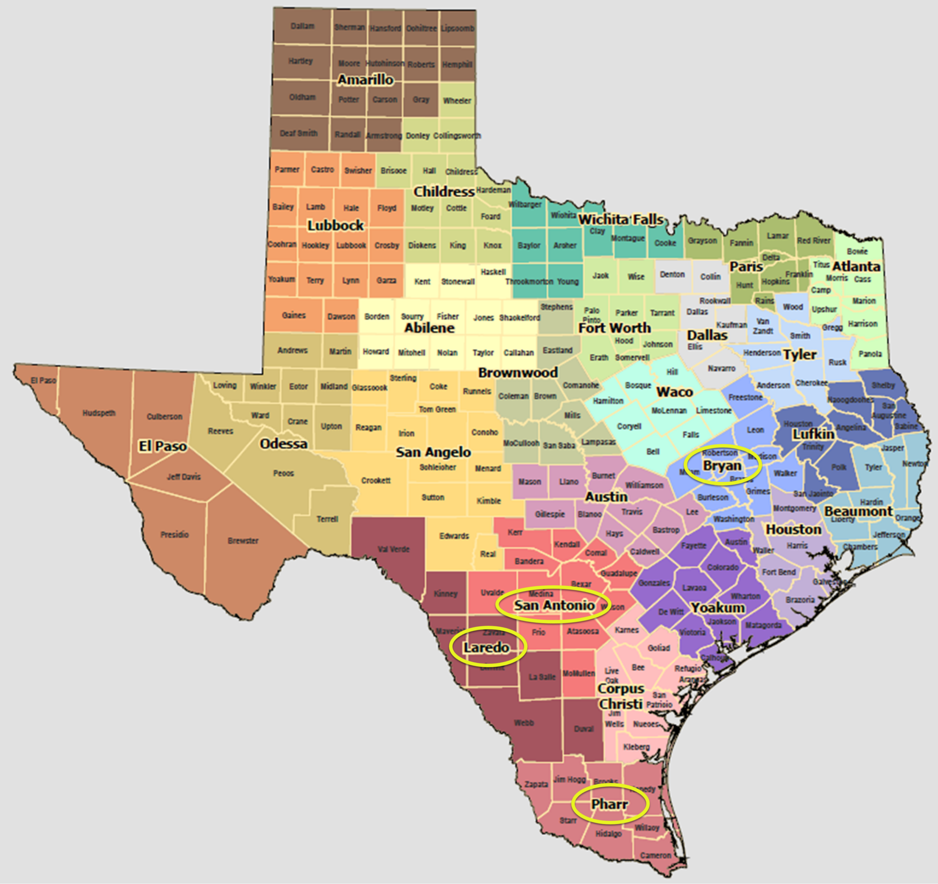
    This month, we feature not one but four bike plan surveys recently conducted by the Texas Department of Transportation (TxDOT) across various districts, including San Antonio, Bryan, Pharr and Laredo.  

    Ride along as we delve into this series and share some key takeaways from their surveys and overall approach. 

    What’s the story? Improving Bike Infrastructure on Major Texas Routes

    Long-time MetroQuest customer TxDOT launched four surveys in English and Spanish to seek input on bike infrastructure across several key regions in order to inform district bicycle plans. The surveys ran for ten weeks from December 2022 to February 2023. They focused on gathering feedback on cycling routes near roads owned and operated by TxDOT, often near major highways and arterial routes.  

    Questions and exercises gathered data on what priorities matter most to cyclists, key details about each person’s travel habits, and geospatial data on cycling concerns. This straightforward approach yielded an incredible amount of data: 35,000+ individual data points from 1,400+ survey participants!

    Surveying by District 

    Map of Texas
    Map of Texas Districts with survey locations circled. Full map here: https://www.txdot.gov/data-maps/reference-maps/district-county-maps.html

    We often see DOT’s survey statewide on bike or widescale active transportation plans. Even if the findings will eventually be compiled together to inform one statewide plan, in certain situations, it can be much more effective to take the time to create individualized surveys for separate regions. Several benefits stem from this approach: 


    • The ability to target each area specifically, including promoting each survey on social media to each region.  
    • The customizability of certain content and survey screens (e.g., zooming in on the Map Marker Screen on the specific area). 
    • Since the datasets will be divided with separate surveys, you can easily combine them at the end but have the option to easily see and compare sentiment in each area.  

    Deciding how you will engage various regions or areas in statewide plans is a key aspect to consider when planning for engagement. 

    Making Engagement Accessible 

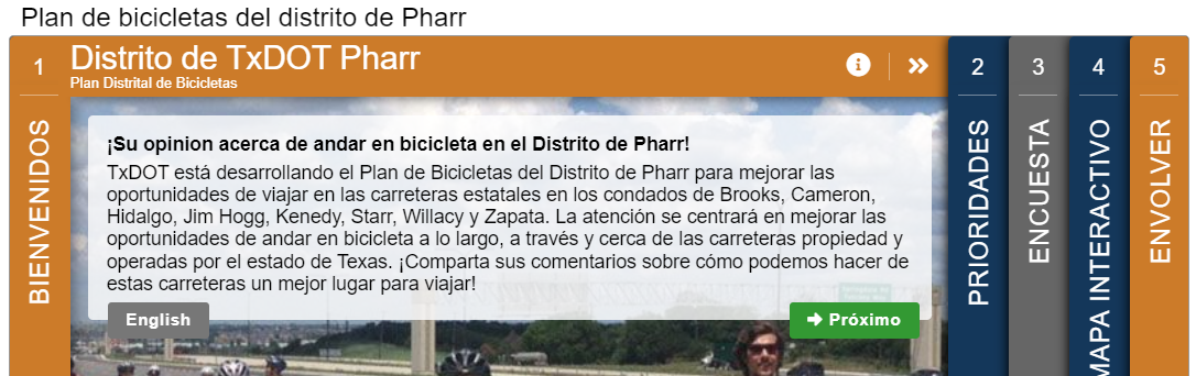
    To ensure language would not be a barrier, all English surveys were translated into Spanish. As is standard with MetroQuest surveys, the translated versions are linked on the Welcome Screen so that anyone coming across the English version knows there is a Spanish one available as well.

    TxDOT engagement survey slide 1.

    Further, the TxDOT team provided contact information for anyone requiring interpretation, translation or assistance completing the survey. Overall, TxDOT’s approach to engagement provides valuable insights into conducting effective, region-specific surveys to gather feedback on bike infrastructure.

    Translation Feature Update!

    We just released a new, revamped translation process that allows you to translate your survey seamlessly in just a few clicks. Additionally, all data will now be combined into one dataset, so there is no longer a need to combine or analyze separate language datasets.

    Anatomy of Cycling Surveys: Simple and Map-Based

    If you read our March blog, you might be experiencing some déjà vu! These surveys follow the same screen order as PlanRVA’s BRT survey but solicit entirely different data on cycling, not transit.  

    All four surveys followed a similar format; feel free to open one or more of the following demo versions to try them for yourself:

    Hold onto your handlebars as we cycle through some fantastic survey content!

    Screen 1: Welcome

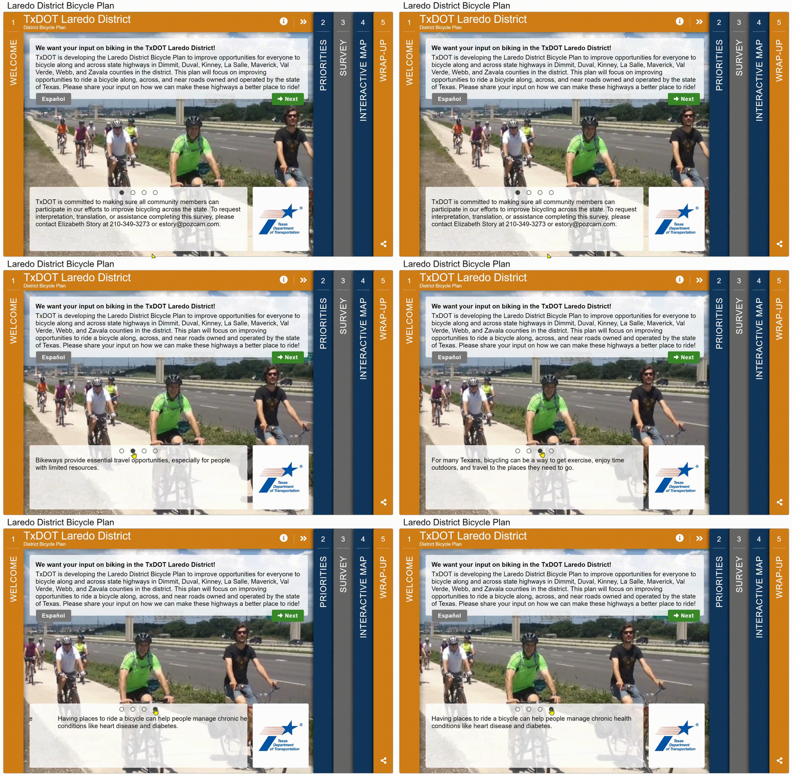
    All four surveys welcome participants with a quick introduction to the survey purpose:

    “This plan will focus on improving opportunities to ride a bicycle along, across, and near roads owned and operated by the state of Texas. Please share your input on how we can make these highways a better place to ride!

    The Welcome Screen is informative but direct in the task at hand.

    TxDOT survey slide 1 gif.

    Screen 2: Priority Ranking

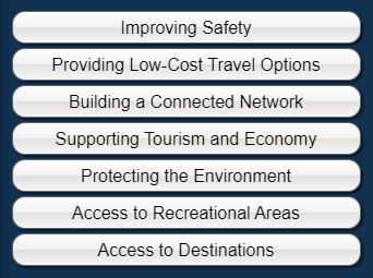
    As with many well-designed MetroQuest surveys, they start with a Priority Ranking Screen, gathering preferences on the participant’s top three of seven key options for improving bikeways:

    TxDOT survey options

    Screen 3: Standard Survey

    Given that cycling preferences, behavior, and needs can vary, the team recognized the importance of collecting more general information on travel activity.

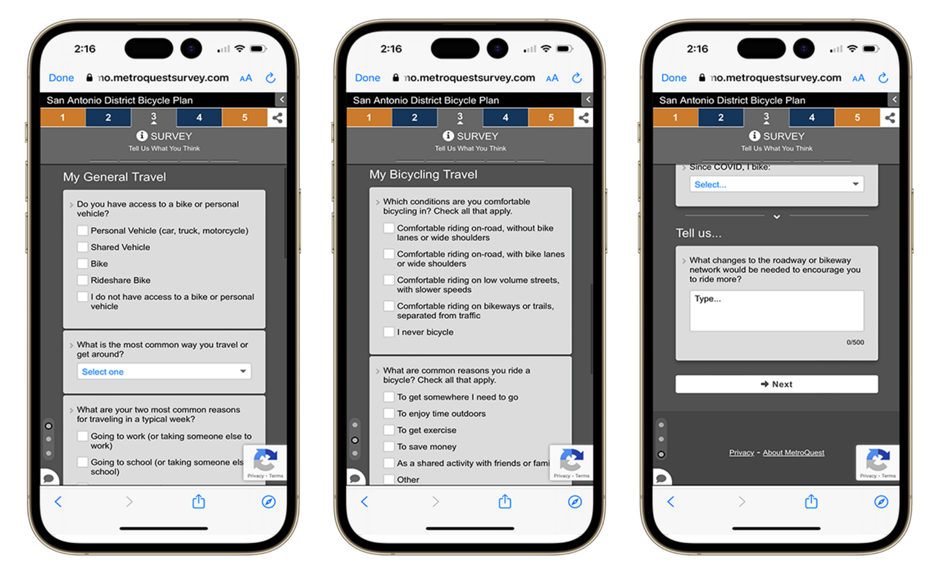
    Utilizing the Standard Survey Screen, they asked various questions, such as biking conditions, why you ride a bicycle, how often, and other travel methods.

    Finally, they end this Screen by asking what roadway or biking network changes would encourage you to ride more often. This simple question gets right to the point!

    TxDOT slide 3 mobile view.

    Screen 4: Map Marker

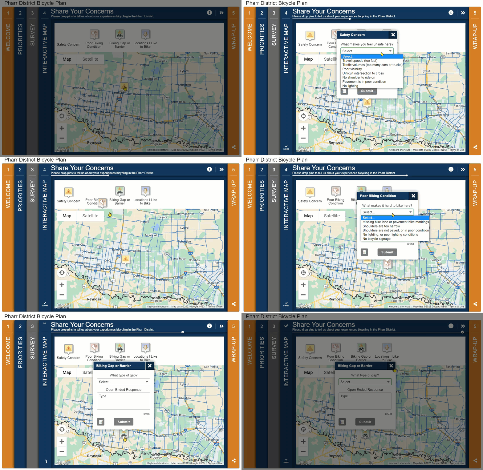
    A MetroQuest transportation survey, especially about biking, wouldn’t be complete without a Map Marker Screen. This is where dividing the surveys by district really paid off. Rather than having participants start on a zoomed-out map of Texas, each survey featured an interactive map specific to the area. Blue road lines indicated TxDOT routes where they sought feedback, while a black outline delineated the study area. 

    In particular, we like how precise the dropdown Map Marker questions are here. Typically, the more specific you are with your ask, the more accurate data you will receive. 

    Check out the below GIF to see some of the different questions TxDOT asked through this map screen:


    Screen 5: Wrap Up

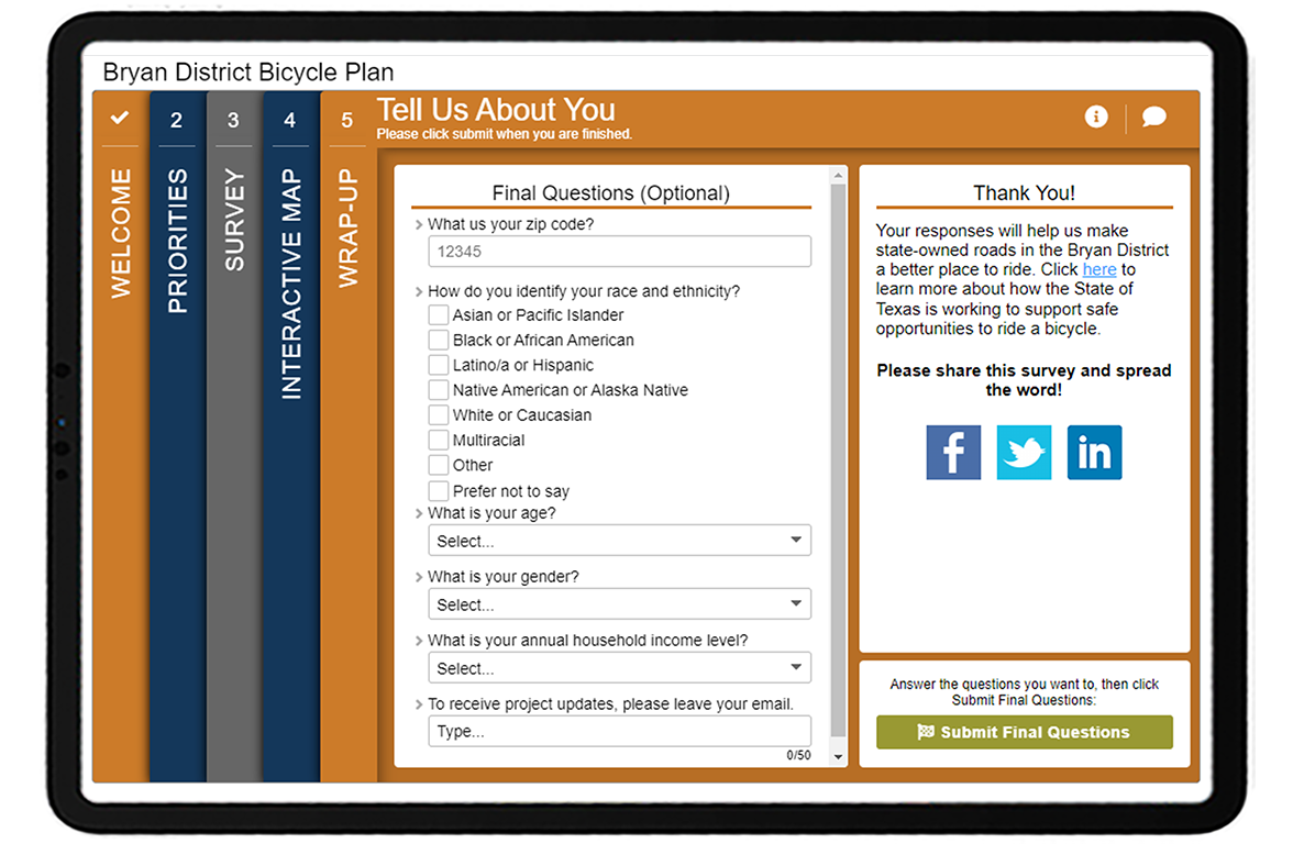
    TxDOT survey slide 5.

    To close, the surveys ask for basic demographic information on the final WrapUp Screen. Asking for some personal information, including ZIP code, race and ethnicity, age, gender, and annual household income, ensured the project team reached a diverse audience and allowed them to identify any significant demographic trends linked with cycling. If you don’t ask for this type of information, you will never know who you reached in the first place.

    5 Tips from the TxDOT District Bicycle Plan Surveys:

    Overall, there’s quite a bit to take away from these bike plan surveys. Here are our top five suggestions:

    1. Consider a district-by-district approach for statewide planning: If you are involved in an initiative that requires engagement with various regions, it can pay off to take the extra time to create individualized engagement strategies and surveys for each zone. Try to keep your surveys and engagement equivalent, as TxDOT did here, so you can easily compile information together later. 
    2. Get to know your participant above and beyond basic demographics: The amount of personal or behavioral information to ask is a delicate balance—you don’t want to seem intrusive but want to gather enough information to get a good sense of who you heard from. It can be instrumental in asking participants about their current transportation habits to help frame the context of their responses. Someone who has never cycled before versus a seasoned bike commuter will likely have very different preferences regarding bike infrastructure.
    3. Keep it simple: We might sound like a broken record saying this, but it’s likely the most crucial factor behind a successful survey. We are all busy, and most people have limited time for completing a survey. Many take surveys quickly on transit or while waiting in line somewhere. The more straightforward and direct your survey is, the more likely people will make it to the end.
    4. Ask for specifics on the Map Marker Screen: Your Map Marker Screen can solicit much more input than just pins dropped on a map. Utilize the option of up to five questions on each marker (one to three questions is best). As evident with this survey, you can get very creative with what you ask about each marker. 
    5. Indicate why you need personal information: Personal data is sensitive; most prefer not to share it widely. Explain why you are gathering the information to encourage more respondents to share their ZIP code, age, income level or other details. For instance, TxDOT included a short note on the Wrap-Up Screen pop-up stating, “Please answer a few optional questions to ensure we are reaching a broad range of people and communities…”.

    Bravo to the TxDOT team for their fantastic work with these surveys! We look forward to seeing more quality surveys from their team. Check out some earlier Survey of the Month blogs featuring TxDOT surveys linked in the right sidebar. 

    For more great tips on how to make the most out of MetroQuest, reach out for more information or, if you are an existing subscriber, contact ourManager of Client Services Team, Woo-Ree Cho. 


    New on our blog: 10 Tips on How to Promote Public Participations in 2023

    10 tips on how to promote public participation.

  • [SURVEY OF THE MONTH] Interactive and Transparent: Rapid Transit Engagement with PlanRVA

    [SURVEY OF THE MONTH] Interactive and Transparent: Rapid Transit Engagement with PlanRVA

    The Survey of the Month series is a monthly blog where we highlight the extraordinary work our customers are doing! We feature well-designed surveys and share takeaways that are relevant for anyone interested in making the most out of online engagement using MetroQuest’s survey platform. To see more in the series, visit the blogs here.

    This month, we are featuring a project and survey where results were reported back to the community effectively! Hop on board as we learn more about PlanRVA’s West Broad Street Bus Rapid Transit (BRT) Corridor Analysis Survey and discuss some key takeaways from both a survey and reporting standpoint.

    PlanRVA’s use of MetroQuest falls under the Virginia Department of Transportation, which holds a license that allows regional planning organizations across Virginia to utilize MetroQuest for their engagement endeavors. Virginia consistently is one of our most active customers, launching nearly 90 MetroQuest-based surveys in 2022! We are thrilled to be featuring this VA-based success story this month.

    What’s the story? Actively Engaging Transit Users

    PlanRVA, which hosts the Richmond Regional Transportation Planning Organization, brings together communities across the Richmond region to plan and provide essential services, including transportation. In collaboration with the GRTC Transit System, they launched a MetroQuest survey in November 2022 to gather input to inform the potential expansion of the Pulse BRT line west in Henrico County, northwest of Richmond, VA. This rapid transit system provides efficient bus transport via dedicated lanes, center-boarding stations, and platform-level boarding.

    The survey remained open for just over one month and received 1,378 responses! This successful response is likely attributed to the strategy the team used to promote the study, detailed below.

    Going to the Community

    To start, the team developed a Partner Toolkit to share with study partners and stakeholders. This information package made it efficient for organizations to spread the word about the survey on their channels and instantly broadened the survey’s reach. 

    The second part of their approach was to engage route users where they already are, often twice a day—commuting! This tactic works particularly well with transit projects. Since this survey involved extending a particular route, the project team took advantage of this to engage commuters while they were en route.

    Promotional tactics included:

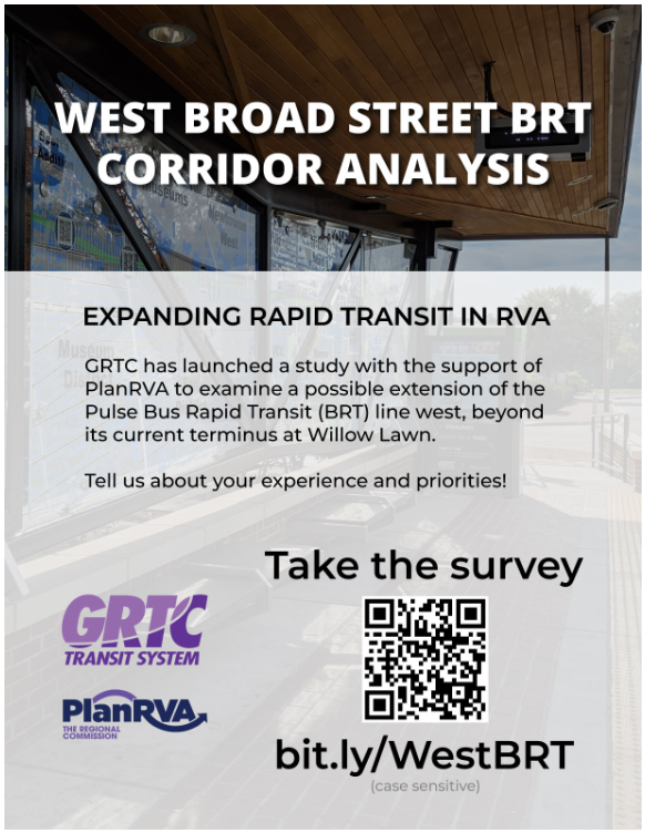
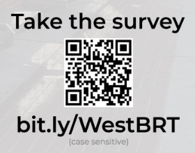
    • Survey flyers with QR codes posted around the stations and stops. 
    • Staff being present during peak hours to interact with transit riders and share information about the survey. They handed out flyers with QR codes to the survey.

    While we often discuss how effective social media promotion is, an opportunity to go directly to your audience can significantly boost survey awareness and traction.

    PlanRVA Flyer
    Flyer that was distributed at transit stations.

    Circling Back with the Community

    The project team did not stop at going to the community for input; they also ensured they came full circle in reporting back to the community. To stay on top of data analysis, the project team regularly reviewed the survey data as it was coming in. It often helps to get a head start on the data analysis while the survey is live, especially as project timelines can often be tight. Since the survey was primarily quantitative, they were able to quickly see trends and summarize the final results in charts and graphs.

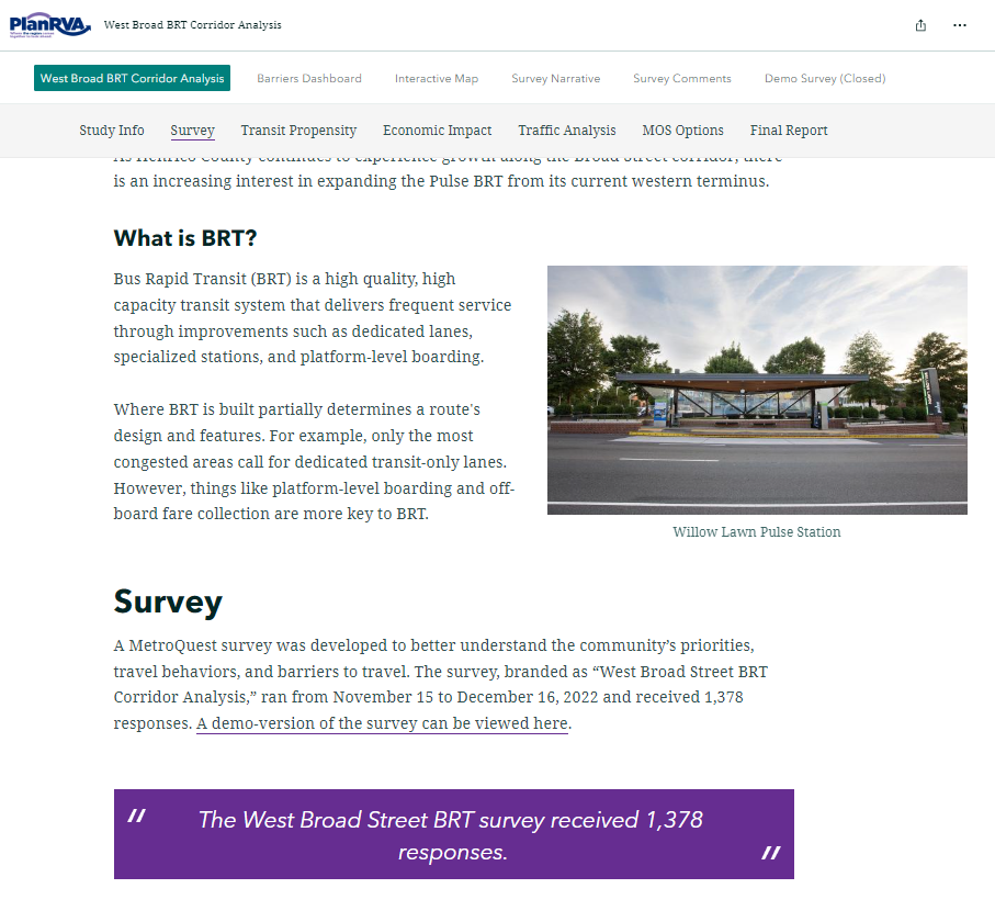
    The Esri ArcGIS-based project website provided an excellent and interactive format to review project information, results and geographic data. Visuals are front and center, and key highlights are pulled out – allowing readers to skim or read in-depth. The project website includes a detailed summary of the overall process and results. Transparency in survey reporting goes a long way in building community trust! Additional tabs contain more detailed reports, such as a full survey narrative and survey comments listed. They even embedded the demo survey within their site.

    PlanRVA Project Website
    Excerpt from interactive project website.

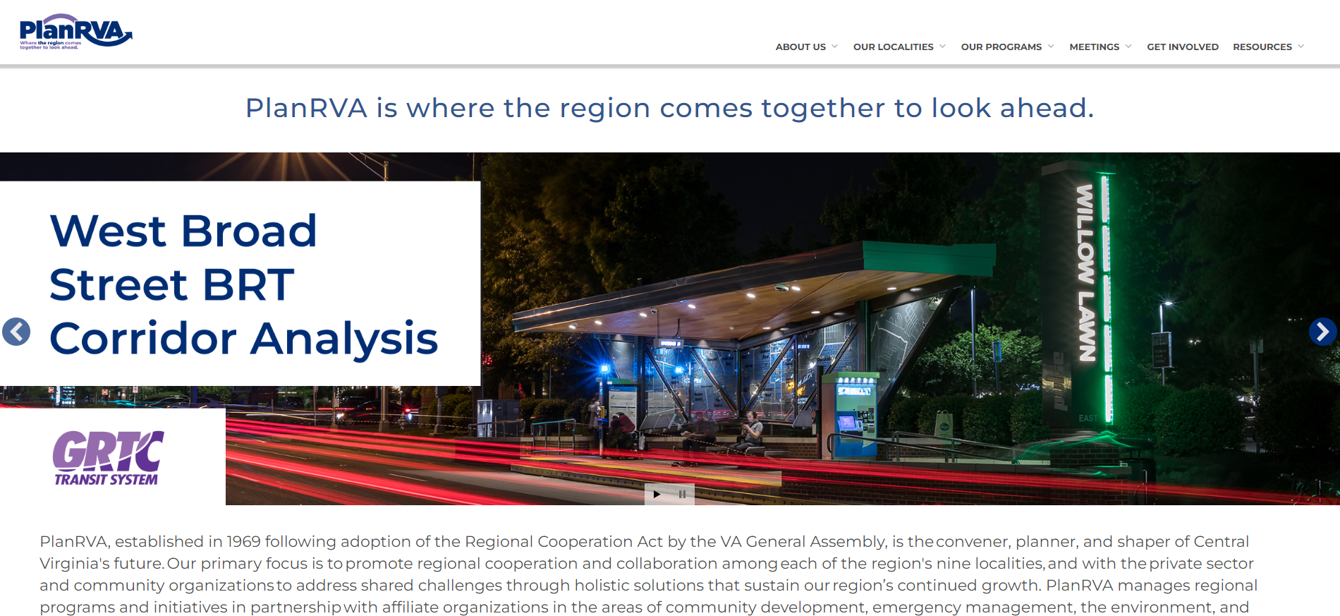
    PlanRVA’s main website homepage also includes a highlight carousel so anyone visiting their website will immediately be aware of the project:

    PlanRVA Webpage Carousel
    Rotating image carousel on PlanRVA homepage.

    Please keep reading as we go into more detail on the survey and how they shared the results in this next section.

    Anatomy of a Transit Extension Survey: Simple, Yet Specific

    This survey used some of MetroQuest’s most popular screens very effectively. As we always say, simple and visual is best!

    Follow along with us by opening the demo survey in a separate tab. Make sure to keep reading until the end where we uncover five key takeaways for your next survey!

    Screen 1: Welcome

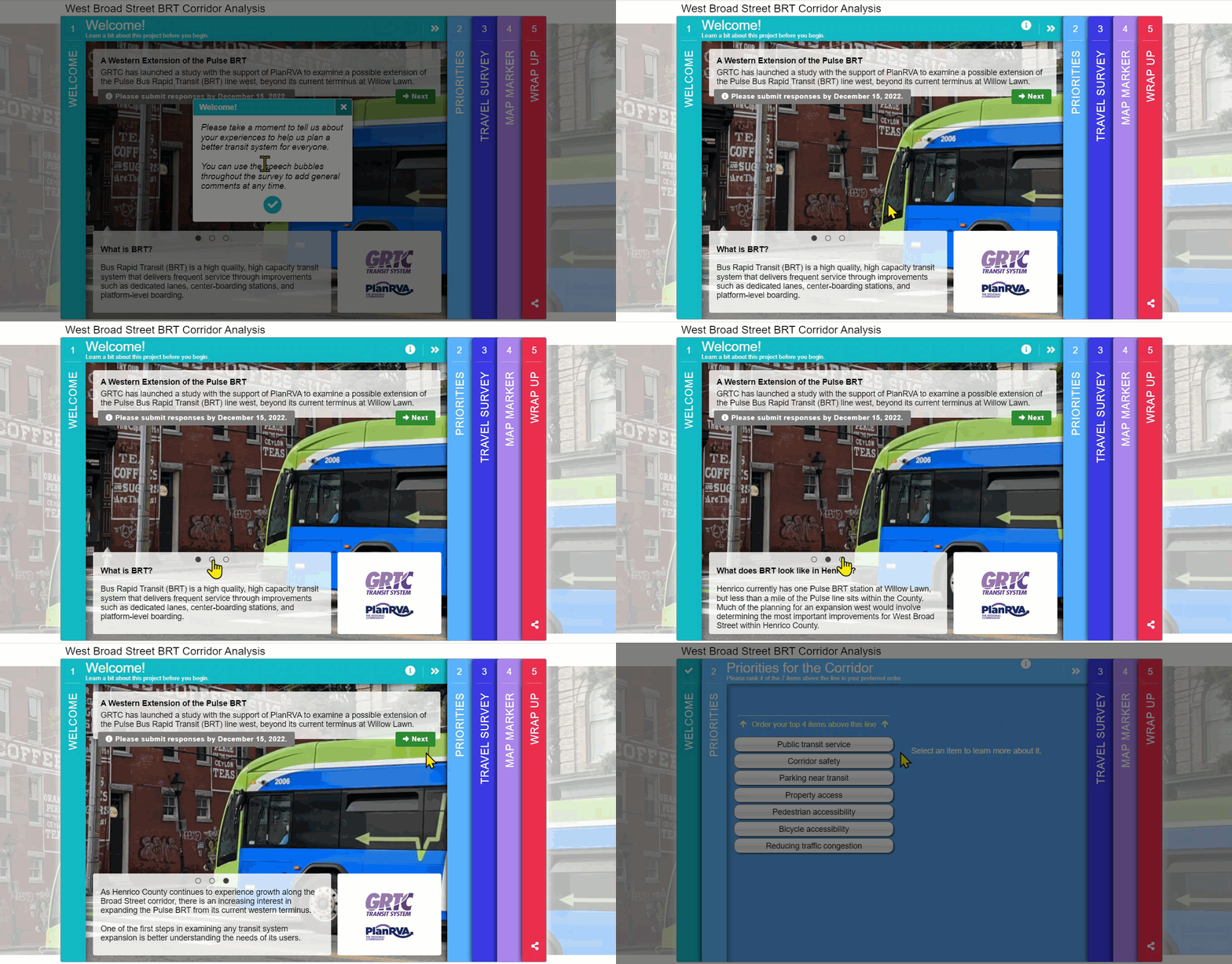
    The Welcome Screen is well organized in that it doesn’t appear text-heavy but uses the bottom slider to communicate some key details. Note they don’t assume that the participant already knows what a BRT stands for and explains what BRT currently looks like in Henrico County.  

    Clearly communicating your survey deadline can significantly impact the number of people you reach. This ensures that your community knows when they need to submit their input and that stakeholders aren’t surprised when the survey closes.

    Welcome screen
    Welcome Screen

    Tip: During the last day or two of your survey being live, do a final push on social media and advertise that the survey is closing very soon. You might be surprised by how many people complete the survey when they realize it’s almost gone! 

    Screen 2: Priority Ranking

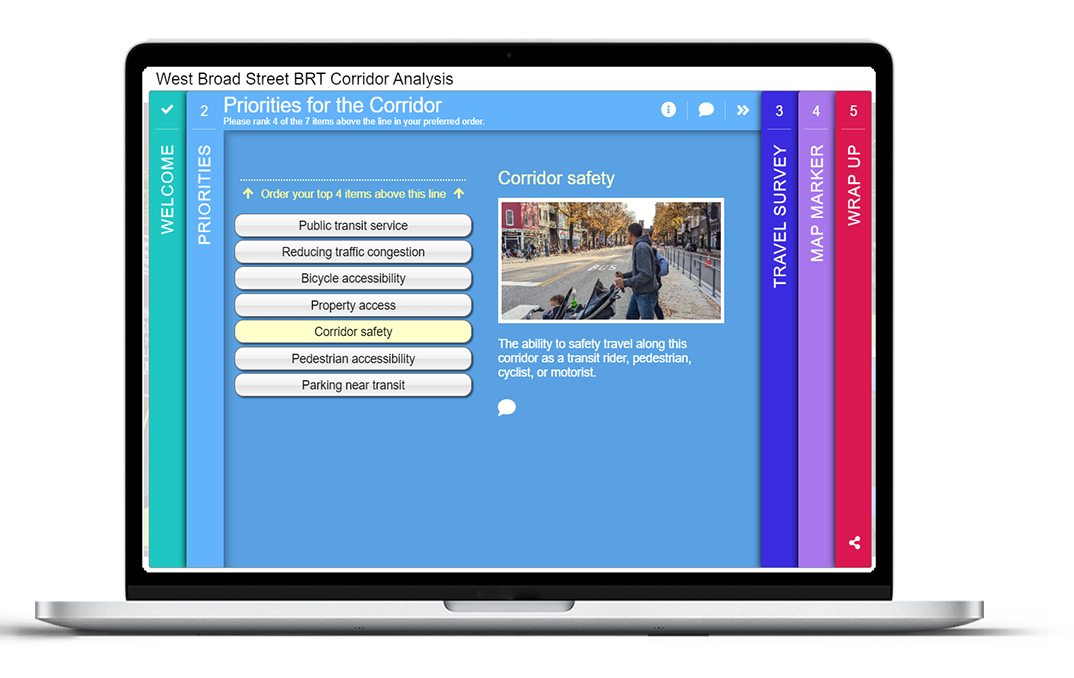
    The introductory Priority Ranking exercise is simple yet engaging as participants are being asked to rank their top four of seven items relating to different transit route improvements.

    PlanRVA Slide 2

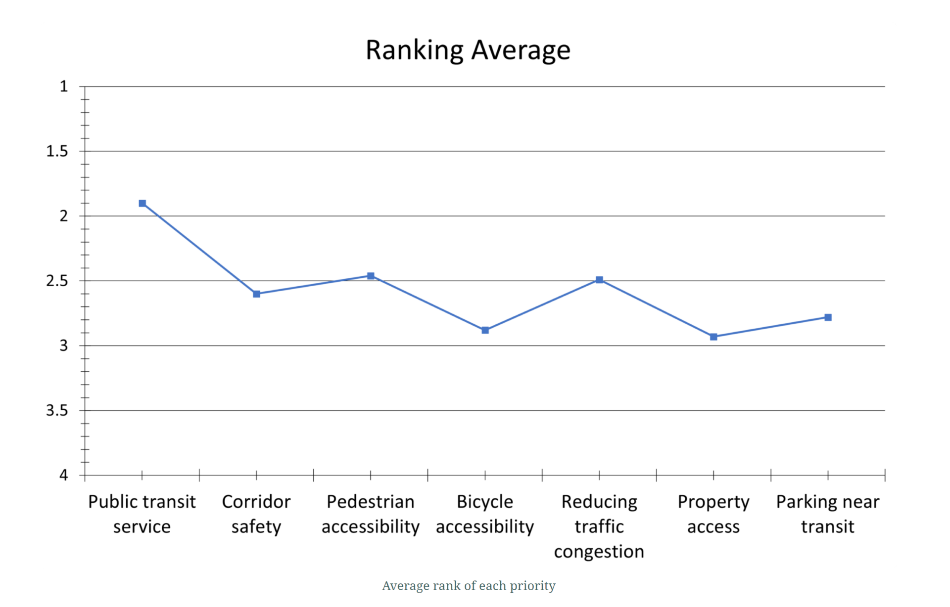
    Given the quantitative nature of this activity, the team was able to easily confirm the top priority was public transit service, being ranked first by 527 participants.

    PlanRVA Ranking Results

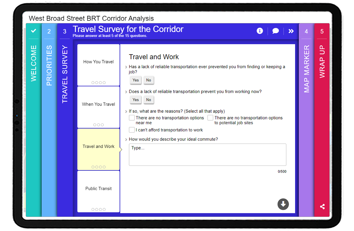
    Screen 3: Standard Survey

    Then, the survey transitions into a form-based component utilizing our flexible Standard Survey Screen. This portion was comprised of four logical sections related to travel:

    1. How You Travel
    2. When You Travel
    3. Travel and Work
    4. Public Transit

    PlanRVA Slide 3

    As with the Priority Ranking Screen, this section continued with the quantitative approach, asking a series of checkbox and multiple-choice questions, with a few comment boxes thrown in for collecting specific details and sentiment questions, such as “How would you describe your ideal commute?”.  

    The questions are concise, clear, and collect easily quantifiable data that is crucial to the project. 

    Some very important insights came out of this portion of the survey, such as:

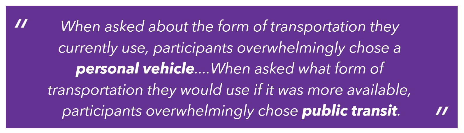
    PlanRVA Insight
    Key insight indicating that if public transportation was more available, participants would use it.

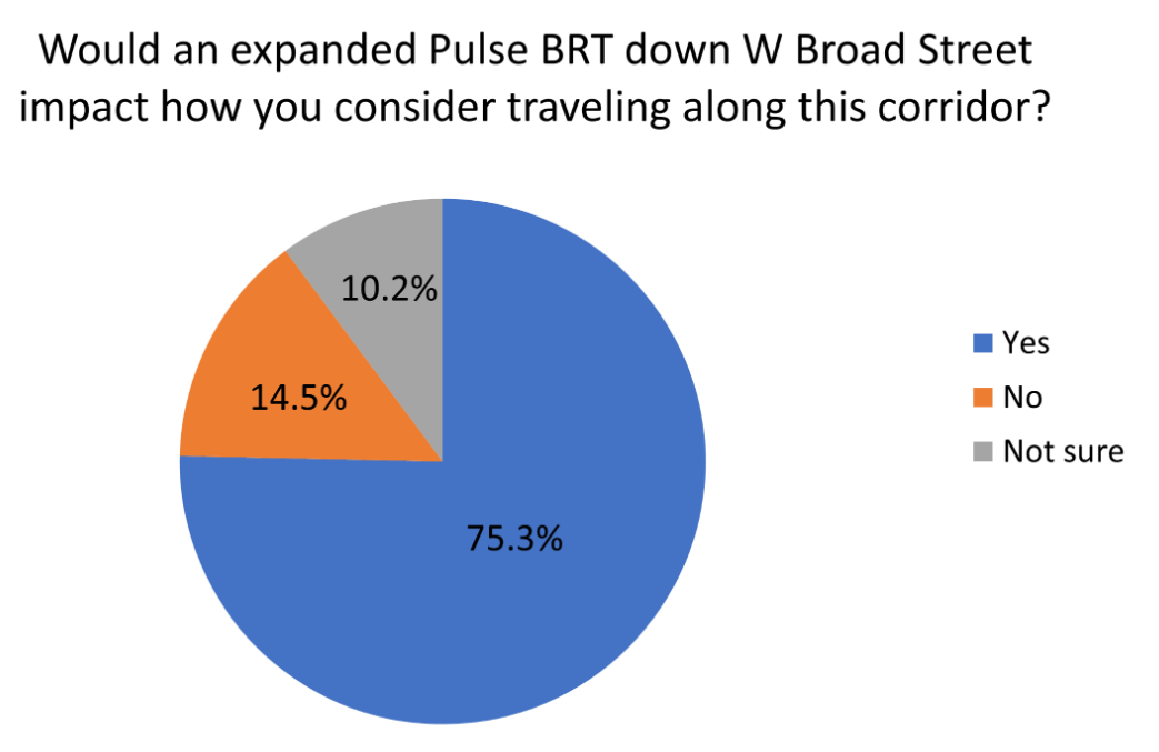
    Survey respondents were asked whether this proposed expansion would impact their travel choices:

    PlanRVA Question

    By asking this question, the project team could clearly determine overall public opinion on the project and in the end, the majority (over 75%) said “Yes”!

    PlanRVA SRV Piechart

    Screen 4: Map Marker

    As with almost every transportation or transit related MetroQuest survey, they asked participants to drop markers on a map.

    PlanRVA BRT Map Marker

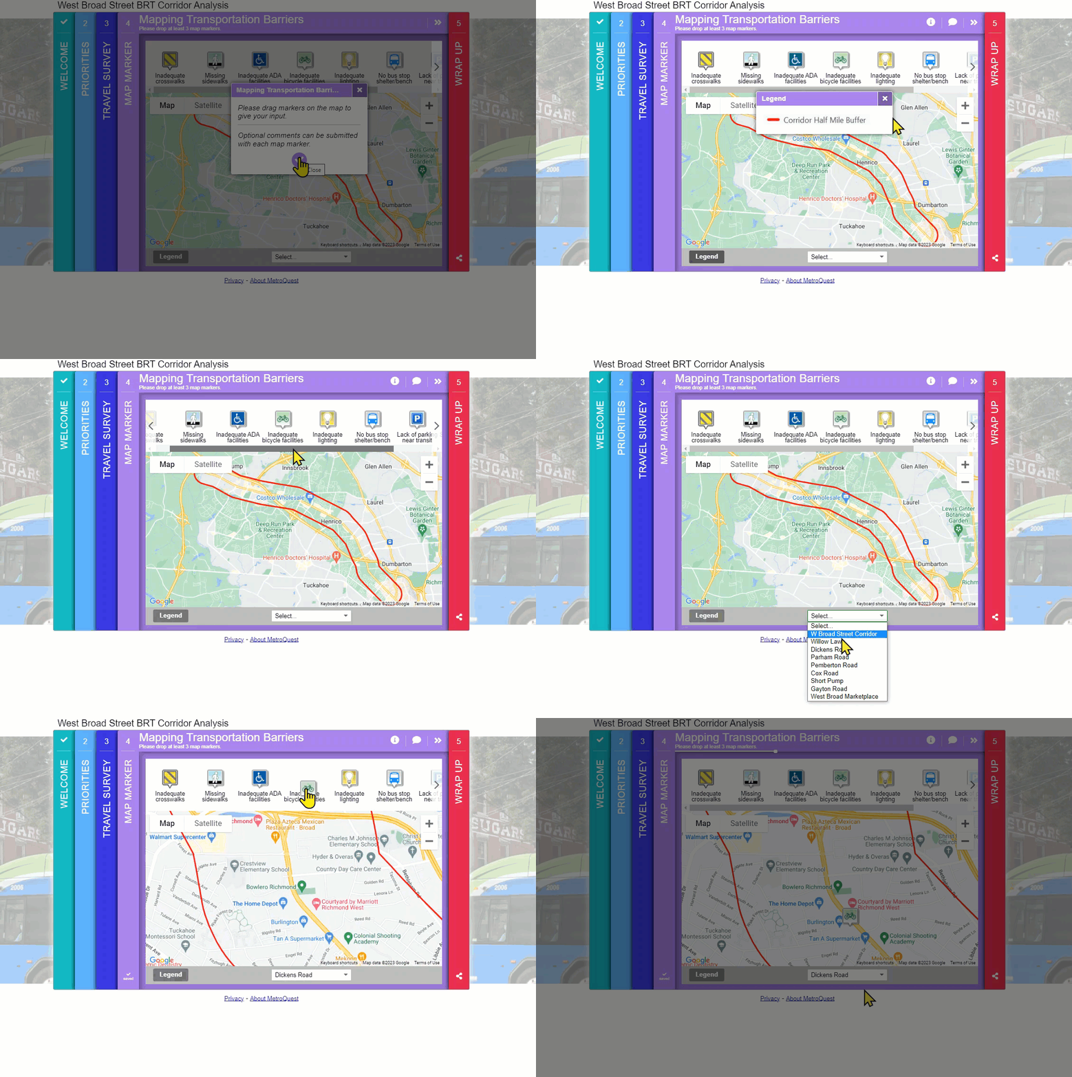
    Several components of this Map Marker Screen were set up perfectly, including:

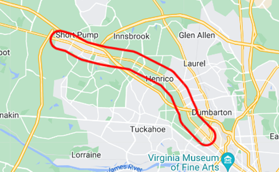
    A clear project boundary and location using a KMZ/KML layer:

    PlanRVA Map

    Specific markers prompting your participant to provide input:

    PlanRVA icons

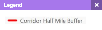
    A simple yet important legend:

    PlanRVA Legend

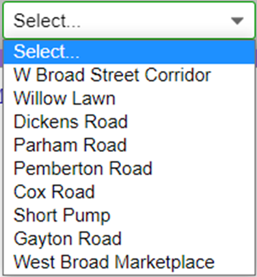
    A dropdown list, automatically zooming the map into specific areas:

    PlanRVA Dropdown List

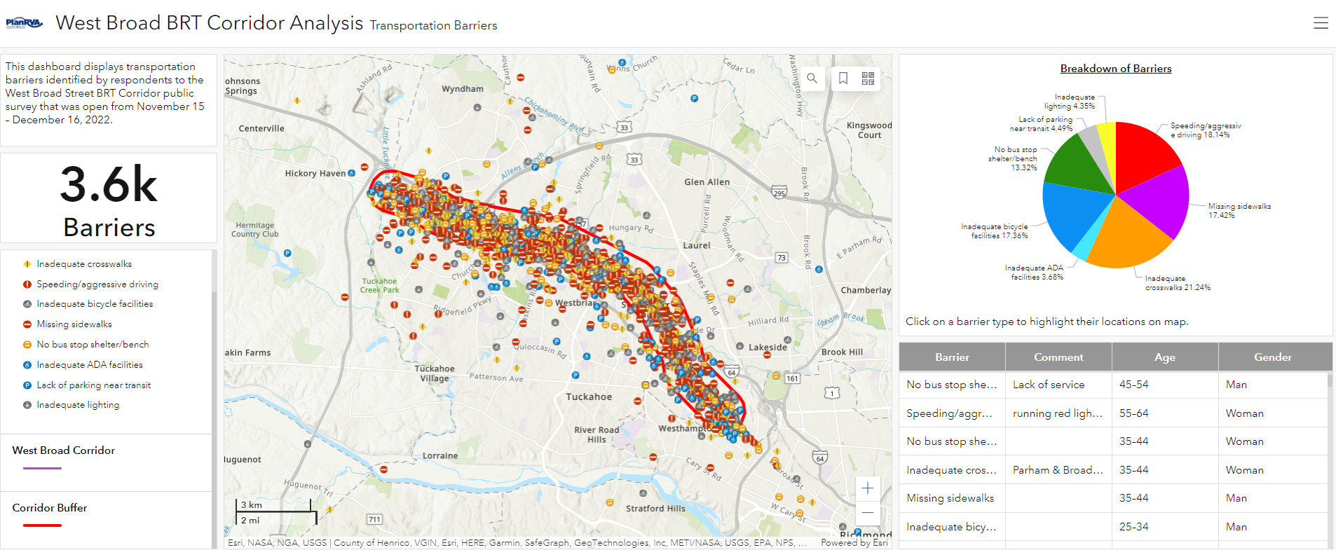
    All of this culminated in over 3,600 data points for transportation barriers encountered. MetroQuest offers a map showcasing results but, in this case, the team uploaded the raw data into their own GIS software.

    PlanRVA Barrier Dashboard
    Interactive barrier dashboard showing markers participants dropped, a pie chart automatically adjusts as you zoom in and out on different areas of the map and you can click on a barrier type to zoom into the map. It also shows the age and gender of those who dropped the marker.

    Make sure to check out the interactive dashboard map!

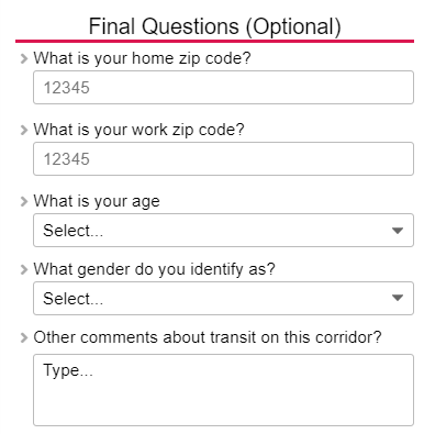
    Screen 5: Wrap Up

    PlanRVA Final Questions

    The final Wrap Up Screen remained simple, with five total questions:

    1. Home ZIP code
    2. Work ZIP code
    3. Age
    4. Gender identity
    5. Additional comments

    From this, the team could understand who they heard from and whether they reached residents or stakeholders proportionally around the project boundary, as detailed in the following graphics.

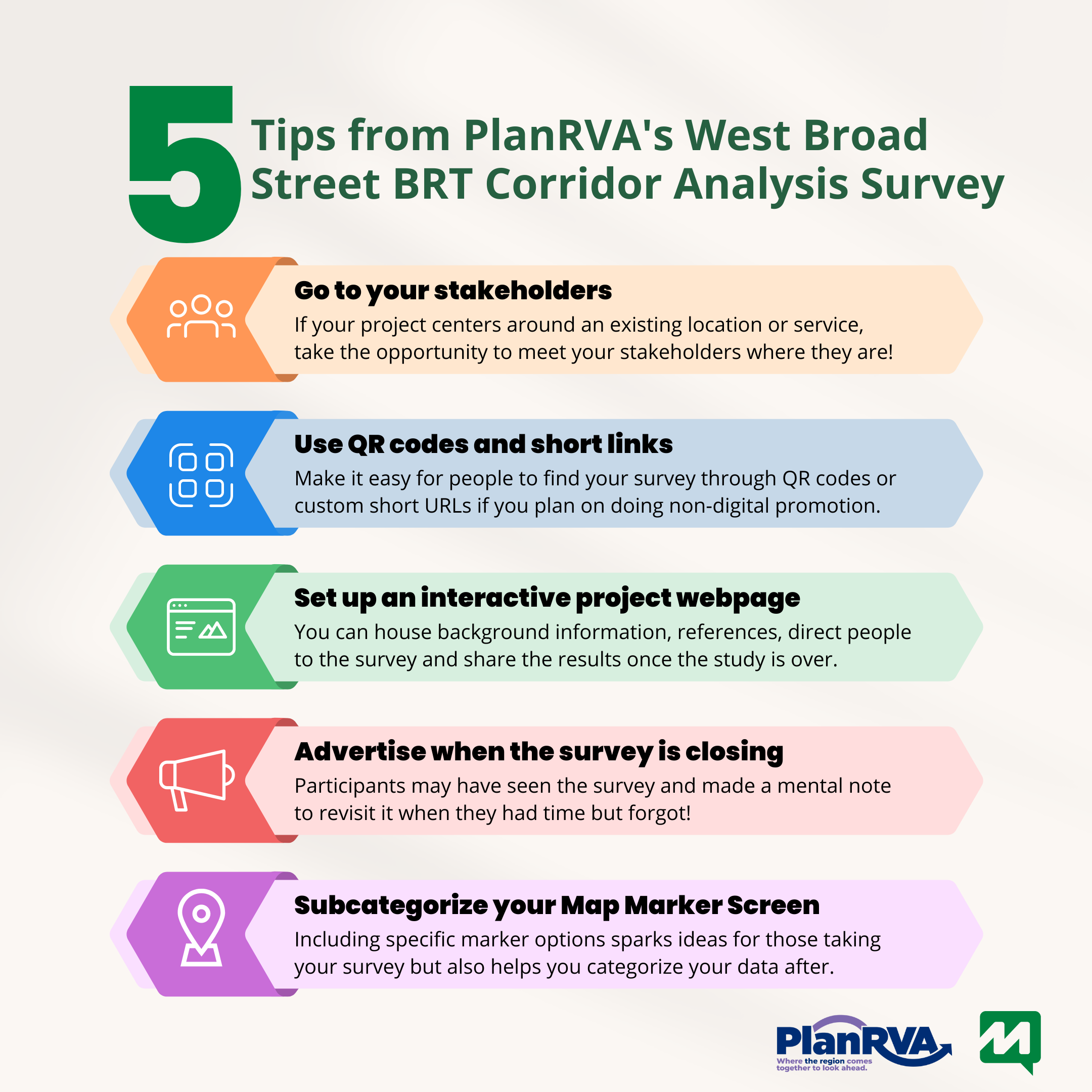
    5 Tips from the West Broad Street BRT Corridor Analysis Survey:

    The 5 Tips

    We could focus on many takeaways, but here are our top five!

    1. GO to your stakeholders: If your project centers around an existing location or service, take the opportunity to meet your stakeholders where they are! In this case, advertising on and around the transit stations was a great way to intercept commuters. Keep in mind not everyone wants to be bothered when they are busy. Wear identifiable organization-branded clothing if you are handing out flyers or information in person. Treats and freebies always help; if you have a booth, consider giving away some swag or complementary beverages to entice commuters to briefly stop and check out the details. 
    2. PlanRVA QR codeUse QR codes and short links for quick survey access: In line with going to your stakeholders, some of this direct engagement may require non-digital promotion such as posters, flyers or billboards. Make it easy for people to find your survey through QR codes or custom short URLs.
    3. Set up an interactive project webpage and use it to re-engage post-survey: Every project can benefit from its own project website or a dedicated section on your organization’s website. A project webpage can house background information, reference documents, direct people to the survey and provide a place to share the results once the study is over. Additionally, project webpages usually include somewhere to sign-up to receive email updates. Once you have some results to share, re-engage survey participants and share what you heard: consider creating some content and visuals with the results that are simple and interactive. 
    4. Advertise when the survey is closing: This is a major yet often overlooked step. By advertising when the survey will close, you communicate a timeline, and participants will be more likely to take the survey with a deadline. It’s imperative to communicate this date in the days before the survey is set to close. Often, participants may have initially seen the survey and made a mental note to revisit it when they had time but forgot. Plus, deadlines help with any procrastination! Survey Close Date
    5. Subcategorize your Map Marker Screen: There are endless icons and options to customize the markers on your Map Marker Screen. The less brainstorming required for participants, the better. Including specific marker options, such as those PlanRVA used for this survey, not only sparks ideas for those taking your survey but also helps you categorize your data after.

    We are very appreciative of the team at PlanRVA for the opportunity to showcase this survey. It is clear they put significant time and effort into designing this survey, their project website and reporting on the results. 

    Once again, make sure to check out the project website and demo survey to see for yourself how interactive and engaging they are!

    For more great tips on how to make the most out of MetroQuest, reach out for more information or, if you are an existing subscriber, contact our  Manager of Client Services Team, Woo-Ree Cho.

    Download Our New VPI Checklist!

    VPI Checklist Banner

  • [SURVEY OF THE MONTH] Almost 6,000 Responses on Sacramento-Reno Rail Extension Study

    [SURVEY OF THE MONTH] Almost 6,000 Responses on Sacramento-Reno Rail Extension Study

    The Survey of the Month series is a monthly blog where we highlight the extraordinary work our customers are doing! We feature well-designed surveys and share takeaways that are relevant for anyone interested in making the most out of online engagement using MetroQuest’s survey platform. To see more in the series, visit the blogs here.

    What’s the story? Collaborating to Engage Potential Rail Passengers 

    This month we are heading into the mountains! MetroQuest subscriber Placer County Transportation Planning Agency (PCTPA) recently launched their Sacramento-Reno Rail Extension Study survey. The study, funded in partnership with several other local organizations pictured below and assisted by other agencies, investigated improvements that would be needed to provide additional passenger rail (Capital Corridor) service from Sacramento to the Tahoe and Reno/Sparks area. 

    Placer County
    Project funding partners included Placer County Transportation Planning Agency, Caltrans, Capital Corridor, Sacramento Area Council of Governments (SACOG), Placer County, Regional Transportation Commission of Washoe County Nevada, Nevada County Transportation Commission and the Tahoe Regional Planning Agency. Other regional organizations were also consulted, such as Caltrans, Town of Truckee, and Truckee/North Tahoe Transportation Management Association.

    PCTPA is the regional transportation planning agency for the majority of Placer County (excluding the Tahoe basin), and is made up of seven member jurisdictions. Bordering Nevada and extending into the Sacramento suburbs, Placer County sees visitors from around the world who come to enjoy the beautiful outdoors, including Lake Tahoe. There are endless opportunities for recreational activities such as fishing, skiing/snowboarding and mountain biking. With that comes the need for accessible transportation into the area from hub areas, such as Sacramento and the San Francisco Bay Area.

    Working Together Across the Region

    Since the rail line passes through several counties and jurisdictions, PCTPA worked with partner agencies to ensure the survey sought feedback that would be helpful for everyone involved. They distributed a demo link of the survey to the over eight stakeholder organizations involved ahead of its launch. Given each organization’s unique interests, teams provided suggestions for new or revised survey questions, resulting in a comprehensive and well-thought-out survey. Questions focused on how participants would see themselves using the service, rather than more general behavioral questions. 

    Additionally, the organizations collaborated to promote the survey within their networks, particularly on Facebook and through email blasts. It is worth noting that they did not pay for any social media ads; the promotion of this survey was entirely organic. By utilizing the networks of several other organizations, they were able to reach a broad audience. Given the amount of online discussion, local media also picked up the project.  

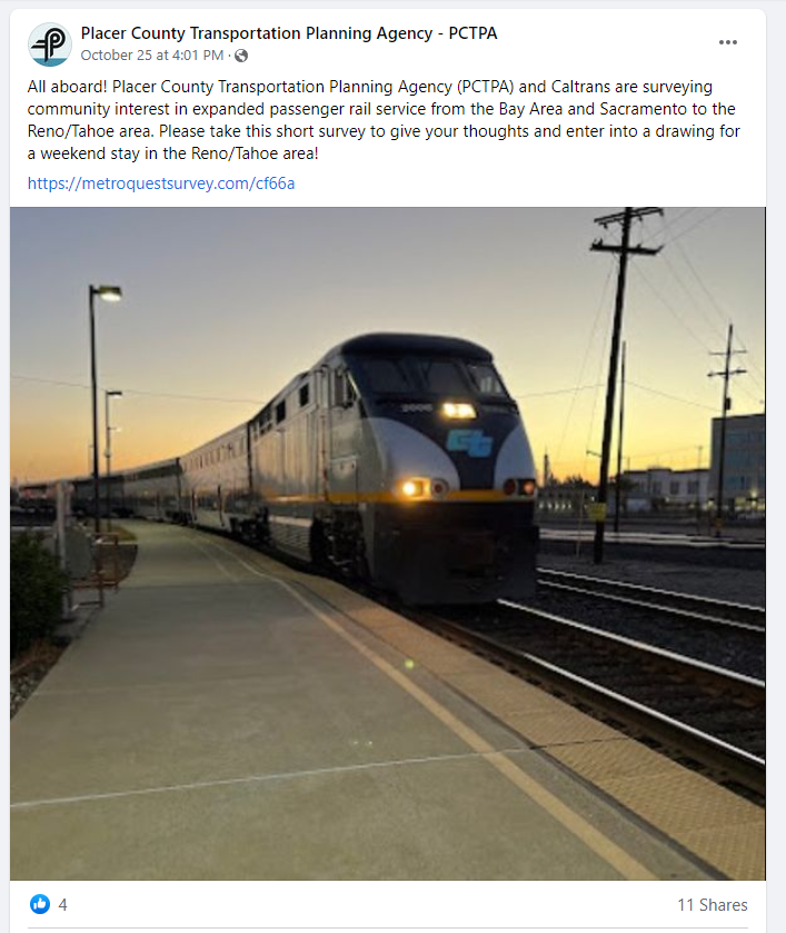
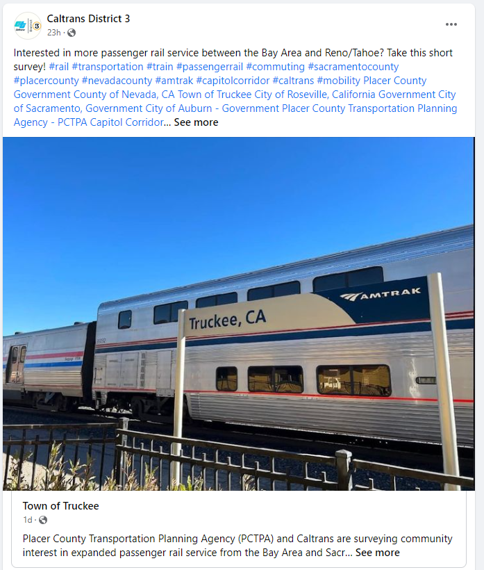
    Below are some examples of the Facebook posts shared. The action-oriented posts emphasized that the survey was short and mentioned the prize draw—likely enticing many to click the link: 

    Placer Country Transportation Planning Agency - PCTPA Facebook post.

    Caltrans District 3
    Posts from PCTPA and Caltrans District 3 to promote the survey. Similar posts were shared by other local organizations, such as the Regional Transportation Commission of Washoe County, Solano Transportation Authority, Truckee Tahoe Area Regional Transit, Truckee North Tahoe Transportation Management Association, and the Town of Truckee.

    In most cases, transportation surveys cross boundaries and impact several areas. As PCTPA did, we recommend leaving plenty of time in your review cycles to consult other organizations. In this case, they had an existing working group that they could collaborate with. Additionally, it can be helpful to prepare a package of promotional materials and communicate with other agencies about your promotional plan; that way, they can broaden the reach by sharing the project with their audiences.  

    What Led to Over 5,800 Responses?

    In speaking with the project lead, they attributed the survey’s large response to these key factors: 

    1. The survey impacted and was therefore promoted to a large catchment area of approximately 10-12 million residents, including the Sacramento area, the Bay Area, and the Reno/Tahoe area
    2. Over six partner agencies assisted with spreading the word about the survey. Additionally, social media posts were picked up by local community groups and grew organically. 
    3. A significant incentive was offered to survey respondents, with a prize draw to win a weekend trip to the Reno/Tahoe area (a world-renowned recreational destination). 

    Next time you are planning a survey where you want to hear from a large audience, consider the following: 

    • Who is impacted? Are my promotions reaching all those areas? 
    • Do I have the budget to offer an incentive?
    • Are there local organizations or community groups that could help spread the word?

    Check out our recently released Virtual Public Involvement checklist for more questions to consider when planning your next survey. 

    Anatomy of a Rail Expansion Survey: Captivating Visuals and Situational Questions

    In addition to the fact that the Sacramento-Reno Rail Extension Study Survey garnered responses from nearly 6,000 people, it also gathered key data to inform rail expansion in Placer County. In total, the survey collected over 133,600 individual data points! 

    Open the demo survey in a second window as we walk through its content! 

    Screen 1: Welcome 

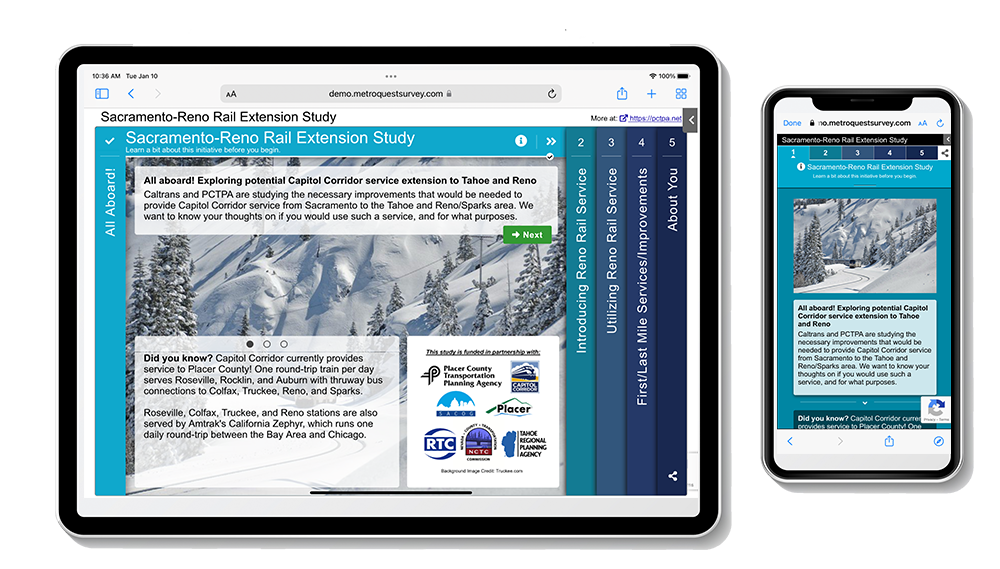
    We often express how important it is to welcome participants with an enticing image. This survey does just that with a captivating photo of a snowy mountain rail pass and cool blue tones.  

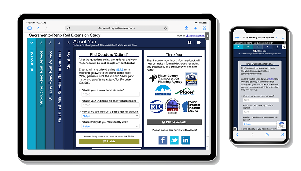
    The Welcome Screen is extremely informative, explaining the key parties involved in the study, the purpose of the survey and how input will inform the project. 

    Sactamento-Reno Rail Extension Study slide 1.

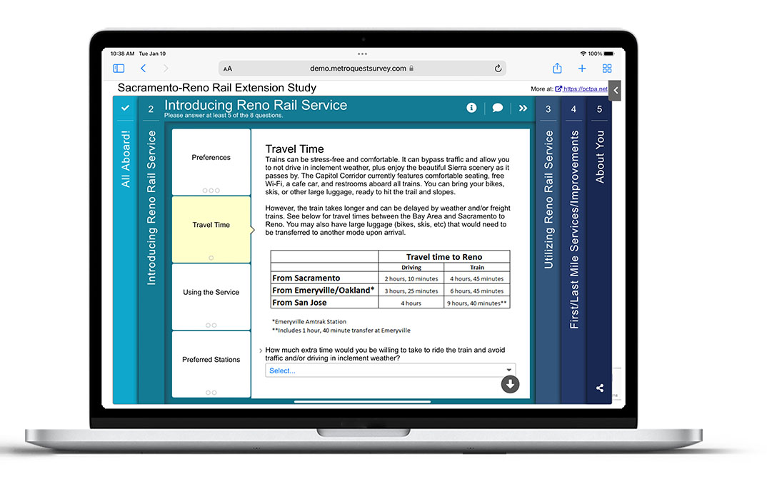
    Screen 2: Standard Survey 

    Next, the survey starts with introductory questions about preferred travel methods, interest in rail travel and commuting scenarios. The questions are thoughtful and specific; participants can tell that their opinions could influence the project outcome. Additionally, these questions are quick to respond to due to the dropdown or multiple-choice formats. 

    Sacramento-Reno Rail Extension Study slide 2.

    As the Standard Survey Screen is not the most inviting option to start with, we only recommend using it when necessary. However, it is a very suitable format here. Given the nature of the study, the project team needed to gather specific details from participants on an array of topics.  

    Tip: If you have explored all twelve MetroQuest Screen options and determined the Standard Survey Screen is the best fit, we recommend placing it fourth in your survey. This allows you to greet participants with a more engaging and visual Screen upfront before diving into more text-based questions. 

    Screen 3: Visual Preference 

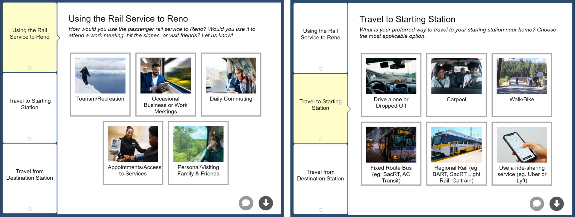
    To balance out the somewhat text-heavy survey screen, the third screen uses our Visual Preference format to ask straightforward questions about using the rail service, traveling to the starting station, and traveling from the destination station. Images are relevant and engaging, aiding in a quick option selection.  

    Sacramento-Reno Rail Extension Study slide 3.

    Screen 4: Image Rating 

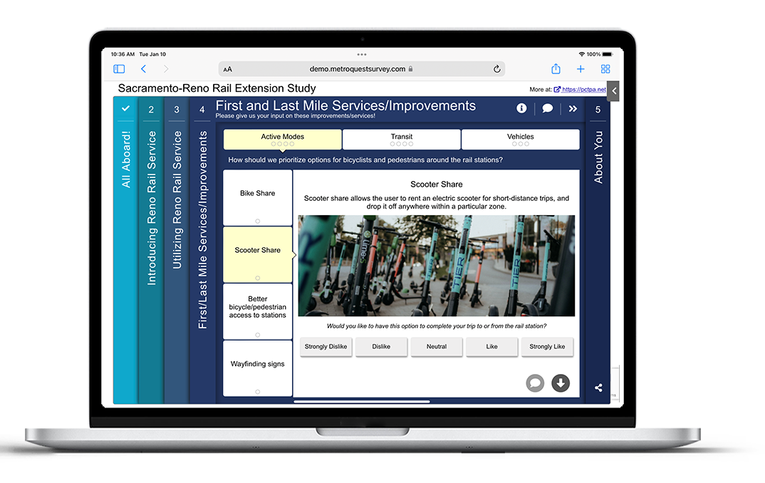
    The survey continues its visual format on the Image Rating Screen. With this screen, they could ask 11 questions, using visual cues to keep the survey fun and engaging. The quality images well-represent the topic areas without imposing biased decision-making.   

    MetroQuest’s tab system allowed them to group the visual questions into three categories: Active Modes, Transit and Vehicles. 

    Sacramento-Reno Rail Extension Study slide 4.

    While you could ask many of these questions without a visual, images make for a significantly more interesting survey experience. With the rise of social media apps, especially Instagram and TikTok, we have become accustomed to seeing content accompanied by visuals. For many, that means we are instinctively drawn to more visual content—in short—visual surveys are significantly more effective. 

    Screen 5: Wrap Up 

    Sacramento-Reno Rail Extension Study slide 5.

    As mentioned earlier, this survey offered a prize draw for a weekend getaway to the Reno/Tahoe area, an amazing spot to visit. Instead of asking survey participants to enter the draw within the survey, they required them to visit another link to enter. This information was on the last screen, so participants likely only found the link after they completed the survey questions.  

    Survey contests can be tricky; of course, you don’t want to adversely impact the survey results or have participants only take the survey to win the prize. Yet, it takes significant public interest and promotional money to gather thousands of responses to a transportation survey. Offering an incentive can result in many more people finding it worthwhile to provide feedback. We recommend only offering prizes that can be collected in-person and used locally to avoid bots overriding your data (unfortunately, that is something to watch out for). 

    The final demographic questions allowed the team to gather key information about who they heard from. Since many Californians have second vacation homes in the Reno/Tahoe area, they asked for 2nd home ZIP codes, where applicable. With MetroQuest’s ZIP code heat maps, they could see the distribution of respondent’s residences immediately. 


    5 Tips from the Sacramento-Reno Rail Extension Study Survey:  

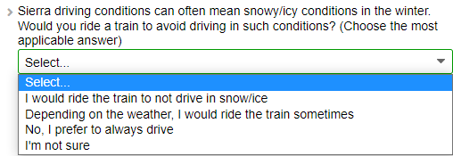
    1. Ask specific, actionable questions: Often surveys ask very theoretical questions, or they might ask for agreement on a set of goals or principles that are positive. Your participant’s time is valuable; make it worthwhile by asking questions that will elicit the data you need. In this case, the survey asked specific questions about travel habits and preferences relevant for this type of project. In turn, they gathered actionable feedback. For instance, the below question refers to a scenario many respondents are likely familiar with. The response options are clear but concise:Actionable questions for Virtual Public Engagement Survey
    2. Sometimes organic social media is all you need: We often recommend utilizing paid social media ads to promote a survey, but in some unique cases, a survey may be enticing enough to the community that it doesn’t require that extra boost. Since over five organizations across the county were sharing posts on social media and those posts got picked up by community groups, not a single dollar of social media advertising was required to boost the message. If budget is a concern, perhaps start your project with organic posts, and if halfway through you don’t have the results you hoped for, then boost your posts or pay for ads.  
    3. Collaborate with area stakeholders: Teamwork is key. If your project involves other organizations, or perhaps you work for a Department of Transportation supported by regional agencies, ensure you set aside time in your project schedule to solicit input from stakeholders. It can be easy to get tunnel vision when working toward tight timelines, so different perspectives and ideas never hurt. As we mentioned earlier, consider working with local groups to spread the word about the survey across the area. Preparing a media package with messaging and images can make this process seamless for everyone. 
    4. Offer a local prize: Emphasis on LOCAL—in some situations, a prize draw can entice more people to take a survey. To avoid ballot box stuffing, keep the gift local, such as a gift card to a local restaurant. Additionally, gather ZIP codes and emails to ensure you hear from locals. 
    5. Question to gather quantitative answers for Virtual Public Engagement SurveyGather quantitative demographic data: Comment responses take time to analyze and keep in mind you might want to do some cross-tabulation analysis to compare different demographic groups. Always ask about age, gender, income, or other personal information using single-selection questions, such as dropdown or button question types, ensuring you can quickly quantify the data.


    There is so much we could point out in this survey so make sure to check it out more closely yourself. We hope you enjoyed learning about this initiative and that you gathered some ideas for your next survey.

    Congratulations to the PCTPA team and the other project partners for successfully engaging thousands through this survey! We can’t wait to see more amazing MetroQuest surveys from their team. 


    For more great tips on how to make the most out of MetroQuest, reach out for more information or, if you are an existing subscriber, contact our  Manager of Client Services Team, Woo-Ree Cho.   

    Get a free copy of our 101 questions for successful virtual public involvement:


    The Virtual Public Involvement Checklist for Success
    The Virtual Public Involvement Checklist for Success