Category: [SUCCESS]

  • [SURVEY OF THE MONTH] Planning for Safe, Equitable and Efficient Movement Across Greater Portland

    [SURVEY OF THE MONTH] Planning for Safe, Equitable and Efficient Movement Across Greater Portland

    The Survey of the Month series is a monthly blog where we highlight the extraordinary work our customers are doing! We feature well-designed surveys and share takeaways that are relevant for anyone interested in making the most out of online engagement using MetroQuest’s survey platform. To see more in the series, visit the blogs here.


    When it was time to update their Regional Transportation Plan (RTP), Oregon Metro utilized MetroQuest to launch a survey that engaged over 1,300 people. For this month’s feature, we dive into their survey that effectively gathered thousands of data points! Keep scrolling for inspiration on what you should include in your next project webpage and how to design a survey that seeks input on a wide range of topics.


    What’s the story? Engaging 1,300+ on Movement in the Region

    Oregon Metro launched the 2023 RTP survey to gather input to inform the broader goal of improving transportation in greater Portland, an area estimated to grow to over two million residents by 2045. As with most transportation plans, this process will guide future investment for all modes of travel: driving, transit, biking, walking, and the movement of goods and services.


    Updating the plan creates an opportunity for the region to come together to address these key questions:

    • What do we need most from our transportation system–now and in the future?
    • How do we pay for new projects while taking care of our existing roads, bridges, bikeways, sidewalks and transit services?
    • How should we measure progress toward our climate, safety, equity and mobility goals?

    Oregon Metro


    The project team promoted the survey through the project webpage, a public notice, email lists of interested parties, advisory group lists and social media. They also utilized connections with public involvement staff at partner jurisdictions and community-based organizations to spread the word about the survey.

    When launching a survey, it is essential to consider where you will host the survey link. The 2023 Regional Transportation Plan project webpage serves as an excellent starting point for those wishing to provide input. We always recommend including the survey link and project information on a project webpage or website for several reasons:

    • It provides a place to present content about the project before and after the survey closes and can serve as a place to continually update the community.
    • It provides legitimacy to your survey and brand recognition.
    • As surveys alone are not findable on search engines, it increases the chance of people finding your survey via an online search.
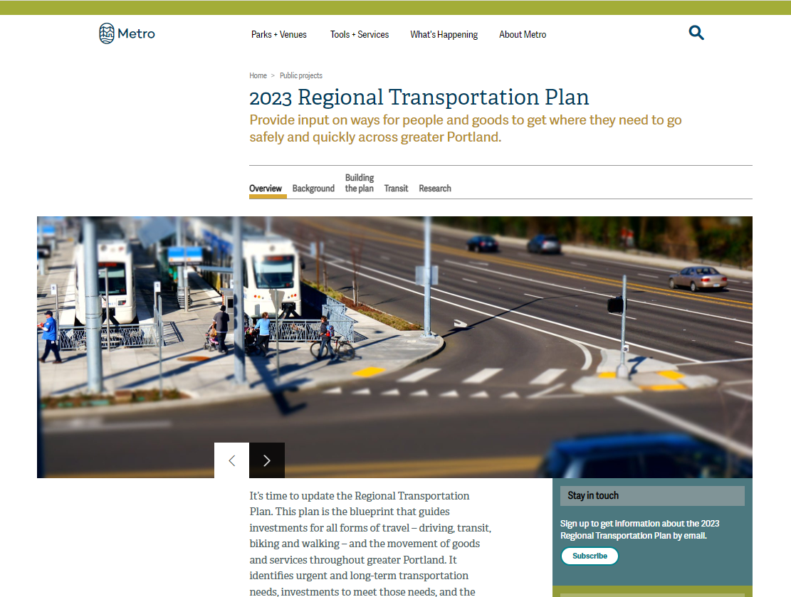
     

    2023 Regional Transportation Plan - Oregon Metro
    2023 Regional Transportation Plan webpage


    Email distribution lists can be extremely effective when engaging the public, especially for multi-phase engagement projects. The inclusion of the “Stay in touch” section pictured above on the right sidebar ensures that those interested in the project are easily reachable for future engagement phases.

    To help provide a full picture of the planning process, consider including a timeline for the project phases and engagement activities, such as the one from Oregon Metro’s webpage below.
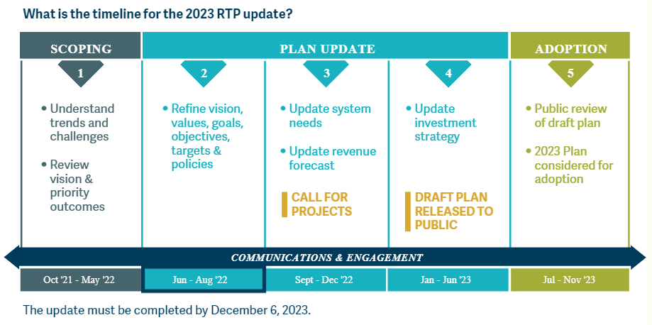
     

    Oregon Metro project timeline showing five phases: Scoping (1), Plan Update (2-4), Adoption (5). The project is currently in the second phase of the plan update: refine vision, values, goals, objectives, targets and policies.
    Project timeline showing five phases: Scoping (1), Plan Update (2-4), Adoption (5). The project is currently in the second phase of the plan update: refine vision, values, goals, objectives, targets and policies.


    Visit the 2023 Regional Transportation Plan webpage to see an excellent example of a well-designed project webpage and for more details on the planning process.


    Anatomy of a Regional Transportation Plan Survey: Shaping Future Regional Transportation

    For their RTP, Oregon Metro was looking to gather quantitative data on transportation challenges, changes pre- and during the pandemic, as well as opinions on the future vision and goals.
     
    Follow along as we go through the Screens utilized and highlight some unique details about this survey:
     

    Screen 1: Welcome

    Participants are welcomed with an aerial shot of the greater Portland area that blends seamlessly with the navy-blue project branding. The description on this Screen immediately identifies the purpose of the survey and how input will be considered, while the sliders at the bottom highlight key facts and details.
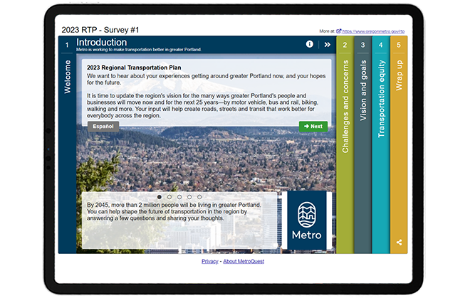
     

    SOTM-OregonMetro-Welcome Screen


    Screen 2: Strategy Rating

    Starting on a practical note, the first Screen is a Strategy Rating Screen which features several tabs divided into three topics:

    1. Transportation challenges (part 1 and part 2)
    2. Travel before COVID-19
    3. Travel during COVID-19

    In situations where there is a lot of information to gather, the Strategy Rating Screen can be used for more than just strategies. This one Screen allows the team to gather 23 individual quantitative data points per participant without making the survey appear too long or challenging.

    We also like how the team clearly defined the rating scale at the top, which is an excellent idea, especially if you are using different rating scales on different tabs of the same Screen.
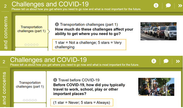
     

    SOTM-Oregon Metro_Screen 2
    Images showing Strategy Rating Screen with the rating scale explained.


    With the Strategy Rating Screen, you have the flexibility to use five stars or thumbs up/down.

    You also have the option to include a comment bubble for each statement so participants can provide their reasoning or ideas.
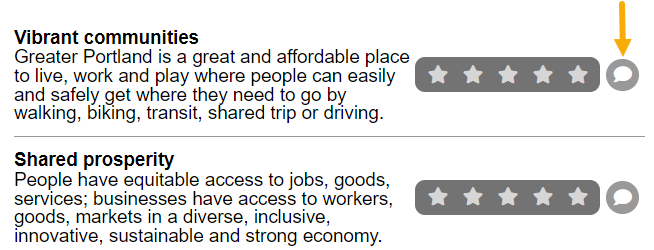
    SOTM-OregonMetro-screen3-Comment Bubble
    Image showing the Strategy Rating Screen with the optional comment box next to the five-star scale.


    Screen 3: Strategy Rating

    Screen three continues with the Strategy Rating format but includes more detailed statements describing the vision for transportation in the region and a series of nine goals. Participants are asked to rate how important each goal is to them, and their perception of how effectively Oregon Metro is achieving each goal.
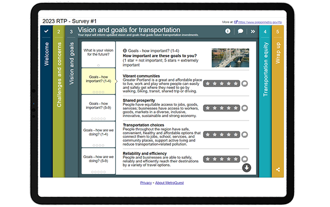
     

    SOTM-OregonMetro-3rd Screen


    Screen 4: Vision Statement

    Diverging from the quantitative format, the fourth Screen uses the Vision Statement format to pose a question about how Oregon Metro should make transportation more equitable. The Vision Statement screen gives participants the opportunity to answer the question in free form, sharing their opinion with the agency. The question is framed with details and data regarding the current situation of inequality and how the pandemic and changing climate are intensifying existing inequalities.
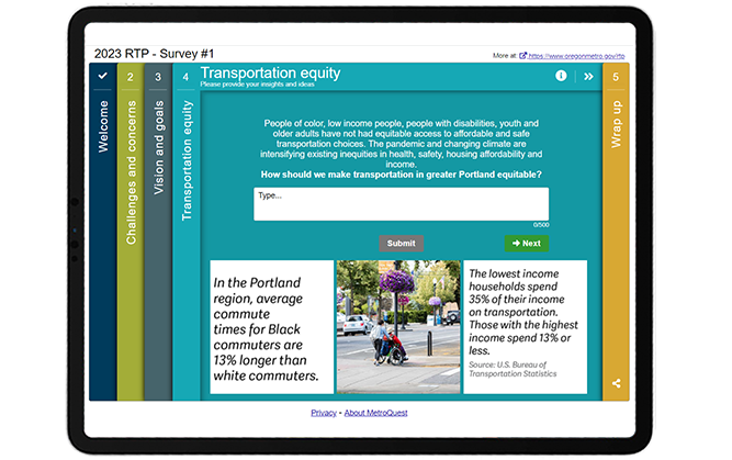
     

    SOTM-OregonMetro-4th Screen


    Screen 5: Wrap Up

    This leads us to the final Wrap Up Screen where the project team gathered specific demographic data to ensure they engaged a diverse audience.

    The Wrap Up Screen of this survey follows many best practices:

    • Participants are greeted with a thoughtful pop-up statement explaining why the information is being collected:

      Thank you for sharing what is important to you. These next few questions are optional but are important as they will help us determine whether we are hearing from a representative group of people reflecting the region’s diverse communities and broad range of experiences.

    • All questions are quantitative and most utilize a dropdown format. Dropdown questions ensure your participants select one option out of a pre-set list, allowing you to quantify the results. (Tip: use census categories when asking about age, income and other demographics so you can compare your data with local census statistics.)
    • Additionally, project next steps are outlined, the project site is linked, and there is an option to sign-up for the project email list.
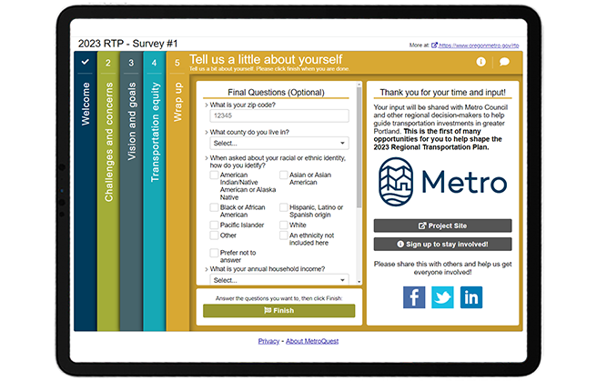
    SOTM-OregonMetro-5th Screen


    As with many MetroQuest surveys, the Wrap Up Screen contains a zip code question. This question takes advantage of one of our latest Data Center features, the zip/postal code heat map! The data can be aggregated based on participant input, and generate a graphic, below, which shows that for this survey, most participants were in the Portland area. With a closer zoom, you can see specific areas to identify who you have engaged and better target areas that are underrepresented.
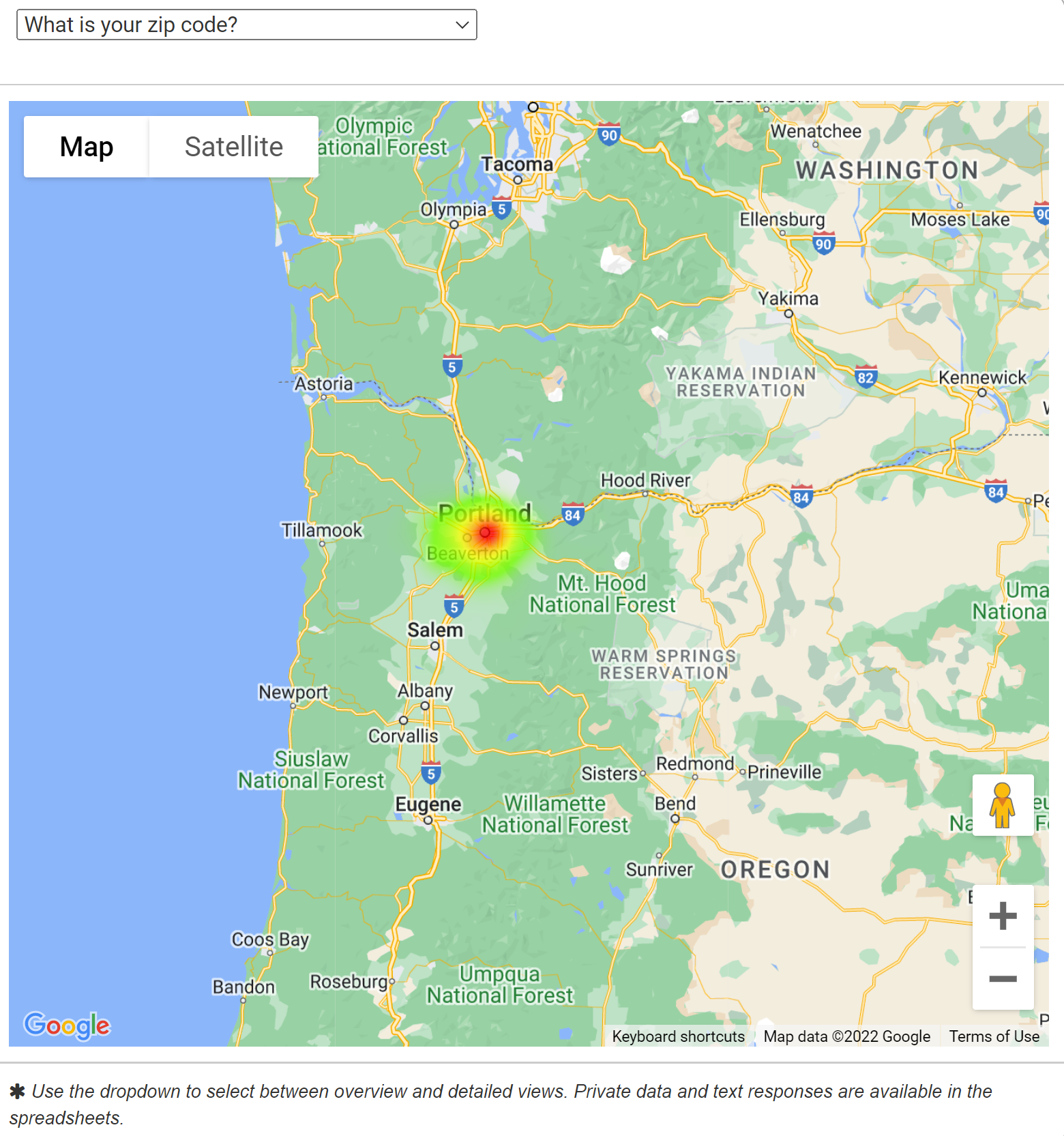
     

    Oregon Heat Map
    Heat Map showing the results from the zip code question.


    Following these Wrap Up Screen best practices will ensure that your survey is backed by quantifiable and informative demographic data. Whether you are trying to reach a diverse audience or a specific group, being thoughtful about demographic data collection goes a long way and is an essential part of an engagement initiative.

    Fill out this demo version of the 2023 Regional Transportation Plan survey to learn more about this initiative and experience the survey format.


    5 Tips from Oregon Metro’s Regional Transportation Plan Survey: Remember to Think About Your Survey’s Online Presence

    1. Develop a website or webpage to house your survey: As outlined in the first section of this post, this survey benefited from an engaging, visual and extremely informative project website. For ongoing projects such as this, it is very important to have a location where the community can learn about the project status and establish a place to post information once input has been considered.
    2. Be transparent about the plan, purpose of the survey and timeline: Creating an engaging and informative project webpage takes time but is always worthwhile. By providing more details on the planning process, timeline, public engagement plan, and how input will be incorporated, the community is more likely to take the time and effort to complete your survey. They will also be more honest and careful with their answers if they feel their opinions matter. Plus, sharing more background information on the website than in the survey allows your survey to remain simple, visual and to the point.
    3. Utilize the Strategy Rating Screen when you need to gather a large amount of information: It is always best to keep your survey quick to complete, with only the questions that are necessary to gather input on your plan. Where that is not possible, we recommend checking out our Strategy Rating Screen as you have the option to separate strategies in up to eight tabs. If your statements can be complemented with images, consider our Image Rating Screen for a more visual approach.
    4. Provide additional instructions for complex rating scales: If you are using the Strategy Rating Scale, it is best to be consistent with your statements so the same rating type works for everything. In unique cases like this survey where questions require different rating scales, include a clear disclaimer upfront to define the rating scale being used.
    5. Consider where you will benefit from qualitative feedback: It takes time to analyze qualitative feedback and can be difficult to summarize it when you receive 1,000+ responses, but there are plenty of benefits in collecting qualitative input. Incorporating a Vision Statement Screen provides an opportunity to gather focused qualitative data on a certain topic without exhausting participants with endless comment questions throughout the survey.


    Congratulations to the team at Oregon Metro for a superb survey! It is always great to see a well-designed survey complimented by an excellent project website and engagement plan.

    For more great tips on how to make the most out of MetroQuest reach out for more information or, if you are an existing subscriber, contact our Director of Client Services, Norma Hogan.


    To learn more about how agencies like Tennessee DOT and Memphis MPO coordinate their public engagement efforts, check out our most recent webinar!
     

    TDOT & Memphis MPO_Webinar

    Exploring TDOT and Memphis MPO’s
    Next Level Public Involvement Strategy


    In this webinar, we will highlight how local and state agencies are working together to engage the broader Tennessee community with a deep dive into the Memphis MPO’s Regional Transportation Plan, Moving Together 2050!


  • [SURVEY OF THE MONTH] MnDOT Seeks Detailed Feedback on Interchange Reconstruction Project

    [SURVEY OF THE MONTH] MnDOT Seeks Detailed Feedback on Interchange Reconstruction Project

    The Survey of the Month series is a monthly blog where we highlight the extraordinary work our customers are doing! We feature well-designed surveys and share takeaways that are relevant for anyone interested in making the most out of online engagement using MetroQuest’s survey platform. To see more in the series, visit the blogs here.


    This month, we are featuring a survey from the Minnesota Department of Transportation (MnDOT), developed in collaboration with SRF Consulting Group. The project team created a highly effective MetroQuest survey that sought feedback on complex interchange improvements through well-designed and easy to understand aerial graphics.

    Read on to see how MnDOT used MetroQuest to gather easily quantifiable data that helped inform interchange reconstruction design options.


    What’s the story? I-90/Highway 52 Interchange Reconstruction

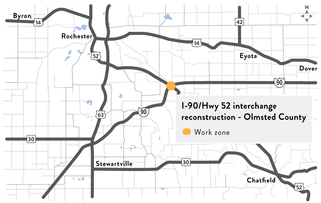
    Map showing the interchange location southeast of Rochester, Minnesota.

    The I-90/Highway 52 Interchange Reconstruction Project Round 1 Engagement was launched in February 2022 to gather feedback on interchange improvements to increase safety and reduce delays. Situated in Olmsted County, Minnesota, the I-90/Highway 52 major intersection is located southeast of Rochester and serves as a major arterial route intersection.

    The primary project goals included:

    • Safety improvements to decrease crashes
    • Traffic flow improvements
    • Increased clearance under the I-90 bridges

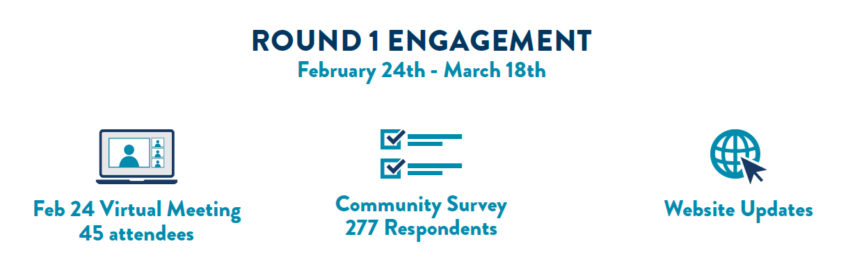
    During this first round of engagement, MnDOT hosted a virtual open house and launched a MetroQuest survey. The survey asked participants to digitally “tour” various intersection improvements, provide feedback on a recommended alternative and rate specific interchange improvements.

    MnDOT-I-90-Engagement Graphic


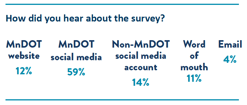
    As with most engagement initiatives, social media proved to be a successful promotional tool with 73 percent of survey participants hearing about the survey through social media.


    MnDOT-I-90-Survey Promotion


    The project team incorporated very clear aerial visuals that turned an otherwise standard, technical survey into a fun and public-friendly exercise. We highlight these visuals and what made them so effective later in this post.

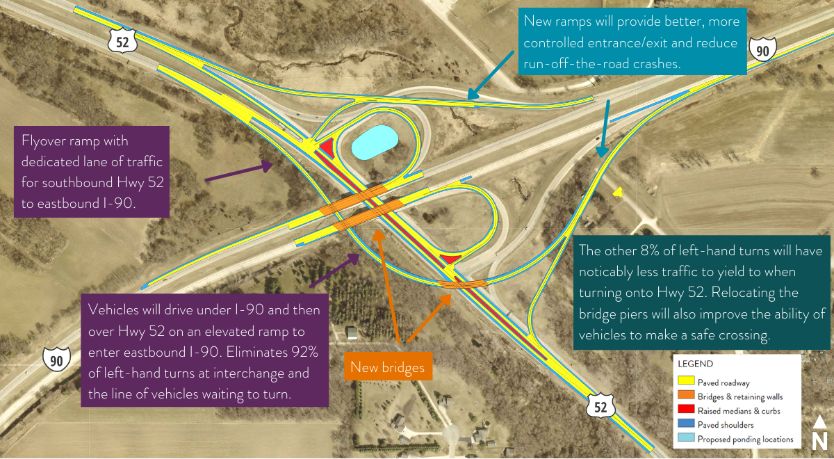
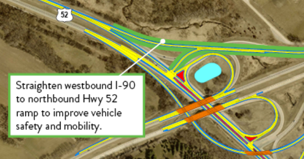
    After reviewing community input and considering technical requirements, the project team had the data necessary to select a preferred alternative that will address several current intersection challenges. This includes constructing an elevated ramp to eliminate 92 percent of left-hand turns as shown in the following aerial shot.


    Proposed changes based on public input and technical requirements.
    Proposed changes based on public input and technical requirements.


    Learn more about the I-90/Highway 52 project and the proposed alternative on the project webpage.


    Anatomy of a Transportation Infrastructure Improvement Survey: Clear Visuals Help Inform and Engage the Community

    We often see surveys ask for feedback on interchange or road improvements, utilizing graphics to present the proposed changes. It’s a great way to convey complex materials and make them easily understandable. What sets this survey apart is how well the graphics are presented.

    Tip: click on the survey images throughout this section to try out a demo of each Screen.


    Screen 1: Welcome

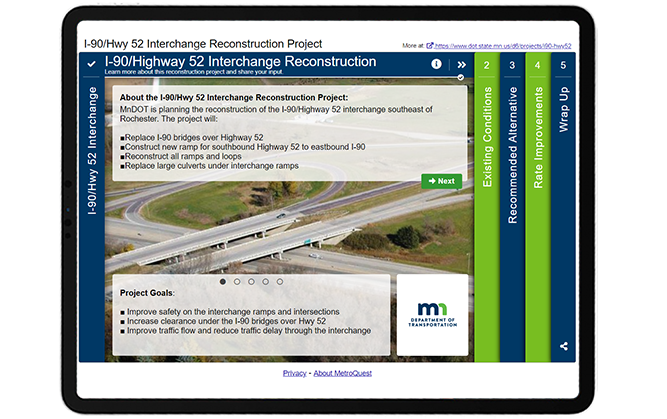
    The survey looks professional from the start, at the Welcome Screen. The project team utilized a color scheme that stands out and matches the MnDOT logo branding. Key details are shared on this Screen, but with the use of bullets and the sliders at the bottom, it does not appear text-heavy or overwhelming.


    MnDOT-I-90-INT


    Screen 2: Priority Ranking

    Screen 2 of this survey made use of our Priority Ranking format. If you read this blog regularly, you may be noticing a theme where surveys start with a Priority Ranking Screen. This simple exercise is an excellent way to gather precise data on your participants’ priorities. In this case, participants are asked, “What issues do you experience” and instructed to rank the following items:

    • Vehicle safety
    • Bike and walk safety
    • I-90 bridge condition
    • Vehicle mobility
    • Safety at EB I-90 ramp (eastbound)
    • Delays at EB I-90 ramp (eastbound)


    Screen 3: Image Rating (Overall Alternative)

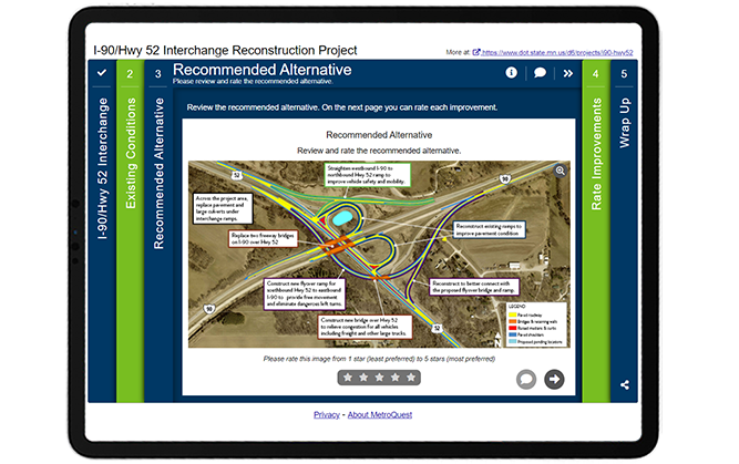
    Starting on the third Screen, the survey presents an aerial graphic with callout boxes explaining the proposed alternatives. Participants are given an opportunity to rate the overall design and are also told that they will be able to rate each improvement individually on the next Screen. This is an excellent way to gather overall feedback on the plan while also collecting specific data on each major proposed change.


    MnDOT-I-90-Survey-Screen 3


    Screen 4: Image Rating (Individual Improvements)

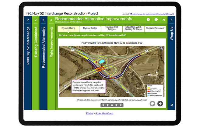
    Like Screen 3, Screen 4 uses our Image Rating Screen as a base to ask for feedback on a number of improvements. Each tab includes a large aerial graphic with a callout box identifying the specific improvement and what it will do for mobility or safety. Callout boxes are an excellent way to make an otherwise technical visual easy to digest!


    MnDOT-I-90-SurveyScreen4


    Screen 5: Wrap Up

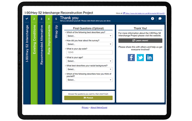
    On the final Wrap Up Screen, the project team kept things simple with six demographic questions, with five utilizing a dropdown format. We highly recommend using a similar format for your next survey as the dropdown questions allow for one response per question, ensuring that you can easily quantify and cross-tabulate responses with other data. Additionally, keeping the questions minimal lessens the risk of participants dropping out of the survey early.


    MnDOT-I-90_Survey_WrapUp-Screen


    When asking demographic questions, explaining the purpose behind collecting the information can help build trust and understanding with your audience. For instance, MnDOT included the following introduction on the pop-up box for the last Screen:


    Thank you for your input so far! Our goal is to get input from a wide range of individuals. In order to understand who is participating in this survey, we are collecting demographic information to identify who we’re hearing from. Providing data is optional, however, by answering you will be helping MnDOT understand the needs and preferences of the diverse communities that MnDOT serves. Your responses will be compiled in aggregate and will not be associated with you, personally.


    This statement clearly explains why the information is being collected and that it will be compiled in aggregate. In this case, almost all participants completed the survey to the end, showing how effective this Screen design was.

    To see for yourself, check out the demo version of the survey.


    5 Tips from the I-90/Hwy 52 Interchange Reconstruction Project Survey: Effective Graphics Guarantee Quality Feedback

    1. Make your graphics easy to understand with callout boxes: We often see surveys that feature technical graphics and maps without explanation. MnDOT-I-90-Graphic-Callout-boxWhile you may know what is being presented, it is important to remember that many of those taking your survey will not be familiar with technical drawings nor do they want to spend the time studying possible changes. Make it easy for your participants to understand the design by highlighting key improvements in callout boxes and explaining the key project benefits. Also, ensure that your aerial graphic or map has visible street labels, a clear legend, and is zoomed in enough to show the key area. This survey is an excellent example of well-designed project graphics!
    2. Use visuals to seek input on infrastructure improvements: Further to the above point, we recommend to ALWAYS use visuals when you are seeking input on specific project improvements. It can be challenging for the public to visualize what the area will look like without a graphic representation. Our Image Rating Screen is an excellent choice for gathering feedback on project visuals, renderings or representative imagery. To make your project even easier to visualize, consider developing an animated 3D flythrough/walkthrough that guides participants through the improvements, contracting a rendering artist to produce realistic renderings, or working with a graphic designer to produce fun and engaging graphics. There are many options to choose from, but great visuals present many opportunities and make great promotional tools.
    3. Match your survey branding to your corporate or project branding: This may sound straightforward, but you can boost the professionalMnDOT-I-90-Survey-branding look of your survey by using a color scheme that matches your logo and overall project branding. In this case, MnDOT utilized bright green and deep blue to match its logo and website branding. Everything looks cohesive, and participants don’t have to question whether they are providing feedback to a legitimate source.
    4. Keep the Wrap Up Screen brief and quantitative: Your survey’s primary purpose is to gather project feedback. In most cases, you will want to collect some demographic information to ensure you are reaching a diverse and representative audience. Try and stick to approximately five questions on the Wrap Up Screen and use our dropdown format to ensure you are gathering quantitative data that can be easily cross-tabulated if needed. Take advantage of our survey templates which include pre-set demographic questions for faster survey building!
    5. Explain why you require personal information: No one wants to provide personal details if they don’t have to. This is why it is a great idea to explain why you are gathering demographic information. As mentioned earlier in this post, MnDOT clearly described why they were gathering personal data and how it would be analyzed and remain private. Including a disclaimer ahead of any personal demographic questions substantially increases the chances that participants will complete them.

    Hats off to the MnDOT and SRF Consulting team members who designed this excellent survey! We enjoy seeing examples like this where quality visuals lend themselves to gathering valuable feedback that will inform transportation improvements.

    For more great tips on how to make the most out of MetroQuest reach out for more information or, if you are an existing subscriber, contact our Director of Client Services, Norma Hogan.


    Check out our recent webinar to learn ways to optimize your virtual community engagement through effective outreach strategies and great survey design!

    Optimizing Virtual Community Engagement to Build Public Support webinar

    Optimizing Virtual Community Engagement to Build Public Support

    A well-designed survey and an effective outreach campaign are two elements critical to public engagement success. Watch this webinar for case study examples from successful projects!

  • [SURVEY OF THE MONTH] Over 90,000 Data Points Inform Mobility Improvements for the US 27 Corridor

    [SURVEY OF THE MONTH] Over 90,000 Data Points Inform Mobility Improvements for the US 27 Corridor

    The Survey of the Month series is a monthly blog where we highlight the extraordinary work our customers are doing! We feature well-designed surveys and share takeaways that are relevant for anyone interested in making the most out of online engagement using MetroQuest’s survey platform. To see more in the series visit the blogs here.


    This month we highlight a survey developed by long-time MetroQuest subscriber Kimley-Horn in collaboration with RS&H, on behalf of the Florida Department of Transportation (FDOT).

    We are eager to share this success story of a survey that played a big part in helping a study team understand transportation issues along a corridor and prioritize areas for mobility improvements. At MetroQuest, we love hearing of projects where survey feedback is considered alongside technical data to define project priorities and identify infrastructure improvements. It’s proof that gathering actionable data and informed input is possible! When millions of dollars are being invested in transportation improvements, understanding issues impacting commuters and the needs of community members and stakeholders is critical.


    What’s the Story? Representative Feedback and Thousands of Data Points

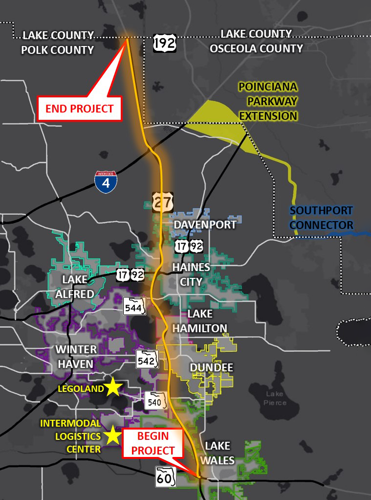
    Map showing the project area along US 27. The project begins at SR 60 near Lake Wales and ends at US 192 at the Polk/Lake county line.
    Map showing the project area along US 27. The project begins at SR 60 near Lake Wales and ends at US 192 at the Polk/Lake county line.

    From late May to early September 2019, the On Time with 27 Survey was launched to gather input to inform the Northeast (NE) Polk US 27 Mobility Study. The study sought to define a multimodal program of projects and strategies to improve mobility, safety and livability within the US 27 corridor and adjacent areas.

    The project area, outlined in this map, included the US 27 regional north-south corridor extending 32 miles within the Polk County area in southwest Florida. Every day, approximately 60,000 vehicles use this portion of the US 27. Given the large area and varied use of this corridor, it was essential that a diverse group of community members and stakeholders were consulted to identify issues and brainstorm potential improvements.

    Achieving high impressions and low cost per participant

    As we often see with surveys that garner many responses, the project team implemented a geographically targeted social media campaign to capture anyone passing through the corridor area. This approach was fundamental for reaching a diverse range of commuters and residents as many people who use the corridor do not live nearby. They supplemented social media content and advertisements with email list outreach, city website posts, and more traditional tools, such as rack cards distributed at popular locations, utility bill inserts, a banner at Florida hospital and distribution at city hall.

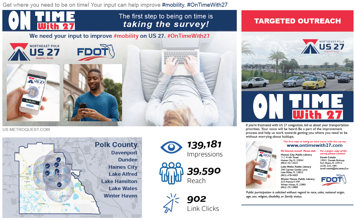
    Social media advertisements focused on promoting the survey with clear instructions and messaging to resonate with commuters. For example, the social media campaign below was shared by the project team, and garnered over 139k impressions.


    Image showing examples of social media messaging used for promoting the survey. With social media, the project team reached 39,590 people, with 139,181 impressions, resulting in 902 clicks.


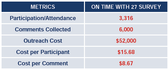
    The project team analyzed their  outreach cost for promoting the online survey and compared it to the typical cost of hosting a public meeting. With the online survey, the cost per participant was just $15.68; significantly more cost-effective and accessible than a typical public meeting where the average cost per participant can be upwards of $1,000 – $2,000. Additionally, online surveys typically yield significantly more data compared to input gathered at public meetings.

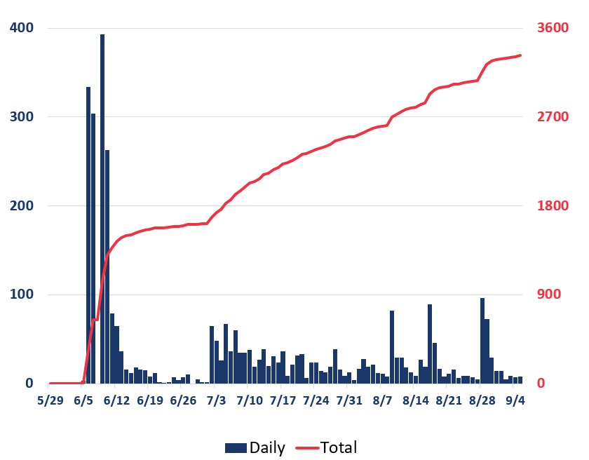
    The below graphic shows the progression of survey responses during the time the survey was open for input. As with most surveys, the majority of responses were received within the first few weeks of the survey being live. The additional peaks correlate to times when the project team launched advertisements, demonstrating how important it is to develop a varied campaign with multiple strategic outreach points throughout the engagement period.


    Bar and line graph showing survey participation levels during the engagement period. Participation was highest during the weeks of June 5 and 12. Later on, participation increased on days with more outreach but remained relatively steady.
    Bar and line graph showing survey participation levels during the engagement period. Participation was highest during the weeks of June 5 and 12. Later on, participation increased on days with more outreach but remained relatively steady.


    Gaining key insight into transportation issues with survey results

    Following an extremely successful engagement period, the study team analyzed the survey results and was able to gain key insights into transportation issues in NE Polk County. With feedback from over 3,000 participants resulting in 96,000+ unique data points and more than 6,000 comments, the team had an extensive amount of data to review and incorporate into their study.


    Graphic showing the project logo and icons representing 3,322 participants, 96,000+ data points and 6,000+ comments.
    Graphic showing the project logo and icons representing 3,322 participants, 96,000+ data points and 6,000+ comments.


    The survey results were mapped, analyzed, and compared to technical study results to identify commonalities and differences. The additional data from the survey helped the project team reaffirm areas in need of improvement and identify any other potential issues to address. In the end, the volume of survey participants and data was a critical factor in helping FDOT and the multi-jurisdictional stakeholders embrace the outcomes of the corridor study, decide where improvements are most needed and move forward with planning future improvements to the corridor.

    To learn more about the study, visit the NE Polk US 27 Mobility Study page.


    Anatomy of a Corridor Mobility Survey: A Personalized Approach Gathers Great Feedback

    Now that we have shared the great impact this survey had on the study, we will cover the survey layout and some key features.

    With traffic congestion being a known issue, the survey asked for input on a number of priorities and strategies to improve mobility. This simple yet specific survey format allowed the project team to gather valuable data while keeping the survey quick to complete.

    Additionally, the Priority Ranking Screen was connected with the Strategy Rating Screen, a feature unique to MetroQuest where the information on the following Screen is customized for each participant based on the priorities they select. We will go into more detail about this later.


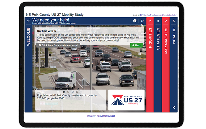
    Screen 1: Welcome

    The Welcome Screen of this survey is concise and simple, following many best practices:

    • A clear call to action headline
    • The top paragraph states the purpose of the survey and how input will be used
    • The study area map is embedded in the info pop-up and clearly shows the location
    • The rotating sliders at the bottom highlight some key facts
    • The logo and overall branding of the survey is cohesive and properly formatted, contributing to a professional look


    Screenshot of the survey Welcome Screen. Key components are described throughout this blog post.


    As we go through the survey, notice how the titles at the top of each Screen help tell a story:

    1. We need your help!
    2. What’s most important to you?
    3. How do we get there?
    4. Let’s pinpoint the problems!
    5. Tell us about yourself!

    The survey stays engaging and relatable by addressing the participant directly while clearly outlining each portion of the survey. We highly recommend considering using phrases like this when writing your survey titles to help make the survey language more inviting.


    Screen 2: Priority Ranking

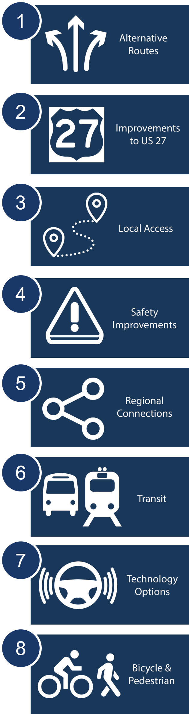
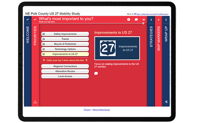
    Following the Graphic showing the eight key items to prioritize: alternative routes, improvements to US 27, Local Access, Safety Improvements, Regional Connections, Transit, Technology Options, Bicycle & Pedestrian.Welcome Screen, the survey asks participants to rank which priorities are most important to them through our popular Priority Ranking Screen. This simple exercise is a great starting point to introduce key options and understand what matters most to your participants.

    This survey took advantage of the Connected Screens feature unique to the Priority Ranking Screen which allows you to connect your survey’s Priority Ranking Screen to one of five other Screen types. Once this is set up, the Screen that follows the Priority Ranking will be customized for each participant, asking for input on the items they ranked as most important to them. This allows you to present a wider variety of questions while keeping the survey relevant and of interest to your participant yet quick to complete. This ensures that participants are not asked to provide input on topics irrelevant or unimportant to them. For example, if a participant has no interest in public transit and doesn’t list it as a priority, they won’t be asked for further input on public transit.


    Screenshot of the Priority Ranking Screen. Key components are described throughout this blog post.


    To demonstrate this feature, consider a scenario where a participant prioritizes the following five options:

    1. Safety Improvements
    2. Transit
    3. Bicycle & Pedestrian
    4. Technology Options
    5. Improvements to US 27

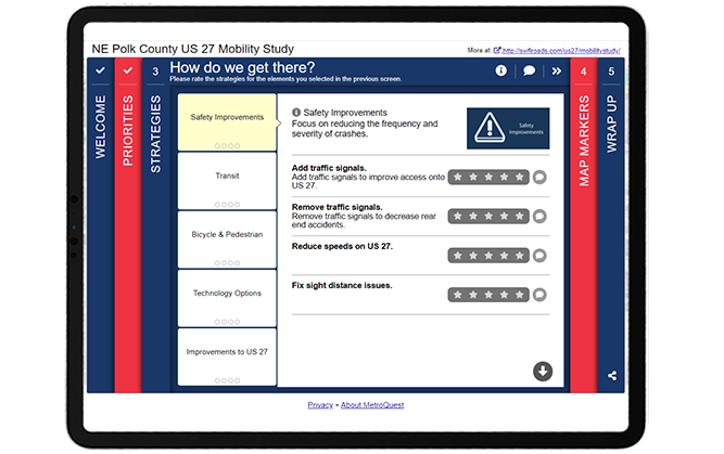
    The Strategy Rating Screen that comes next only presents the strategies linked with the participant’s priorities, as shown below in Screen 3. Read tip number two near the end of this blog post to learn why this feature is so beneficial.


    Screen 3: Strategy Rating


    Screenshot of the Strategy Rating Screen. Key components are described throughout this blog post.


    Note how the category headers on this screen match the priorities selected in Screen 2, Priority Ranking. When connected, this screen will automatically match the priorities that the participant selects!


    Screen 4: Map Marker

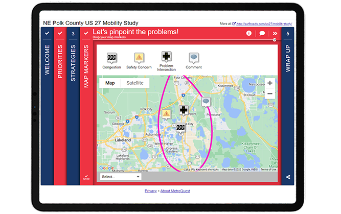
    The fourth Screen utilized the Map Marker Screen and asked participants to “pinpoint the problems” by dropping markers for areas with congestion, safety issues, problem intersections or any other issues.


    Screenshot of the Map Marker Screen. Key components are described throughout this blog post.


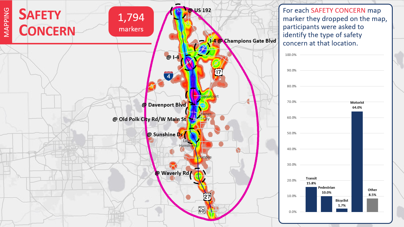
    This data was imported into a Geographic Information System (GIS) to create heat maps based on each marker type (see example below). The different color areas indicate parts of the map where larger numbers of participants indicated a potential safety concern.


    Heat map showing areas where Map Markers were dropped to indicate safety issues. 64 percent of safety concerns raised related to motorists.
    Heat map showing areas where Map Markers were dropped to indicate safety issues. The colors relate to the density of markers dropped in each area. 64 percent of safety concerns raised related to motorists.


    Screen 5: Wrap Up

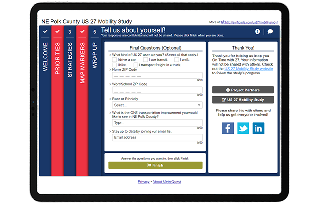
    To close the survey, the Wrap Up Screen included six simple questions, including three demographic questions: home ZIP code, work/school ZIP code and race or ethnicity. By keeping personal questions to a minimum, you are less likely to scare off participants who may have concerns about sharing personal details.


    Screenshot of the Wrap Up Screen. Key components are described throughout this blog post


    Try the US 27 Mobility Study Survey Yourself!

    Check out this demo version of the survey to try out the connected Screens feature and see how simple this survey is to complete! You can toggle the green icon on the top right to view the survey in mobile or desktop view.


    5 Tips from the NE Polk US 27 Mobility Study Survey: Targeted Ads and a Straightforward Survey

    1. Promote with targeted location-based social media ads: Many people rely on this highway corridor, but the project team knew that many of those impacted didn’t live within the immediate vicinity of the project area. They were able to catch the attention of those passing through by using location-based paid social media advertisements on Facebook, Twitter and Instagram. This is a great approach when you are working on a project that crosses many different jurisdictions. We notice that surveys using targeted social media advertising often achieve the best participation results.
    2. Connect your Screens: The Priority Ranking Screen is an excellent Screen choice for the start of your survey and our Connected Screens feature allows you to link this Screen to several other Screens. As the NE Polk County US 27 Mobility Study Survey demonstrates, connecting the Priority Ranking with a subsequent Screen keeps the survey concise and, most importantly, relevant for your participants. Rather than listing out strategies for all eight priorities, this survey only needed to present five concepts based on the participant’s indicated priorities. This gives the survey a tailored feel for every participant and ensures that they are providing feedback on what they identified as important to them which in turn maximizes their input.
    3. Consider the data needed: We touched on this in our write up of the Texas DOT i20 Corridor Study and the NE Polk County US 27 Mobility Study Survey is another great example where simplicity achieved excellent results. The NE Polk survey received over 96,000 data points, yet the questions and exercises that gathered this actionable data were straightforward to complete. It is clear that Kimley-Horn, and the broader project team, took the time to consider the data they needed to gather before developing their survey questions. Keeping your survey concise and focused will always elicit better quality data.
    4. Include a study area map: If your survey focuses on a specific corridor or area, it can be extremely helpful to include a project map that clearly defines the study area and labels nearby cities, towns and arterial roads. In this case, the map was linked on the Welcome Screen so participants instantly understood the area in question.
    5. Keep it simple at the end: This survey is another great example of a Wrap Up Screen done well. The questions are relevant to the study and concise. When planning questions for your Wrap Up Screen, consider what type of information is crucial to understand about your participants. In this case, home and work/school locations were important to get a sense of the average commute of each participant and whether they use the corridor for their daily commute. The final open-ended question: “What is the ONE transportation improvement you would like to see in NE Polk County?” helped keep additional comments focused on what matters most for each participant compared to a generic additional comments prompt.

    Once again, the Kimley-Horn team developed an outstanding survey alongside Florida DOT that achieved great results! This initiative is another superb example of a survey where simple asks and a clear purpose combined with a targeted social media campaign helped bring in thousands of responses and ultimately generated very crucial data to improve mobility across the corridor.

    For more great tips on how to make the most out of MetroQuest, contact our Customer Experience team or reach out for more information!


    Image showing two people sitting on a couch, looking at a laptop in an office environment.

    Optimizing Virtual Community Engagement to Build Public Support

    A well-designed survey and an effective outreach campaign are two elements critical to public engagement success. Watch this webinar for case study examples from successful projects!

    WATCH WEBINAR  

  • [SURVEY OF THE MONTH] How Texas DOT Engaged Nearly 8,000 Participants in their I-20 Corridor Study

    [SURVEY OF THE MONTH] How Texas DOT Engaged Nearly 8,000 Participants in their I-20 Corridor Study

    The Survey of the Month series is a monthly blog where we highlight the extraordinary work our customers are doing! We feature well-designed surveys and share takeaways that are relevant for anyone interested in making the most out of online engagement using MetroQuest’s survey platform. To see more in the series, visit the blogs here.

    In this month’s blog, we are featuring a survey by the Texas Department of Transportation (TxDOT) that exemplifies how a well-designed survey is key to gathering feedback from thousands of participants! TxDOT’s I-20 Corridor Study Survey shows precisely why keeping things simple and asking only what you need to know will result in more people taking the time to complete your survey in its entirety.

    Continue reading to learn how an effective communications strategy and straightforward survey design resulted in thousands of data points and quantifiable feedback for the corridor.


    What’s the story? Engaging thousands through a short yet effective survey

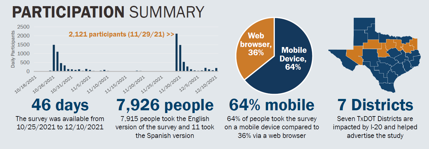
    In fall 2021, TxDOT engaged more than 7,900 participants through their most successful MetroQuest survey to date, the I-20 Texas Corridor Study. TxDOT and their consultant partners conducted this study to identify multimodal needs and prioritize improvements for the I-20 Texas corridor, one of the primary travel routes between east and west Texas.

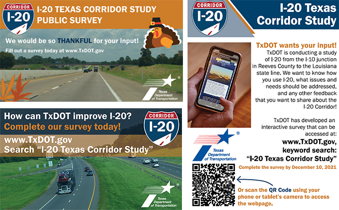
    The project team developed a comprehensive communications plan along with engaging messaging and graphics to promote the survey and reach a broad audience of residents, corridor users, local businesses, advocacy groups and other stakeholders. The survey was advertised in English and Spanish through various digital and print channels, such as social media, email, newsletters, organization websites and posters.


    Example promotional materials


    Instead of only using TxDOT’s social media channels to share the survey, the project team expanded the promotion of the survey throughout the corridor by distributing templated materials to regional agencies, local organizations, the project steering committee, working groups and other key contacts. The team:

    • Developed fliers with unique trackable QR codes and distributed them to TxDOT’s local Travel Information Centers (TICs).
    • Sent requests to Public Information Officers (PIOs) along the I-20 corridor to post to their social media channels and send out press releases.
    • Provided project steering committee and working group members with pre-prepared, easy to share content and images for social media, as well as advertisements for sharing the survey in print materials.

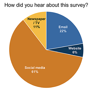
    In the end, TxDOT i-20 Corridor survey medium result61 percent of respondents to the question “How did you Hear about this Survey?” indicated they accessed the survey through social media, demonstrating how effective their social media campaign was in driving traffic to the survey.

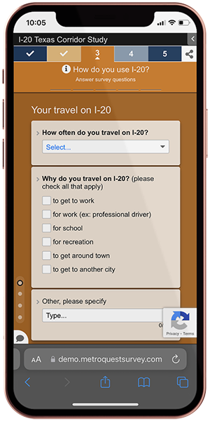
    Correspondingly, TxDOT i-20 Corridor study on iPhone64 percent of participants accessed the survey on a mobile device. With more people finding out about surveys on social media via their mobile devices, it is essential to develop a survey that works just as well on a phone as on a laptop. MetroQuest’s Survey Editor allows you to view the survey as it would look on a mobile device while editing to make sure your content will appear properly on a phone.


    The following graphic summarizes participation for the I-20 corridor survey and demonstrates the success of the TxDOT team’s outreach strategy. Over 46 days, 7,926 people participated in the survey by taking the English or Spanish version. The bar graph below demonstrates how survey participation numbers significantly increased on days where promotional materials were launched. Survey promotion was targeted across Texas in seven districts near I-20, as highlighted in orange on the map.


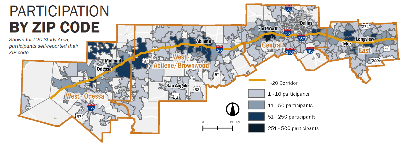
    The project team also identified potential gaps in the demographic representation of participants while the survey was live by reviewing geographic representation of the responses (see graphic below showing participation by ZIP code). From this research, the team adjusted the promotional materials and focused on reaching underrepresented areas for the remainder of the survey period. This is an excellent strategy and a step we highly recommend adding during your engagement period to ensure that your survey reaches a diverse and representative audience.


    To learn more about the study and the engagement process, visit the I-20 Texas Corridor Study project page.


    Anatomy of a Corridor Survey: Identifying Needs and Prioritizing Improvements

    As we go through the survey content in more detail, you will notice how the simplified approach taken by TxDOT makes each Screen quick and easy for participants to complete!

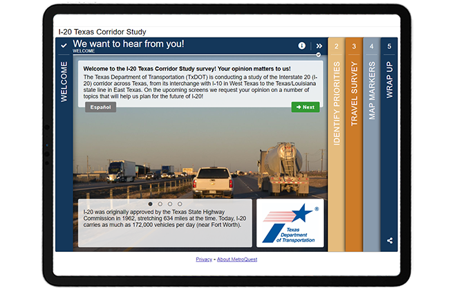
    First, the Welcome Screen content greets participants with the call to action of “We want to hear from you”. It does not waste any time and immediately outlines the project location, the purpose of the survey, and some interesting but relevant facts, such as pointing out the importance of the study by highlighting the large number of bridges and interchanges on I-20 in Texas.


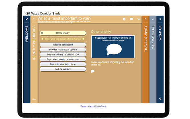
    Like many MetroQuest surveys, the second Screen is in our Priority Ranking format to ask respondents what three priorities are most important to them out of six options. Additionally, this survey takes a unique approach by including an “other priority” option within the ranking list. This allows participants to customize their ranking to include a unique priority.


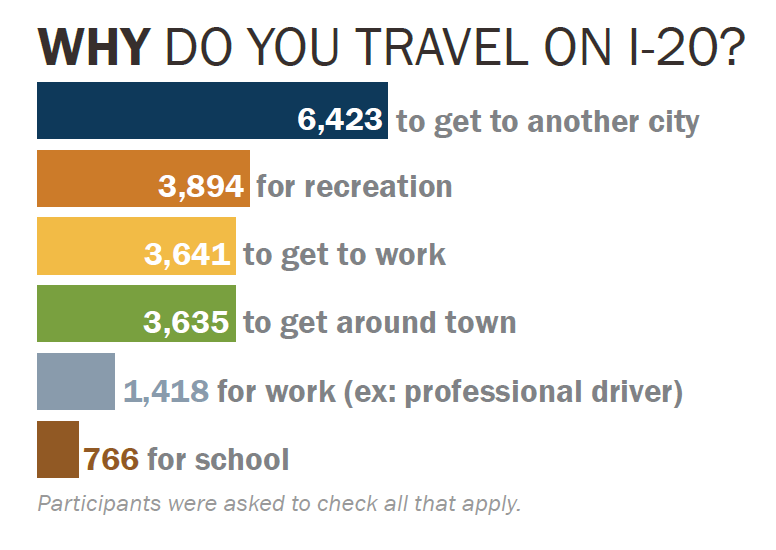
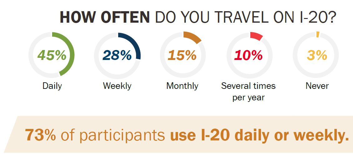
    The survey continues with a Standard Survey Screen asking participants to provide input on their current and past usage of the I-20 route through a series of multiple choice, checkbox and comment questions. Questions are direct, asking for simple input on transportation use. Quantitative questions allow the project team to easily summarize key data, as demonstrated through the following graphics.


    TxDOT i-20 Survey Result - Travel use reason


    One of the biggest challenges when designing any survey is narrowing down what you want to ask. It can be tempting to ask endless questions, but the key is to flip your thought process when developing your survey. Start by determining what information and data you require to make future decisions, and then design your survey to ask for feedback on only those required items.

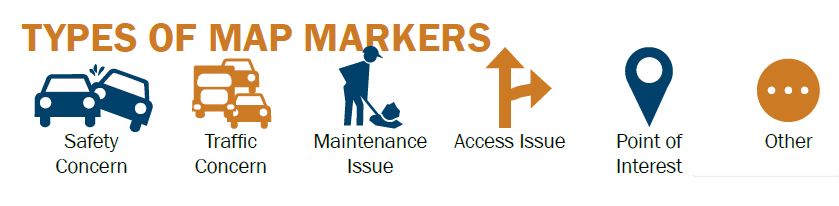
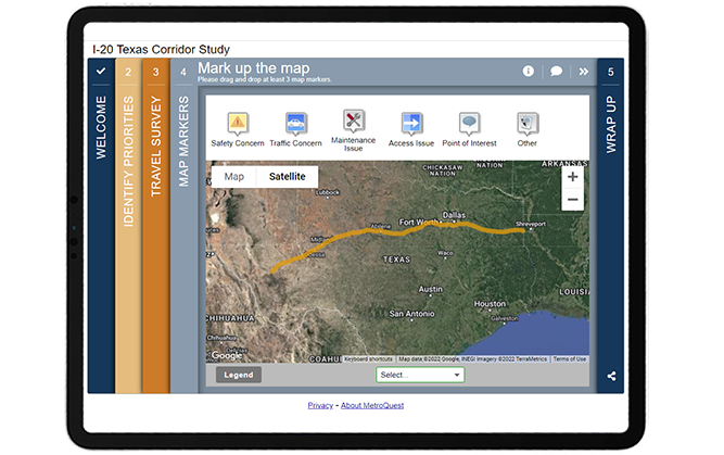
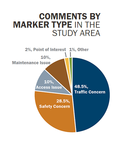
    The Fourth Screen of this Survey uses one of our most versatile Screens for gathering location-based input: the Map Marker Screen! The I-20 route is easily highlighted through a yellow line uploaded on the KMZ layer and markers offer participants options to provide data on safety or traffic concerns, maintenance or access issues, points of interest and other comments.


    The map also includes custom location settings for the overall study area, as well as west, central and east locations. That way, if a participant is only interested in providing feedback on one area, they can use the auto-zoom option to narrow their view. This Screen provided the project team with more than 21,700 unique data points from markers being dropped on the map!


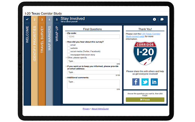
    This survey is also an excellent example of a Wrap Up Screen done right! The Screen asks just four simple questions. Often, respondents will drop off before the end of the survey, especially if there is a long list of demographic or personal questions. At the same time, demographic information is vital to ensuring diverse participation and representation, and knowing where participants first encountered the survey is important for fine-tuning your promotional efforts. We recommend only asking what you need to know, and this survey did exactly that!

    Thanks to this simplified approach, they received more than 6,000 responses to the checkbox question: “How did you hear about this survey?”. This number amounts to about 79 percent of total participants and demonstrates how this survey effectively kept participants engaged to the very end!

    MetroQuest surveys are designed in specific ways to help you achieve great results. The Wrap Up Screen, which always appears at the end of the survey is the best place to ask final demographic and personal questions, as participants are usually more willing to provide this type of information at the end after becoming familiar with the study.


    When writing demographic questions and your survey in general, consider how you will tabulate and analyze the data after the survey is complete. Thousands of open-ended comments can take many hours to analyze for key insights, so we always recommend including mostly quantitative questions where there are set options for participants to select, rank or rate, such as the checkbox questions on this Wrap Up Screen. Close-ended questions will allow you to identify key trends and opinions from your survey results immediately.

    Check out this demo version of the survey to see how easy and quick this survey is to complete! You can toggle the green icon on the top right to view the survey in mobile or desktop view.


    5 Tips from the I-20 Texas Corridor Study Survey: Concise Content and Simple Asks

    1. Keep the content simple and short: We mention this often but for a good reason. People have limited time and attention spans. If you want to receive quality responses and hear from thousands, survey content needs to be concise, to the point and easy to understand. We recommend designing surveys to only take five to ten minutes to complete as most people tend to drop off after this amount of time. This survey is a prime example of a study that that required specific and general feedback on an entire corridor but managed to gather a huge amount of input through a very simple survey.

    2. Track your outreach and re-assess your strategy partway through: It is essential to track the progress of your survey while it is live, especially to make sure you are reaching a diverse audience. In this case, the project team reserved time midway through the survey’s engagement period to dive into the data. By collecting ZIP codes and Map Marker geospatial data, the team was able to identify if certain areas were not well represented and broaden outreach to those areas for the latter half of the engagement period. With social media advertisements, it’s easier than ever to target specific areas and demographic groups without spending significant time or money.

    3. Find ways to broaden your outreach through partner organizations: Especially when it comes to social media, often your reach is limited by the size of your audience. The TxDOT team did an excellent job of identifying other state organizations and contacts where they could get the word out of the survey. Even better, they prepared content and imagery so these organizations could promote a consistent message and didn’t need to take extra time to develop their own posts. The use of broad communication channels was a key driver in this survey receiving thousands of responses.

    4. Start with an inviting Welcome Screen: The image choice on the Welcome Screen is important for greeting participants but so is the content. Use engaging calls to action, keep the content brief and identify key information to introduce the survey. The I-20 Texas Corridor Study Survey clearly indicates the project area and purpose without requiring the participant to read a large paragraph.

    5. Ask only what you NEED to know, especially on the Wrap Up Screen: If you want participants to get to the end of your survey and still provide some personal information make sure only to ask demographic or personal questions essential to your data analysis process. Keep the Wrap Up Screen minimal and simple with a mix of quantitative and qualitative data. The simplicity of this survey’s Wrap Up Screen led to their team receiving feedback on this Screen from the majority of survey participants. Thanks to the quick and straightforward questions, participants were less likely to drop off partway through the survey.

    Congratulations to TxDOT and the I-20 Texas Corridor Study project team for developing a robust communications plan and excellent survey that engaged more than 7,900 participants! Thank you to the project team for providing the excellent campaign images and data graphics featured throughout this post.


    For more great tips on how to make the most out of MetroQuest, contact our Customer Experience team or reach out for more information!

    Check out our recent webinar to learn ways to optimize your virtual community engagement through effective outreach strategies and great survey design!


    Optimizing Virtual Community Engagement to Build Public Support

    A well-designed survey and an effective outreach campaign are two elements critical to public engagement success. Watch this webinar for case study examples from successful projects!


    WATCH WEBINAR

  • How to Host a Dynamic Virtual Event For Community Engagement Success

    How to Host a Dynamic Virtual Event For Community Engagement Success

    Grace Lau is the Director of Growth Content at Dialpad, an AI-powered cloud communication and computer telephony integration (CTI) platform for better and easier team collaboration. She has over 10 years of experience in content writing and strategy. Currently, she is responsible for leading branded and editorial content strategies, partnering with SEO and Ops teams to build and nurture content. Here is her LinkedIn.


    The changing world has led to the rise of virtual events, yet hosting one for the first time can be daunting. Fortunately, although different, hosting a virtual event is more similar to the physical events we’re familiar with than many of us realize. Public meetings, for example, have shifted to hybrid or virtual versions with success.

    That being said, there are certain important things to consider to make sure your virtual event is as engaging and dynamic as possible. This guide has been created to help you with this.

    Virtual Events: Are They Here to Stay?

    Despite the in-person world beginning to open up again, people have now discovered that some things actually work better online. From book festivals to training conferences and even intimate concerts, it seems virtual events will be sticking around in one form or another for a while longer.

    After all, they have the unique benefits of being globally accessible, requiring fewer set-up costs and traveling fees, and of being easily recorded for future viewing. Those are not benefits to be scoffed at.

    Virtual events, managed well, can also increase your opportunity to interact with and engage the community, build a longer-term relationship, and develop a feedback loop that benefits both planners and community members. By being online, the transition from the build-up to post-event can be made much smoother.

    For this reason, among others, many are looking ahead at virtual events as here to stay!


    The Pre-Event: Six Ways to Get the Community Involved

    So, where to begin? There’s no need to wait for the event to get going before starting successful online community engagement. From your first point of contact, open the conversation with participants and get them involved. Encourage them to promote your event and to get others excited too. Community-driven engagement is very effective.

    Let’s look at how you can do this:

    1. Set clear goals from the start

      Why have you decided to host a virtual event? It might seem an obvious question, but having a clear idea of this can help you get your planning team on the same page. Deciding on a goal will identify which parts are essential to your aim and which are bonuses and perhaps don’t need the same level of planning energy.

    2. Choose the right platform to host your virtual event

      Each platform has pros and cons and is suited to different types of events. The perfect platform for putting your team’s virtual celebration ideas into action may not be as ideal for a three-day conference.

      Is screen sharing something that’s going to come in handy or is space for discussion more essential? Looking at your event goals will help pinpoint the features you most need from your virtual event platform and make sure everything runs smoothly.

    3. Choose the right time for your event

      Just because you don’t have to factor in travel time, doesn’t mean any time of day will work. Depending on your audience, different times of days will be more effective. If you’re trying to reach working parents, for example, weekday afternoons will be difficult: consider where your participants likely are, and choose times that you know will work for them.

      Likewise, don’t forget to set timings for your event – allocating time for Q&A sessions, presentations, and breaks will make your event even slicker.

    4. Send out engaging activities before the actual date

      Don’t wait for the big day to get participants involved. Send out social media posts, utilize your email list to share questionnaires or online surveys, or launch a competition ahead of time as part of your marketing strategies, to get participants excited and talking about your event. Set the stage and make it interesting for participants to learn about your virtual event before they even get there!

      Getting your staff and event team involved will make their faces known and help to build that all-important sense of community.

    5. Promote your virtual event

      No one will come to your event if they don’t know it’s going on. Promote it across your channels and encourage those signed up to do the same. Cognitive automation can make this simple by working out where promotions will be most visible and when to publish them.

      Include information that will draw in the audience you want, such as key speakers, workshop topics, and clear directions on how to register. If you’re trying to generate attendance among hard-to-reach communities, use tactics like partnering with community groups, targeted social advertising, or even mix it up with some in-person promotions at community centers, at transit stations, or other public places in the neighbourhood.

    6. Prepare backup plans

      We all know technology doesn’t always go to plan. All it takes is a weak internet connection or badly timed update and the best-planned virtual event can fall to pieces.

      Prepare alternatives for these worst-case scenarios, including sharing plans for workshops with multiple co-leaders, testing your conference call services beforehand, and providing clear guidance on what participants should do if worst comes to worst. Ensure a top-notch customer experience platform.


    Here’s How You Make Virtual Events Engaging:

    Onto the event itself. You may be familiar with ‘virtual meeting fatigue’. The last thing you want is for that to set in.

    By keeping things exciting and engaging, you should ensure everyone stays awake and paying attention. But how?


    Get moderators for your event

    You can employ moderators for all aspects of your virtual event, from corresponding with speakers or fixing mic echo to keeping an eye on chat rooms for unsavory comments, encouraging participants to share their input, and helping educate on how to use various engagement tools. Essentially, their role is to make sure the event runs smoothly.

    It’s likely you already have members of your planning team taking on moderator roles; however, you may want a few extra people on hand on the day.

    Have a fun, engaging program

    If you look at your program and yawn, you can only imagine what participants are going to think. Intersperse talks or seminars with activities that require audience participation or response, and make sure your event is suitable for a range of attention spans.

    You might want to set challenges or activities that can be peppered throughout longer presentations or allow time for reflection after a particularly jam-packed session.

    Involve your speakers and audience equally

    Q&As are super popular ways to foster discussion within the group, helping everyone to get the most from your virtual event. The depth and breadth of opinions and knowledge sat in the audience may surprise you.

    By providing space for conversation, questioning, and sharing ideas, you may find your speakers come away having learned something too!

    Have an “ask me anything” (AMA) session at the end

    AMAs started as part of a subreddit but have risen to fame due to the interest they bring and the opportunity they give askers. They encourage questions not directly related to the topic and can lead to really interesting answers.

    Where appropriate, an AMA session after the event where participants can ask additional questions can provide a place of transparency and ongoing communication that your team can monitor and respond.


    It All Starts With a Virtual Event…

    By now, you should see that virtual events aren’t all quizzes and “I think you’re on mute”. All it takes is a bit of planning to host a dynamic event and engage your community.

    Although the event is a key part of the process, it’s not the only part. Ultimately, community is built through the bits in between events and how you keep people interacting. Developing this takes time and consistent effort but is well worth it in the long run.

  • [SURVEY OF THE MONTH] Shaping the Transportation Future of the Memphis Area

    [SURVEY OF THE MONTH] Shaping the Transportation Future of the Memphis Area

    The Survey of the Month series is a monthly blog where we highlight the extraordinary work our customers are doing! We feature well-designed surveys and share takeaways that are relevant for anyone interested in making the most out of online engagement using MetroQuest’s survey platform. To see more in the series, visit the blogs here.

    This month, we are sharing a long-range transportation plan initiative led by the Memphis Urban Area Metropolitan Planning Organization (MPO) for the Mid-South Region, an area spanning southwestern Tennessee and northwestern Mississippi.


    The Moving Together: 2050 Regional Transportation Plan (RTP) sought feedback on future transportation priorities, broad ideas and potential enhancements with the goal of improving overall transportation conditions in the Mid-South Region.

    The team launched a MetroQuest survey at the start of 2022, and it demonstrated clearly that a survey can be quick to complete yet still collect thousands of data points to inform future planning. Every day we are bombarded with constant notifications and information from social media, traditional media, family, friends, and work. Today, surveys must compete with a ton of other priorities. That’s why MetroQuest’s fun, interactive surveys are so effective at turning initial visitors into actual survey participants.

    Below, we will showcase why the Moving Together 2050 RTP Survey was such a great example of an easy-to-digest format that still collected key feedback by engaging over 500 people!

    The secret? A fun, engaging survey and a well-thought-out outreach strategy.

    What’s the story? Engaging the Region about Transportation Goals, Objectives and Priorities

    The Moving Together: 2050 RTP is the Mid-South Region’s plan for defining the vision of future transportation in the region. To ensure that recent trends and priorities are reflected in the plan, the RTP is updated every four years.

    The MetroQuest survey was launched on January 6, 2022 and remained open for input until February 11. It gathered a mix of qualitative and quantitative feedback from over 500 participants!

    Before the release of the survey, the MPO had developed an extensive outreach campaign that was aimed towards getting higher engagement and participation levels, as compared to their past outreach efforts. Due to the online nature of the survey, special attention was given to the development of social media and other online content for sharing, with the primary focus to make the information catchy and interesting. Beyond sharing the survey through daily posts on the MPO’s social media accounts, the MPO also:

    • Partnered with its member agencies, which in turn shared the MPO’s postings on their social media accounts;
    • Featured the survey in local agency newsletters;
    • Distributed posters with a QR code to the survey to the major libraries and community centers;
    • Added a website pop-up notification with a survey link;
    • Promoted the survey on the Nextdoor App, a new tool that had not been used in past efforts.


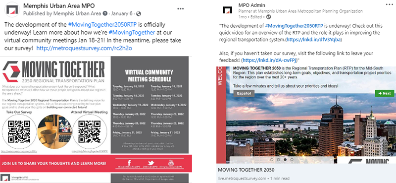
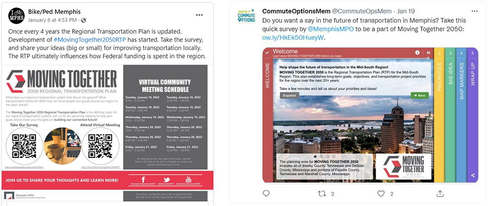
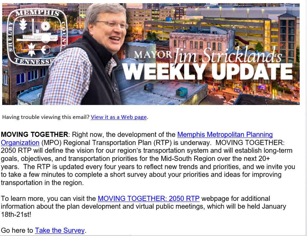
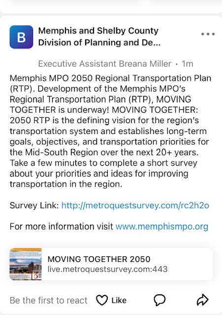
    See below for some examples of the social media posts shared by Memphis MPO and partner organizations during the engagement process.


    Example social media posts on Twitter, Facebook and LinkedIn


    Inclusion in the Memphis Mayor’s Newsletter


    Post on Nextdoor App


    This campaign strategy exemplifies how a well-planned, comprehensive outreach campaign is key to ensuring your survey reaches your audience and engages hundreds, if not thousands, of participants and gathers the input you need to move your project along.

    To learn more about this initiative, visit the Moving Together: 2050 Regional Transportation Plan webpage.

    Anatomy of a Regional Transportation Plan Survey: Gathering key input to help the region continue moving together!

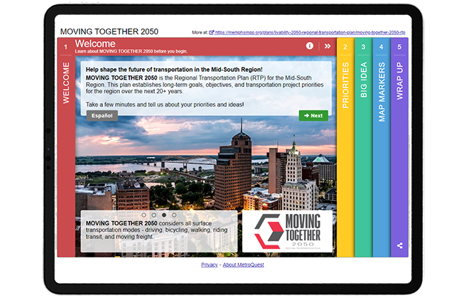
    Right away, the survey draws visitors in with a colorful scheme and captivating Welcome Screen image. This first Screen also features many other key items we recommend: a brief project description, a well-designed project logo and a link to the alternate language version of the survey. You’ll notice that the Screen quotes “a few minutes” for the length of the survey, indicating right at the start that this survey won’t take too long. For the best participant experience, we recommend aiming to create surveys that take approximately 5-minutes to complete.


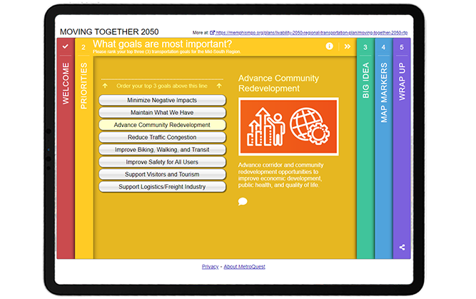
    As with many MetroQuest surveys, the first interactive Screen is a Priority Ranking exercise. The priorities are written in plain language and easy to understand. Each priority is matched with an icon graphic allowing participants to immediately identify the topic. By asking for three of the eight goals to be ranked, the exercise is simple and will elicit actionable data on what goals matter most to the region.


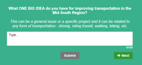
    The middle Screen presents a unique method for open-ended feedback, asking participants to indicate “ONE BIG IDEA” for improving transportation in the Mid-South Region. The Vision Statement Screen is an excellent tool to gather broad qualitative feedback and allow participants to vocalize their opinions entirely in their own words.

    We love how this survey took this Screen and, rather than asking for feedback on a pre-written statement, asked the community to come up with ideas. The question is specific and detailed enough to elicit quality responses.


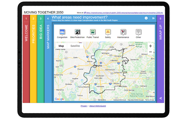
    If you are familiar with MetroQuest surveys, you will likely recognize this fourth Screen—the Map Marker Screen! By placing this Screen fourth, participants had a chance to warm up to the project and prepare their thoughts to provide specific location-based data about transportation improvements. Six different markers allow for a huge range of data on various improvements needed for: traffic congestion, bike/pedestrian transportation, public transit, safety and maintenance.


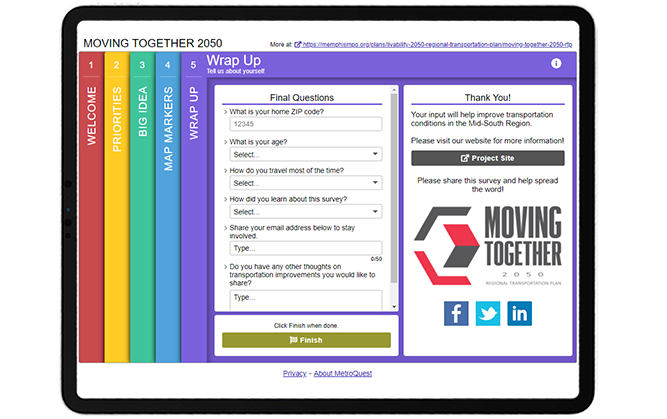
    As with all MetroQuest surveys, the final Wrap Up Screen provides a space for few quick final questions to gather demographic information, optional contact details and final thoughts.


    Try out the survey yourself through this demo version!


    5 Tips from the Moving Together 2050 Survey: Great Visuals and Quick Activities to Engage Hundreds

    We’ve highlighted many great features of this survey above. Here are five key tips to remember for your future surveys to turn visitors into participants!

    1. Make sure your Welcome Screen is inviting: By featuring eye-catching colors and a beautiful aerial image on the first Screen, participants instantly know this is not your standard survey and will be interested to continue. It is important to make sure your Welcome Screen highlights why you want feedback and that the survey will be quick to take, as this survey introduction indicates.
      2. Use consistent, clear graphics and visuals: The use of icon graphics on the Priority Ranking Screen is an excellent way to include visuals if you don’t have images that represent each topic. Graphics which are all designed in the same color and visual style can help prevent bias that comes from comparing images, as naturally we are always drawn to select the best-looking image.
      3. Write a well-defined question on the Vision Statement Screen: Rather than gathering feedback on a vision statement for the project, this survey took a unique approach with this Screen and asked residents to come up with one big idea. Since this question was written with a direct ask, participants are more likely to provide quality answers. Generally, the more specific you are with open-ended questions, the more precise the feedback will be.
      4. Make sure your Map Marker Screen map is properly centered: The KMZ/KML layer on the Map Marker Screen is automatically centered on the Screen so participants do not need to move or zoom-in/out to see the project area. The black border outline clearly defines the area for input.
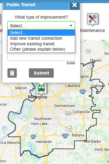
      5. Use dropdown questions on the Map Marker Screen: The Map Marker Screen is an excellent way to gather geospatial data but it’s important to consider what each Marker is asking. We recommend always including a dropdown question (example shown left) in addition to a comment box for each Marker so you can gather a mix of quantitative and qualitative data. Qualitative responses can be time-consuming to analyze so it can be very helpful to also gather data on consistent items to compare in aggregate.

     

    Kudos to the Memphis Urban Area MPO team on their excellent survey design! The Moving Together 2050 survey is a perfect example of how to effectively engage a region about their transportation future while keeping the survey simple and quick to complete.


    For more great tips on how to make the most out of MetroQuest, contact our Customer Experience team or reach out for more information!

    Want to learn more about how MetroQuest supports community outreach on your next transportation plan? Check out our recent webinar:


    Forum on Measuring Public Involvement Effectiveness for Transportation Agencies

    Forum on Measuring Public Involvement Effectiveness for Transportation Agencies

    In this interactive webinar forum, public involvement leaders from TxDOT, NCDOT and GDOT share how agencies can ensure that their public engagement programs are an effective and efficient use of public resources!


    WATCH WEBINAR