[SURVEY OF THE MONTH] Visuals Pave the Way for Feedback on Tennessee Corridor Study

The Survey of the Month series is a monthly blog where we highlight the extraordinary work our customers are doing! We feature well-designed surveys and share relevant takeaways for anyone interested in making the most out of online engagement using MetroQuest’s survey platform. To see more in the series, visit the blogs here.
After a couple of months focusing on active transportation, this month, we transition to showcasing a corridor study, another topic where MetroQuest is commonly used to gather input.
MetroQuest subscriber, the Tennessee Department of Transportation (TDOT), along with Jefferson City, and the Lakeway Area Metropolitan Transportation Planning Organization (LAMTPO), worked with CDM Smith, a consulting firm that frequently designs MetroQuest surveys. This collaborative effort led to a survey with over 20 visuals to communicate key design ideas and improvements rather than substantial text.
The project team made several successful design choices, resulting in an effective online survey!
What’s the story? Exploring Corridor Improvements
Jefferson City is located in northeast Tennessee, just over 25 miles northeast of Knoxville. The city was initially known as Mossy Creek when founded in 1788. Later in 1901, it amalgamated with several other neighboring communities and became what we know today as Jefferson City.
For this study, the project team was looking to determine improvements for safety, traffic flow, and the overall operation of US Highway 11E along the SR 34 corridor (shown below).
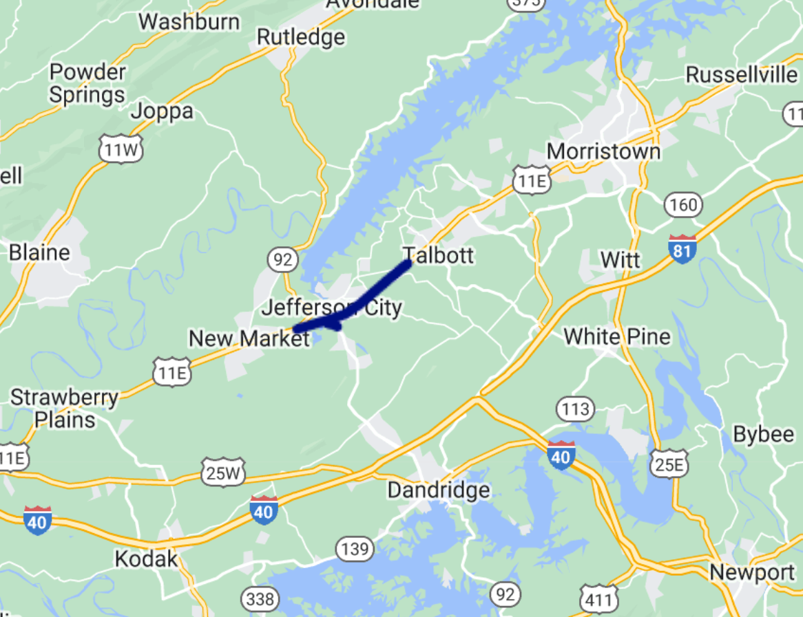
The project area extended from W Andrew Johnson Hwy to E Andrew Johnson Hwy and SR 92 from US 11E to George Avenue.
Community Response
Corridor study surveys often see quite a bit of traction compared to more theoretical future studies. Due to their typically imminent nature and definitive location, community members often are more engaged with specific ideas on what they wish to see. Imagining improvements to one specific zone can be much easier than a statewide area.
The Jefferson City – US 11E Corridor survey ran from January 15 to February 15, 2023, gathering input from over 400 individuals and collecting over 9,000 data points. Similar to last month’s survey in Lebanon, New Hampshire, this survey saw a large response considering that the 2020 Census cited just over 8,000 residents in Jefferson City. Of course, it’s worth noting that this throughfare impacts many who live outside of Jefferson City, so residents in adjacent areas likely weighed in as well.
Notably, the word about the survey spread fast following coverage in local newspapers and online media such as the Jefferson County Post. Survey coverage also included a QR code linking to the survey, making it efficient to access the survey.
Anatomy of a Corridor Survey: Using Images and Maps to Communicate Concepts
Since every Screen of this survey followed best practices we love to see, we will go through each one in detail!
Try out the exercises and questions yourself at this demo link.
Screen 1: Welcome
The Welcome Screen features a striking image of the corridor during golden hour. The landscape orientation allows it to extend across the browser window.
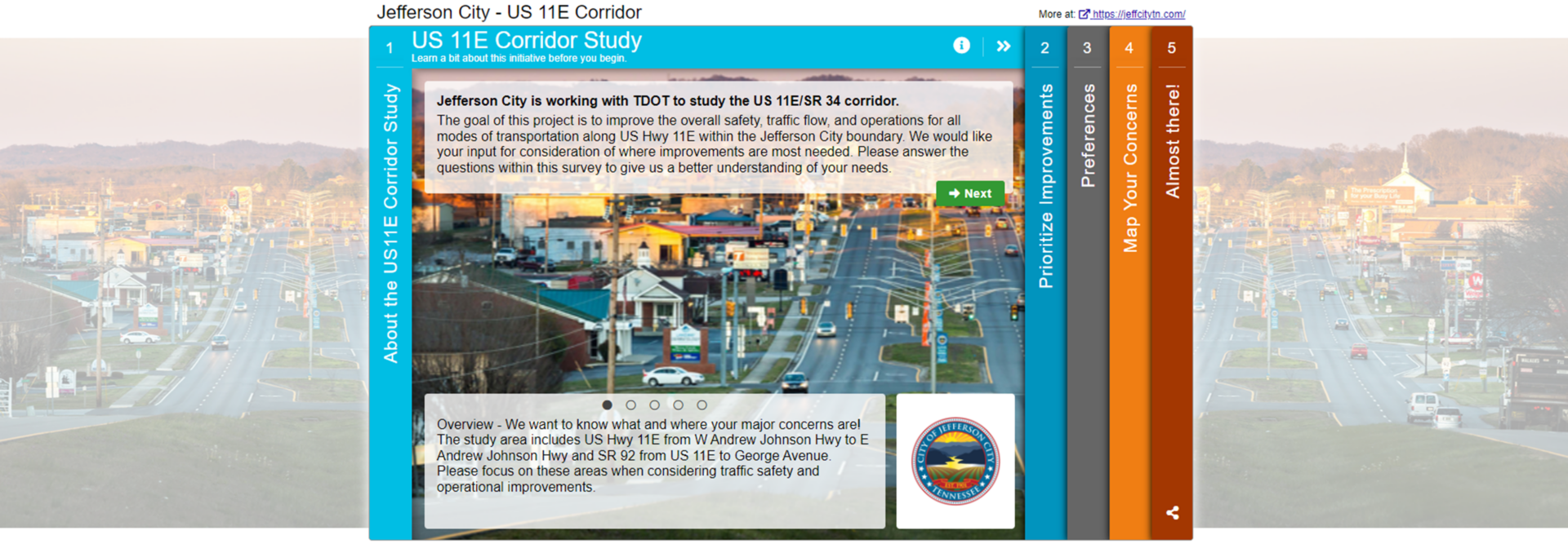
The introduction gets to the point succinctly, clearly stating the goal of the survey. The content tone is directed at the participant with phrases such as:
“We would like your input for consideration of where improvements are most needed.”
“We want to know what and where your major concerns are!”
This communication style ensures you are speaking directly to those taking your survey, and it is more likely that the message will resonate.
Another minor detail that has a significant impact is the cohesiveness between the logo, survey colors and image. Everything blends together and instantly looks more appealing.
Screen 2: Priority Ranking
The survey starts with our most popular second Screen: Priority Ranking. Large images and descriptions complement eight types of corridor improvement options. The team used the image enlargement option for a more detailed look. Notice the specificity of the descriptions; the less interpretation required, the more accurate data will be.
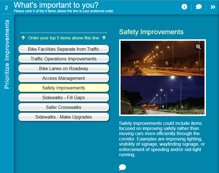
Notice how the lighting image shows a before and after view to represent the types of safety improvements that are being proposed.
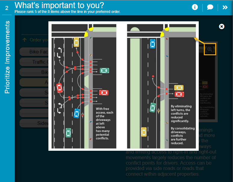
Using the image zoom function allowed the team to share images with more details like this one.
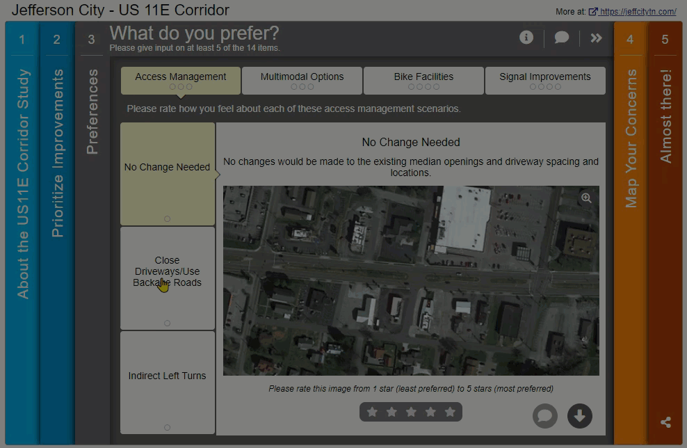
Screen 3: Image Rating
Image Rating Screens have a wide range of use cases; the format allows you to ask for feedback on concepts best described visually. In this survey, the proposed improvements are specific, such as closing off driveways to the main road, adding protected bike lanes, and adjusting traffic signal timing. During our daily lives, we observe many types of road infrastructure, but unless you are an engineer or planner, you may not be familiar with the technical jargon. This is where images come in as a handy reminder.
As shown in the GIF below, the images on this Screen help demonstrate each concept, leading to better-informed feedback!
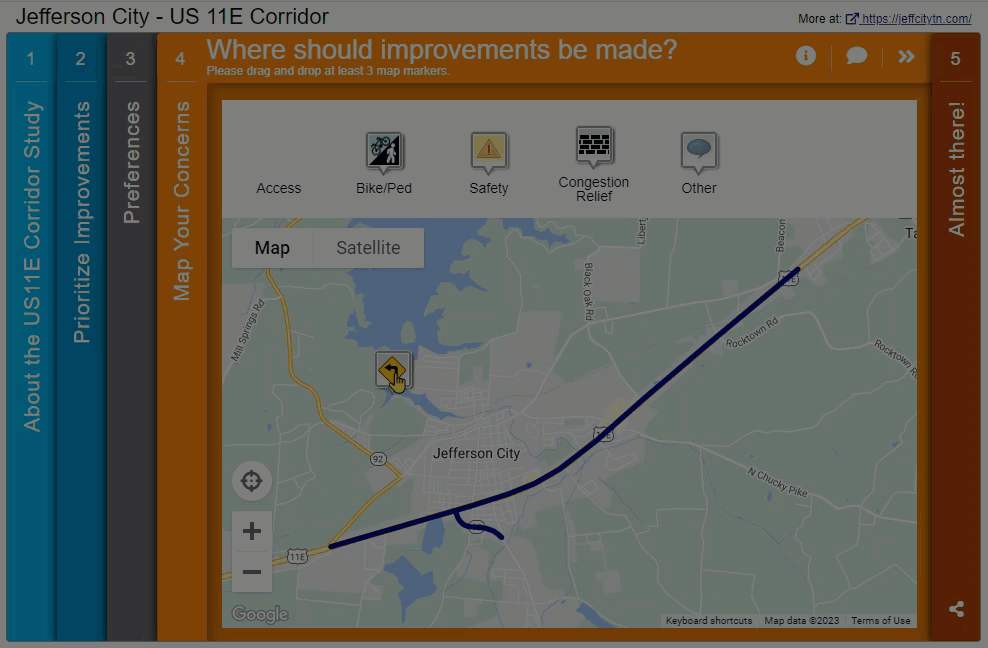
Screen 4: Map Marker
Next, we navigate to a very clearly laid out Map Marker Screen. The corridor under discussion is indicated through the KML layer that blends seamlessly into the map. The Map Marker dropdown questions help generate ideas with phrases to fill in. In survey design, always remember that your participants have limited time. Including prompts and dropdowns helps speed up the survey for participants and quantifies the data for you.
Screen 5: Wrap Up
The survey concludes with a very well-designed Wrap Up Screen. Here, the team asked a set of questions that were particularly informative for the project but didn’t require much more time from participants. The use of fill-in-the-blank dropdown options, such as “Personally, these projects_____” and “These projects, when implemented_____” provided precise data that indicated overall sentiment.
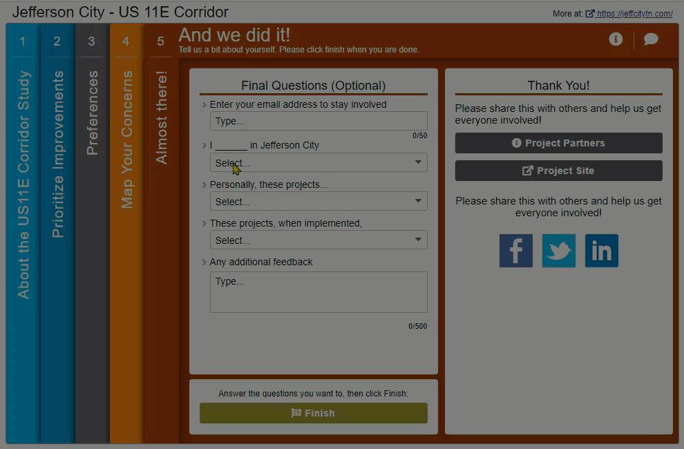
While most questions were quantitative, participants had an opportunity at the end to share any additional feedback.
The simplicity of this Wrap Up Screen led to a large percentage of participants completing these final questions. Based on the data collected through this Screen, it was evident that most respondents thought the projects would positively affect them and be valuable for the community. These types of insights can significantly help inform future council decisions.
For your next survey, consider whether it would be suitable to ask some general sentiment type questions, in addition to more detailed feedback on each aspect of the project.
5 Tips from the Jefferson City – US 11E Corridor Survey:
Make sure to check out the demo survey for yourself to see the visual and precise approach of this survey.
In summary, here are our five key takeaways from this survey:
- Let the visuals do the talking: Often, surveys rely on text content to get the message across. Yet, with technical concepts such as proposed road layouts or how bike lanes will be designed, images can be much more effective. Just be careful to select images that are representative and easy to interpret. Here, the Image Rating Screen provided a format for their team to ask a series of rating questions complemented by relevant images.
- When it does come to your text, make it engaging yet direct: Since many survey participants will be skimming text quickly, keep it simple and be specific about the task at hand. Background information can be helpful, but the Welcome Screen should really focus on the purpose of the survey, what type of feedback is needed, and specific details such as how long the survey may take and the deadline for input.
- Provide helpful prompts: While you never want to put words in your participant’s mouth, at the same time, only asking vague, open-ended questions can sometimes make it difficult for participants to brainstorm. By utilizing questions with dropdown options or multiple checkboxes, you instantly make the survey faster for each participant and, in turn, receive easily quantifiable data. Of course, it is always good to supplement with opportunities for additional comments.
- Keep the Map Marker simple: The Map Marker Screen can be a new style of surveying for participants who may be used to form-style surveys. It performs best with simple, quick dropdown questions and a clearly delineated feedback area.
- Be creative with your final questions: While the Wrap Up Screen is predominantly designed for demographic questions, it can also be utilized to ask for some final thoughts more generally. By this time, participants have had a chance to get familiar with the project and form opinions. Asking a few summary-type questions toward the end can assist you in determining the overall community opinion.
We hope you will keep these tips in mind for your next survey.
Kudos to everyone involved in designing this superb survey! It followed MetroQuest best practices with a simple format, inviting questions and applicable images. We’ve covered some fantastic Tennessee-based surveys on this blog and look forward to more in the future.
For more great tips on how to make the most out of MetroQuest, reach out for more information, or, if you are an existing subscriber, contact our Manager of Client Services Team, Woo-Ree Cho.
Check out our latest webinar recording!

Phase-by-Phase: Unbundling MnDOT’s Winning Virtual Public Engagement Strategy