Category: [SUCCESS]

  • [SURVEY OF THE MONTH] Imagining Bridge Concepts Through Images with Linn County Conservation

    [SURVEY OF THE MONTH] Imagining Bridge Concepts Through Images with Linn County Conservation

    The Survey of the Month series is a monthly blog where we highlight the extraordinary work our customers are doing! We feature well-designed surveys and share takeaways that are relevant for anyone interested in making the most out of online engagement using MetroQuest’s survey platform. To see more in the series, visit the blogs here.


    In this blog series, we often feature surveys that focus on long-range planning initiatives, major statewide or corridor plans, or other broad-based planning projects. This month, we wanted to showcase a survey that demonstrates how MetroQuest can be equally useful for smaller or more specific local projects. 

    Community engagement is typically part of the process during long-range planning initiatives where projects and improvements are prioritized on a large scale. Yet, often there is not enough time to re-engage the community to gather their opinions as projects move into design phases. Tight project timelines, complicated decision-making processes, and bidding processes make it more challenging to conduct public engagement during infrastructure development projects. However, the small design choices often impact commuters and residents the most.  

    As your team heads into the new year and plans for upcoming projects, we encourage you to consider whether there is an opportunity to survey the community on more specific design components for a project. You might be surprised by how engaged people can be when it comes to the design of a specific street, bridge or public area!


    What’s the story? Consulting on Bridge Design in Linn County, Iowa

    Linn County Conservation owns and oversees over 8,000 acres of public resources such as parks, trails, campsites, and other facilities in the county area surrounding Cedar Rapids, Iowa.  

    The county, in collaboration with Corridor Metropolitan Planning Organization, is working on a Highway 100 Trail Alignment Project to convert a former railroad route around the western perimeter of Cedar Rapids into a cycling and walking route. This route is proposed to make use of the base structure of the Milwaukee Road Rail Bridge, first constructed in 1905-06. This bridge was eventually abandoned and deconstructed in 1983 due to changes in traffic patterns. With the popularity of active transportation infrastructure, this historic route may have a purpose once again—from rail to trail!
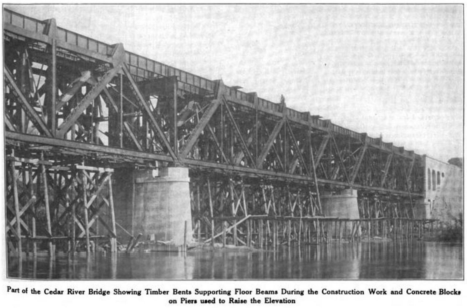
    Milwaukee Bridge
    Image circa 1923 showing the original Milwaukee Bridge structure during construction upgrades (source).

    Linn County contracted Snyder & Associates, a full-service civil and structural engineering firm and MetroQuest subscriber, to study the condition of the existing Highway 100 Bridge’s abutments and piers to determine whether they could support a new trail bridge to cross this section of the Cedar River. The engineering study concluded that the bridge’s abutments are sound (the supports at the end of each side), but the piers (supports in the river) are not in good condition. 

    To move forward with the design process and establish a preferred concept, Snyder & Associates developed a MetroQuest survey to gather feedback on important considerations and design options. Following the survey being live from September 16 to October 14, they heard from over 1,300 people—an astounding number for an area with about 230,000 residents.  

    As we see with many successful surveys, an emphasis was placed on sharing the survey frequently through various channels. Linn County Conservation spread the word through Facebook and e-newsletter blasts, reaching a wide audience across the area. Local media also covered the project, helping further inform the community. 

    Let’s get into the survey itself now and how the team at Snyder & Associates used a visual format to communicate the possibilities for the new bridge.  

    Anatomy of a Bridge Design Survey: Using Visual Screens to Communicate Design Concepts

    As we walk through the survey, notice how it follows a logical order—starting with general considerations—and ending with bridge span and repair options. The survey is quick, takes approximately five minutes, and can be easily completed on a phone, yet it still managed to collect over 19,500 individual data points (about 15 data points per participant).  

    Feel free to pull up the demo survey on a separate tab to go through it while reading the remainder of this blog.


    Screen 1: Welcome 

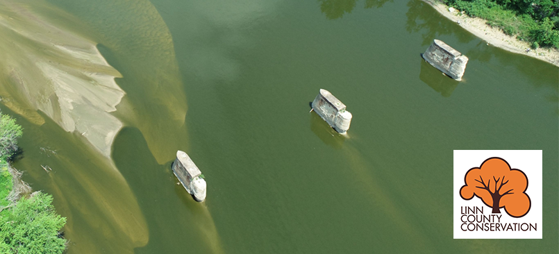
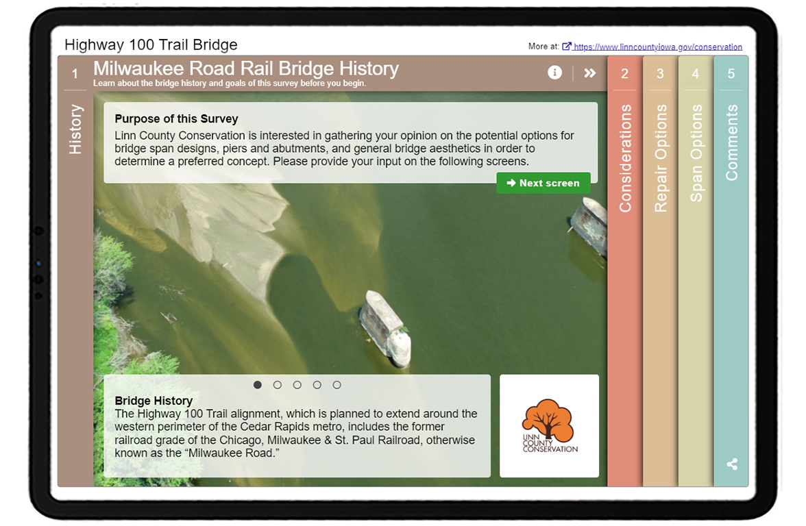
    Immediately, when you visit the Welcome Screen, you are greeted by a calming, almost watercolor-like image of the existing bridge’s concrete supports. Like consumer product branding, the color choices, image and overall look of the survey can significantly impact whether participants gravitate to the survey. 
    Snyder Welcome Blog

    The descriptions on the Welcome Screen are concise yet informative. The sliding details at the bottom of the Screen help tell the story about the existing bridge:

    Slide 3 and slide 4


    Screen 2: Priority Ranking

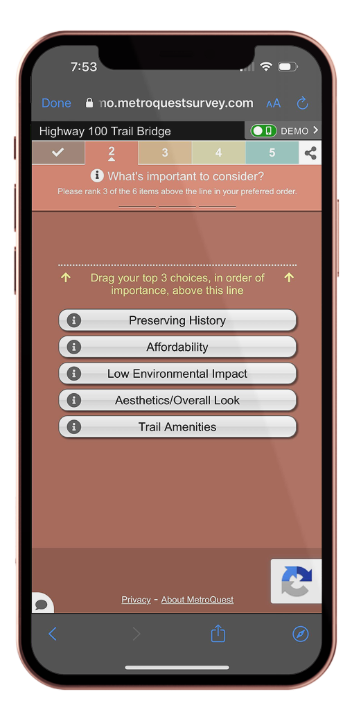
    The survey exercises start with a customer favorite: the Priority Ranking Screen. The team used this Screen to ask participants about what should be considered the most when designing the bridge: 

    • Aesthetics/Overall Look 
    • Preserving History 
    • Low Environmental Impact 
    • Trail Amenities 
    • Affordability 

    By asking participants to rank their top three of five options, this Screen would have taken most participants just a few seconds to complete. We are all busy; if you can balance gathering quality data without expending your participant’s time, you have reached the perfect survey design scenario.  
    Snyder RNK iPhone

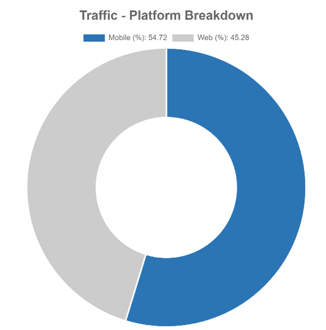
    When building a MetroQuest survey, take advantage of our feature where you can toggle between web and mobile view. As demonstrated in the diagram below, over 50 percent of survey respondents completed this survey on a mobile device, meaning it was even more important to ensure the survey was quick, concise and compatible across all mobile devices. 

    By just including five priorities, notice how the survey content fits well on a phone screen.
    Snyder Device Data
    Circular graph showing that approximately 55% of respondents accessed the survey on a mobile device such as a phone and 45% on a laptop/desktop.


    Screen 3: Image Rating 

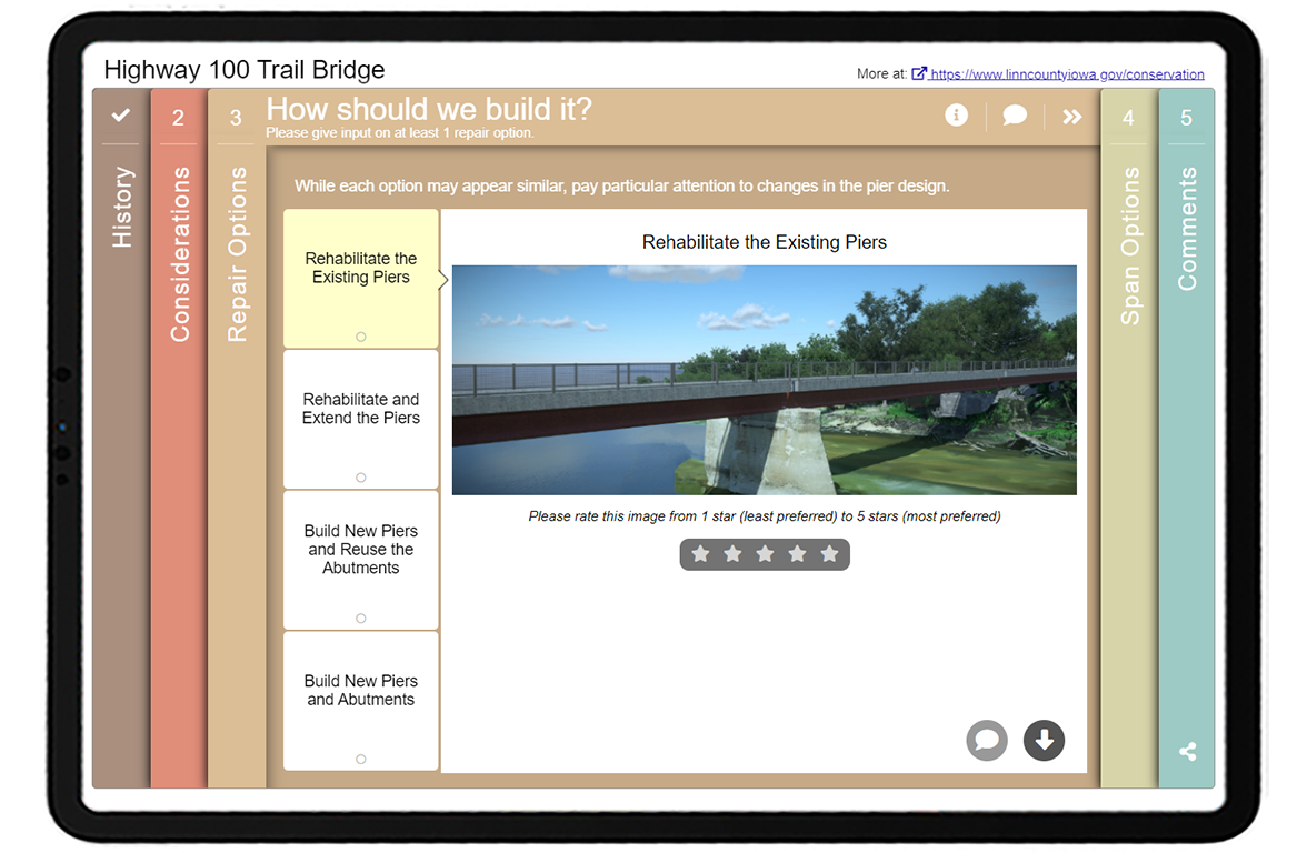
    After defining the most important considerations for the bridge design process, the survey transitions into the highly visual Image Rating Screen. The Screen walks participants through four different repair options, showing a rendering of each concept: 

    • Rehabilitate the Existing Piers 
    • Rehabilitate and Extend the Piers 
    • Build New Piers and Reuse the Abutments 
    • Build New Piers and Abutments 

    As some of these terms may be new to respondents, they indicate on the info pop-up that “piers are the middle supports of the bridge, while abutments are the end supports”. 
     

    Screen 4: Image Rating 

    Bridges stand out, especially in more natural settings, so design matters! On this second Image Rating Screen, the team presented five bridge design options for input (shown below). As is important when using a Likert scale, they used a range with a neutral option. The average person not in the construction industry likely has no idea about the difference between an archway versus a box truss design and the visual impact they can have. Taking an image-based approach to collecting feedback will always ensure you receive valid input. 
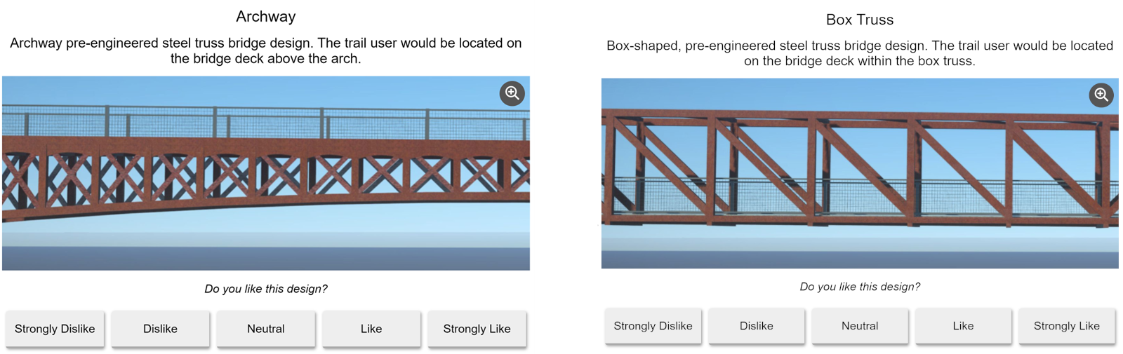
    Archway and Box Truss options


    Screen 5: Wrap Up 

    On the final Screen, the survey continued its very simple and minimal approach. Participants were asked to check their top amenities, the most important bridge aesthetics, write any additional comments and share their home ZIP code. Notice how this Screen’s simplicity suits the mobile format shown on the right. The questions are brief and don’t take up too much space nor require significant scrolling.
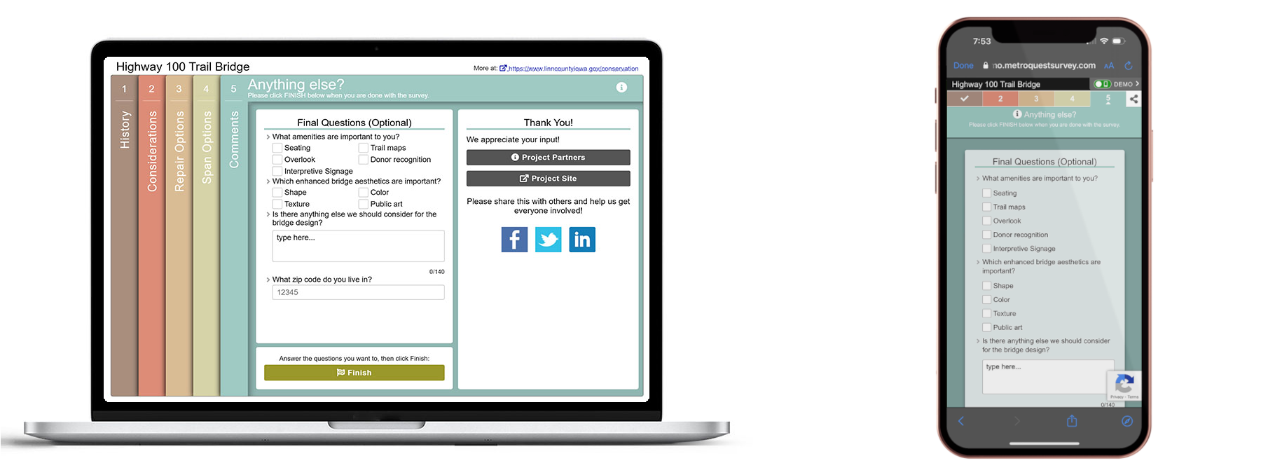
     

    5 Tips from the Highway 100 Trail Bridge Survey: Concise and Visual Surveys are Always Effective 

    1. Consider engaging the community on specific design concepts: During infrastructure projects, there are numerous opportunities where you can solicit public input; it does not necessarily only have to be during the initial planning phase. Look at your project timeline and key decision points to determine where there might be opportunities to check back in with the community. When there are specific design concepts to share or a framework for feedback, participants may have an easier time providing comments as they don’t have to brainstorm from zero. 
    2. Design your survey for mobile users: Since most of us design and create surveys on a desktop or laptop computer, it can be easy to forget that most participants will come across your survey while scrolling through social media and navigate to the survey on their phone. Use our survey editor’s mobile view to see your content’s appearance on a mobile frame. Usually, the less text, the better! 
    3. Avoid jargon or explain it: Terms that you may be familiar with as a planner, engineer or communications professional may be entirely new to some participants. We recommend having a family member, friend or colleague unfamiliar with the project and industry take the survey before you launch it to ensure everything is understandable. If it is important to use specific terms, add a definition like Snyder & Associates did on Screen three. 
    4. Let your visuals speak for the content: As the saying goes, “an image is worth a thousand words”; consider that many will be trying to complete your survey quickly. Typically, it is more effective to communicate a design concept through a rendering or visual. Add a caption and image descriptors/callouts where necessary but let the image communicate the design. Image-sourcing or rendering design can be the most challenging part of project communications and survey design; we recommend dedicating a good chunk of time to work on this and making sure to browse our image library. 
    5. Keep your second Screen simple: Most MetroQuest surveys start with a Priority Ranking Screen for a good reason, it offers a quick, simple introduction to the survey. We always recommend starting with a straightforward exercise like Priority Ranking, Tradeoffs or Image Selection. The first two Screens are critical for influencing whether participants decide to close the survey window or continue answering questions—keep this in mind when designing the flow of your questions. 


    Thank you to the Snyder & Associates team and Linn County Conservation for the opportunity to showcase this excellent bridge design survey. Don’t forget to check out the full survey demo here. 

    If you’ve reached this point, thank you for taking the time to read our blog! See you next month.

    For more great tips on how to make the most out of MetroQuest, reach out  for more information or, if you are an existing subscriber, contact our  Manager of Client Services Team, Woo-Ree Cho.  
  • [SURVEY OF THE MONTH] Identifying Transportation Needs in Ashe County, NC

    [SURVEY OF THE MONTH] Identifying Transportation Needs in Ashe County, NC

    The Survey of the Month series is a monthly blog where we highlight the extraordinary work our customers are doing! We feature well-designed surveys and share takeaways that are relevant for anyone interested in making the most out of online engagement using MetroQuest’s survey platform. To see more in the series, visit the blogs here.


    What’s the story? Organizations Working Together to Engage Ashe County Residents and Road Users

    Ashe County logos
    Logos of all six organizations involved in the survey.

    This month, we feature a survey developed jointly by the North Carolina Department of Transportation (NCDOT), one of our longest subscribers, along with Ashe County and High Country Council of Governments (HCCOG). This survey was truly a team effort and an excellent example of statewide and regional organizations working together to plan for future transportation needs.

    Ashe County is a mountainous region in northwest North Carolina, along the border of Tennessee and Virginia. The centrally located town, West Jefferson, is located about 113 miles northwest of Charlotte, NC and the area is well-serviced by four major highways.

    Comprehensive Transportation Plans, CTPs, are a form of long-range transportation plans. They seek to identify transportation needs and subsequent solutions to address those needs. Input may be gathered at a regional level but often informs statewide planning decisions.


    Anatomy of a Comprehensive Transportation Plan Survey: Seeking Feedback on All Things Transportation

    Like many CTPs, the Ashe County survey sought a wide range of feedback on everything from vehicle use and public transportation to bicycle and pedestrian movement. The project team successfully engaged over 570 people on the survey that remained open from May 11 to June 30, 2022.

    The survey followed a straightforward and logical layout, starting with an inviting and informative Welcome Screen. You may notice a pattern here with surveys starting with a Priority Ranking Screen, and there is a good reason for that! It is a very effective exercise to gather clear and actionable data, which also acts as a simple introductory activity. Then, a Strategy Rating Screen was utilized to gather ratings on 16 statements, and finally, a Map Marker Screen allowed participants to provide location-specific data. As with all MetroQuest surveys, demographic questions are asked on the final Wrap Up Screen.

    We’ll focus on each Screen and highlight some key takeaways for your next survey!


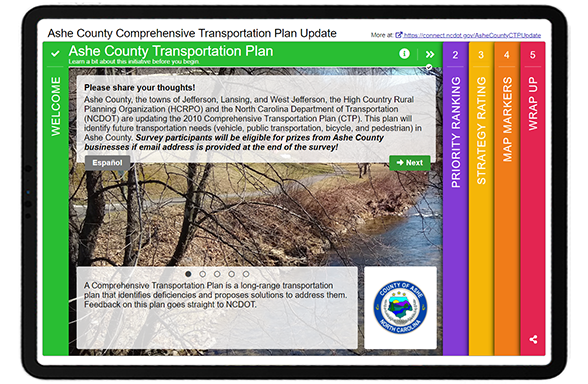
    Screen 1: Welcome

    Similar to our example from last month, bright colors instantly draw you into the survey! They also subconsciously communicate to participants that this will not be another “boring” transportation survey. A wealth of information is shared on this upfront Screen, yet the format ensures it does not appear as a wall of text. The team relayed some key details here, including:

    • Who is conducting the plan/survey
    • What a CTP is
    • How input will be considered
    • The CTP vision statement


    Ashe County Survey_Screen 1


    They also note that those who complete the survey will be eligible for prizes from businesses in Ashe County. When considering a contest for participants, we always recommend offering local prizes, as was done here. When you offer a prize that can be spent from anywhere, such as an Amazon gift card, you increase the risk of ballot box stuffing or bots taking your survey multiple times to win the prize. By keeping your prize as something that can only be useful to someone living in the project area, your risk of ballot box stuffing remains low.

    Notice this Screen also offers a link to the Spanish version of the survey.


    Screen 2: Priority Ranking

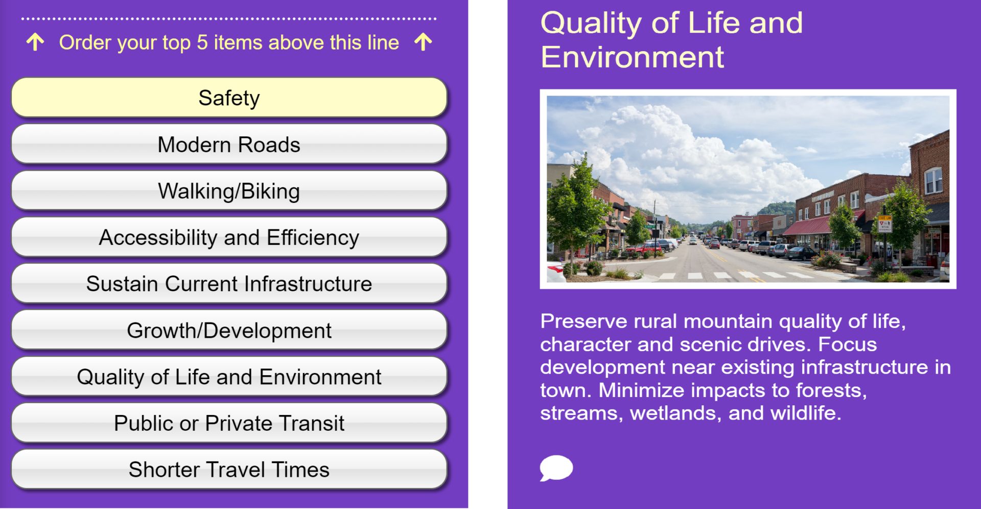
    As noted above, the Priority Ranking Screen offers a great starting point for participants. In this case, they were asked to rank their top five of the following nine priorities as presented in the left image. Each priority is accompanied by an image and a concise yet informative statement, such as this one shown for the Quality of Life and Environment.


    Ashe County_SoTM_Priorities
    [LEFT] List of items to prioritize: safety, modern roads, walking/biking, accessibility and efficiency, sustain current infrastructure, growth/development, quality of live and environment, public or private transit, and shorter travel times.
    [RIGHT] Screenshot of the content and description for the “quality of life and environment” priority.


    Screen 3: Strategy Rating


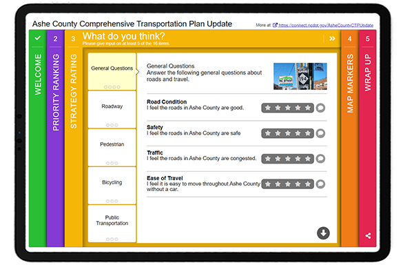
    Ashe County Survey Screen 3


    The Strategy Rating Screen is also one of our most popular activities! It allows you to gather a large volume of quantitative data efficiently. While it works well for strategies, it can also be used for general sentiment statements and gathering opinions on infrastructure options.

    This survey gathered feedback on five main categories:

    • General questions (e.g. overall road condition and congestion)
    • Roadway (e.g. road improvements and widening)
    • Pedestrian (e.g. more sidewalks and improved pedestrian connections)
    • Bicycling (e.g. bike lanes and types of paths)
    • Public Transportation (e.g. expanded use and transit vs. vehicle space)

    * Tip – if you are considering the Strategy Rating Screen but want more of a visual focus, try out our Image Rating Screen. It’s a similar question format that allows for larger images.


    Screen 4: Map Marker

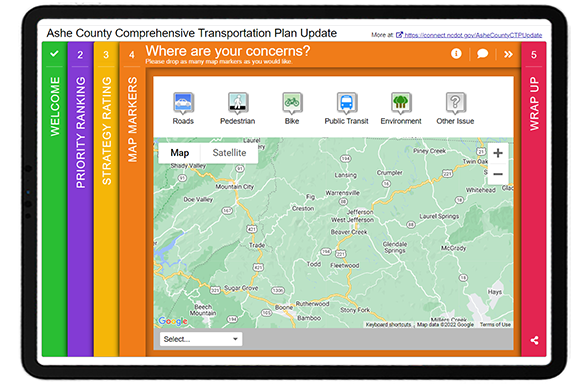
    Continuing with the same topic areas, the Map Marker Screen allowed participants to visually drop markers where they had experienced issues and explain what they encountered in more detail.


    Ashe County Survey Screen 4


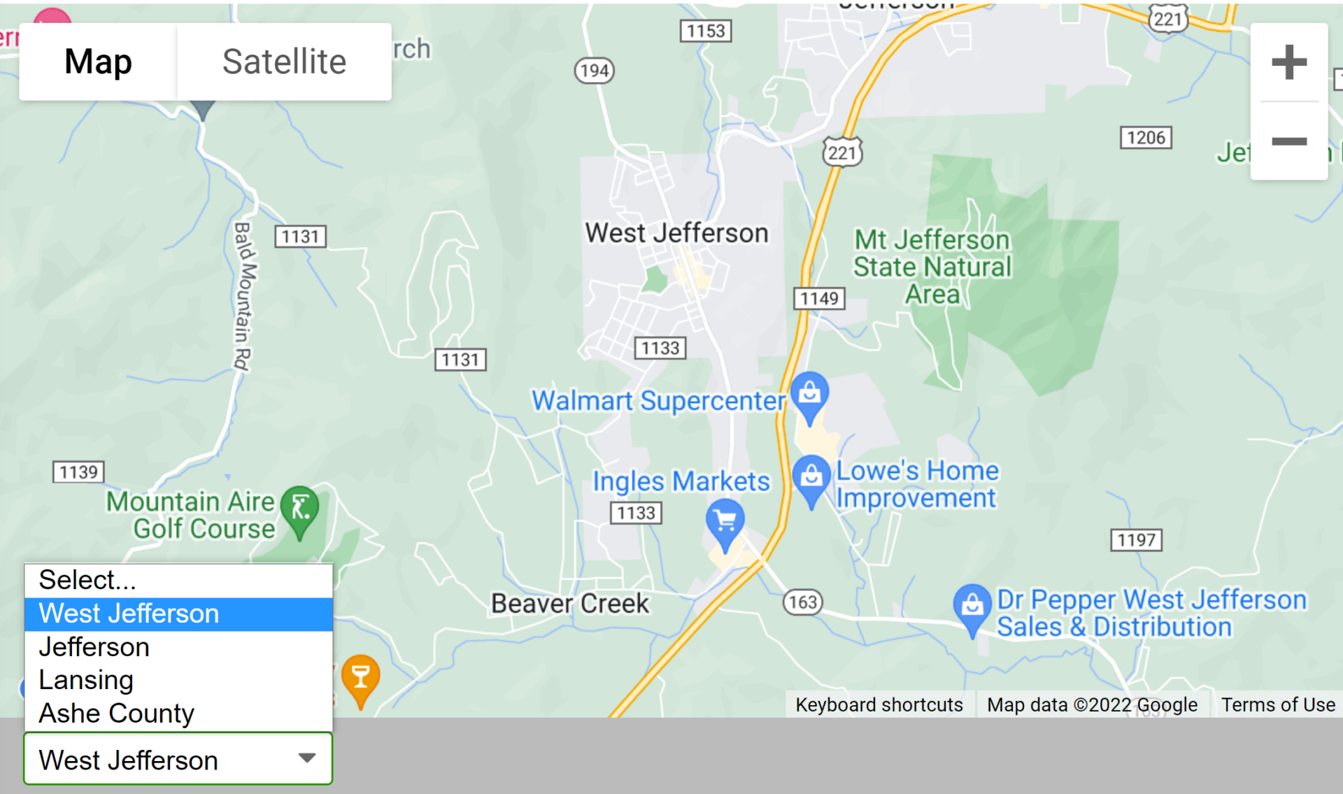
    Ashe County MRKdropdownAdditionally, since the project area encompassed several towns, they used the dropdown menu to allow participants to zoom into Ashe County, Jefferson, West Jefferson and Lansing. Anything you can do to make your survey faster to complete will pay off.


    Screen 5: Wrap Up

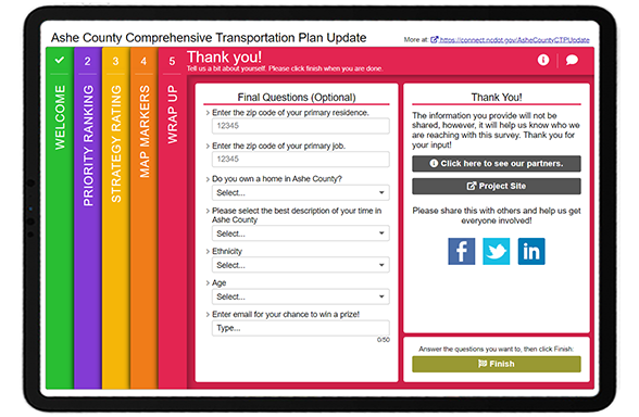
    To wrap things up, the final Screen asked a series of demographic questions. The team followed a number of best practices here, such as:

    • Utilizing dropdown menus to gather quantifiable data and keep the format brief
    • Listing ethnicities in alphabetical order
    • Sticking to just six simple questions


    Ashe County Survey Screen 5


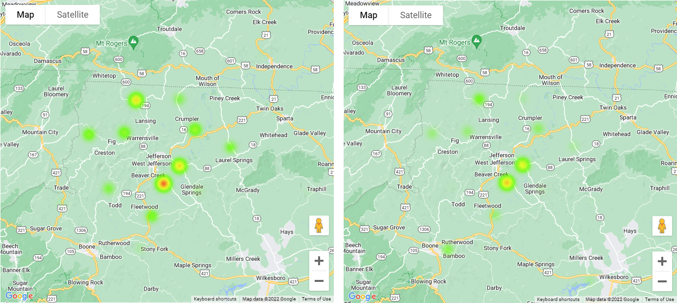
    Additionally, during our latest optimizing webinar, we highlighted our relatively new ZIP/postal code heat map feature. By asking participants to provide ZIP codes for their residence and job, the team could see trends between common commuter routes. Notice the difference in the two heat maps below:


    Ashe County Residential ZIP Codes
    Residential ZIP codes are shown on the left and primary job ZIP codes on the right. Notice how they are similar, yet residents are more concentrated in Beaver Creek and more jobs appear near Boone.


    5 Tips from the Ashe County CTP Update Survey:


    1. If you are offering an incentive, keep it local: As mentioned earlier, this survey included an option for participants to provide their email to be entered into a prize draw. The survey indicates that the prizes are local, reducing the likelihood of non-community members or bots completing the survey just for the prize.
    2. Consider bright and inviting colors: Whether you match your color palette to your branding or choose something bright and cheerful, consider that your survey colors often are the first thing that participants notice. The more they stand out, the more likely your survey will be taken. Keep in mind that surveys are often shared via a thumbnail image on social media, so the colors and Welcome Screen image have a big impact.
    3. Flow through content in a consistent sequence: You will notice when going through this survey that the topics remain the same throughout each Screen, but different activities and questions gather a variety of input. Surveys that are consistent and build on the same topic areas are often more successful. Consider that a survey may be your community’s first time learning about a particular topic, so you want to keep the content focused to avoid information overload.
    4. Ask for home and work ZIP codes: As shown above, the Wrap Up Screen included a place for respondents to provide both their primary home and work location ZIP codes. Coupled with our recent heat map feature for ZIP codes, you can easily see who you hear from and identify whether you need to target your promotion in certain underrepresented areas. Asking for both a home and work location also gives you a sense of common commuter activity.
    5. Order demographic options in alphabetical order: To ensure you are engaging equitably and fairly, always list race or ethnicity options in alphabetical order.


    The NCDOT team and the various regional sub-organizations throughout the state create some excellent MetroQuest surveys. We thank them for the opportunity to highlight this excellent CTP update survey! Make sure to check it out yourself here.


    For more great tips on how to make the most out of MetroQuest reach out for more information or, if you are an existing subscriber, contact our  Vice President, Norma Hogan.

    Check out our latest webinar where we discussed the most effective strategies for promoting and designing surveys that support diverse and equitable participation.


    Webinar_Optimizing Diverse and Equitable Public Engagement

    Optimizing Online Surveys for
    Diverse and Equitable Public Engagement


  • [SURVEY OF THE MONTH] Taking Action on Road Safety in Phoenix

    [SURVEY OF THE MONTH] Taking Action on Road Safety in Phoenix

    The Survey of the Month series is a monthly blog where we highlight the extraordinary work our customers are doing! We feature well-designed surveys and share takeaways that are relevant for anyone interested in making the most out of online engagement using MetroQuest’s survey platform. To see more in the series, visit the blogs here.

    Road safety and the goal of Vision Zero have come to the forefront of transportation planning in recent years. The idea of Vision Zero—a strategy to eliminate all road fatalities and severe injuries—started in Sweden in the 1990s and has gained traction in North America. We can all agree that safer roads, sidewalks, and bike lanes benefit everyone!

    Continue reading to learn how the City of Phoenix, Arizona, engaged over 2,500 community members and gathered precise data to inform their Road Safety Action Plan. Following this engagement process and the plan submission, Phoenix City Council unanimously approved a comprehensive Vision Zero Road Safety Action Plan on September 7, 2022, and the allocation of $10 million annually for its implementation.


    What’s the story? Thorough and Thoughtful Engagement

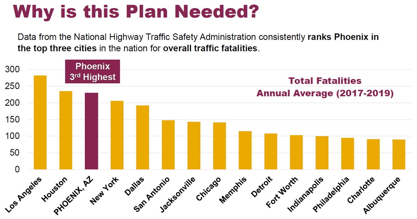
    The WSP team regularly develops outstanding MetroQuest surveys, such as the one we featured about a year ago for Illinois DOT. This time, they worked with the City of Phoenix to engage community members on their roadway experiences. Phoenix consistently ranks among the worst three cities in the US for traffic fatalities. As demonstrated in the bar graph below, an improvement in road safety and a reduction in collisions is urgently needed.


    SOTM_Phoenix road safety_Bar graph
    Bar graph showing Phoenix with the 3rd most traffic fatalities, with Los Angeles and Houston 1st and 2nd .


    We often concentrate on the survey itself, but this time, we also want to emphasize the importance of transparent public consultation processes. It is one thing to survey a community, but closing the loop and showing consideration of input is what will build long-term civic involvement and trust.

    We’ll highlight several key components and results from the Public Involvement Summary Report, but we recommend checking it out yourself!

    Before we get into the survey content, we want to point out a few key factors that contributed to the success of this initiative.


    Achieving a Cohesive and Identifiable
    Project Brand

    At the outset of the planning process, the project team developed a brand package to create a cohesive visual look for the project. Since cities must communicate about a wide array of topics, it is particularly helpful to create strong project identities.

    The brand package included: a logo, colors, fonts, letterhead, and templates for a memo, meeting agenda, fact sheet and PowerPoint presentation.

    Creating a brand package makes a lot of sense for longer-term projects and saves time in the long run, ensuring consistency across materials when a larger project team is conducting outreach. Additionally, you can leverage community group involvement by creating an outreach package for them to distribute.


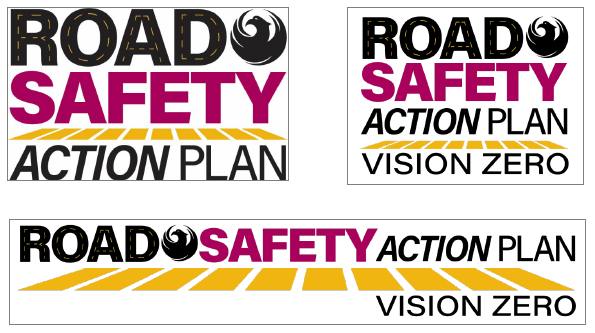
    SOTM_Phoenix road safety_road safety action plan logos
    Example logos as part of the Road Safety Action Plan branding package. The Vision Zero line was added in February 2022 following Council approval to adopt Vision Zero.
     

    Creating a One-Stop Project Webpage

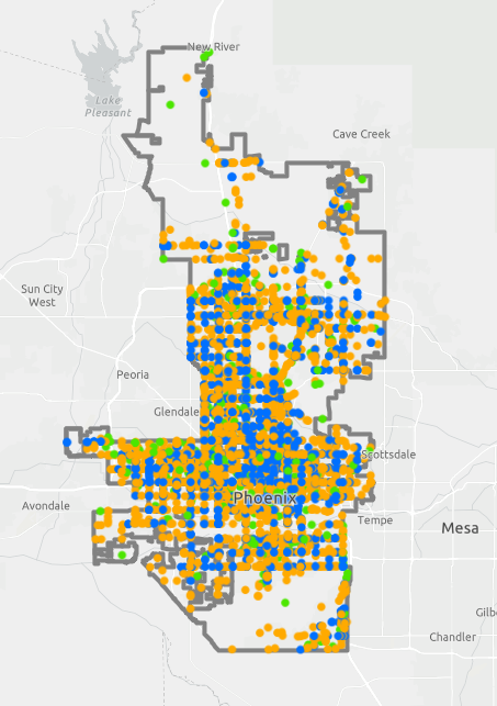
    SOTM_Phoenix road safety_ArcGIS Map
    ArcGIS map identifying areas with frequent road injuries or fatalities.
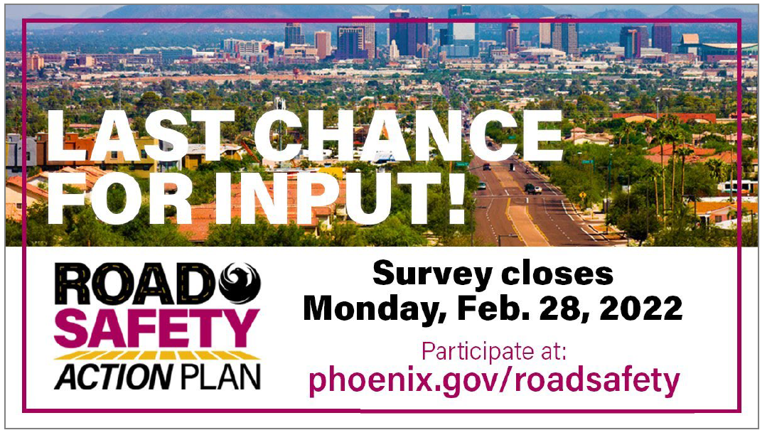
    We always recommend having a project website to host your survey information. The City of Phoenix created phoenix.gov/roadsafety as a hub for project information.

    The City of Phoenix ensured the community was informed leading up to, during, and following the engagement process. The webpage offers a feed with project updates, links to project materials and even an ArcGIS map.

    The High Injury Network (HIN) interactive map demonstrates the full scale of transportation incidents and deaths, displaying data from five years of motor vehicle crashes. Using interactive visuals to tell these devastating but true stories helps the public better understand the need for the plan.

    Additionally, the team even embedded a video to update on the plan!


    During the public involvement period, over 1,500 unique visitors viewed the project webpage.


    Leveraging Social Media and Tracking Impressions

    To ensure the community was well aware of the MetroQuest survey, they notified everyone through City newsletters and posts on the @StreetsPHX Twitter page. The project team tweeted 35 times during the engagement period, which resulted in 14,727 impressions! Social media posts were quick, visual and direct about when input needed to be submitted by:


    SOTM_Phoenix road safety_Twitter post
    City of Phoenix Street Transportation Department Twitter Post


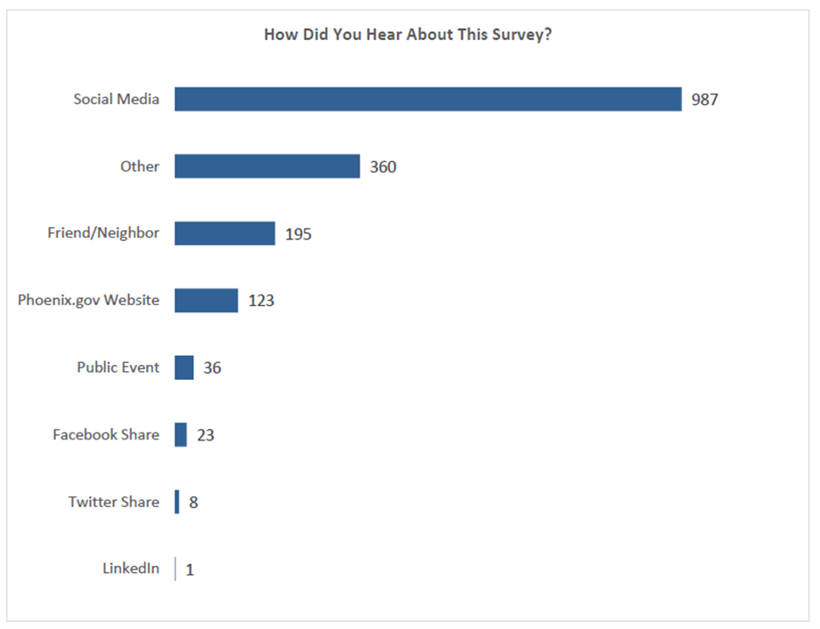
    As evident in the below bar graph, the majority of respondents heard about the survey through social media:


    SOTM_Phoenix road safety_Social media_Survey results
    57 percent of respondents heard about the survey on social media. *Based on 1,733 total responses.


    Informing the Community at Virtual Meetings

    Following the COVID-19 pandemic, MetroQuest was the primary public involvement activity during the planning process. The project team also held a virtual public meeting and community touchpoint events in six community districts.

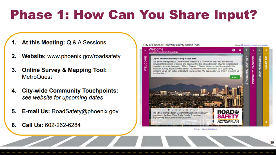
    At the live virtual public meeting in November 2021, they shared an informative, graphics-focused presentation that highlighted the need for the plan. They made it extremely easy for participants to know how to provide input by outlining the options in the presentation:


    SOTM_Phoenix road safety_Social media_presentation slide
    Presentation slide showing the six ways to provide input.


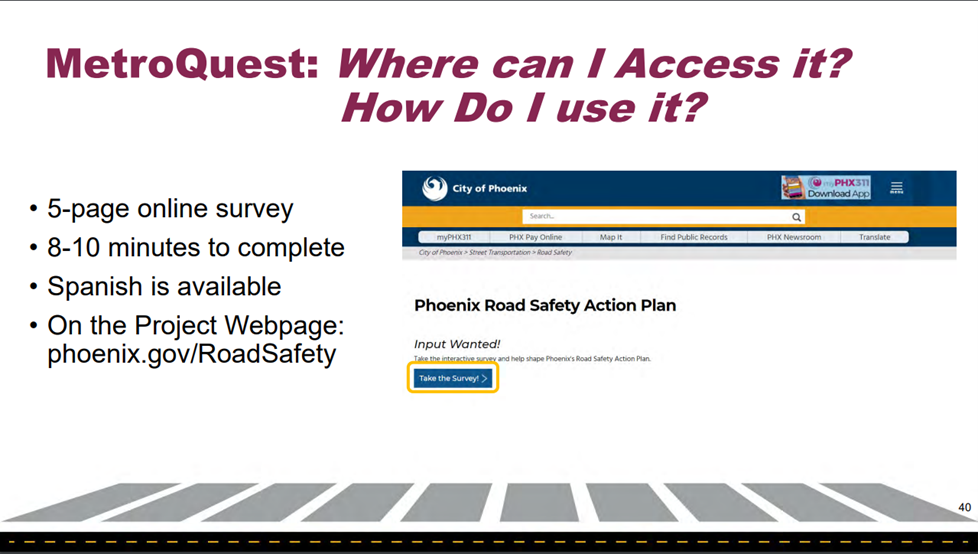
    They also highlighted where to find the online survey and noted it only takes 8-10 minutes to complete (something we love to see).


    SOTM_Phoenix road safety_Social media_presentation slide_survey launch
    Presentation slide showing where to launch the survey.


    Anatomy of a Road Safety Survey: Informing and Collecting Input to Make Roads Safer

    The Phoenix Roadway Safety Action Plan Survey was live from November 16, 2021, to February 28, 2022, allowing 15 weeks for input. When surveys are live during a holiday period, it can make sense to leave them open for longer, especially if you are supplementing with events and continuously reaching out via social media.

    In total, there were over 4,000 visitors to the survey and more than 2,500 people provided input for a conversion rate of over 60%.


    Screen 1: Welcome


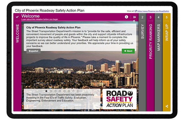
    As demonstrated above, the Welcome Screen was particularly eye-catching. In speaking with the project team, the survey was not only important for collecting input but was also used as a method for educating the community about road safety issues.

    “One of our key reasons for using MetroQuest is that it helps us educate the community as much as it helps us gather key input.”

    – Alexandra Albert, Southwest Mountain District Lead, Communication and Public Involvement at WSP

    In particular, they wanted the community to be aware of the four (now five) “E’s” of Traffic Safety: evaluation, engineering, enforcement, education and equity.

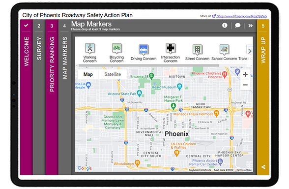
    Following the informative and inviting Welcome Screen, the survey included three main activities:

    • Standard Survey Screen: questions about safety concerns
    • Priority Ranking Screen: prioritize the focus of safety work
    • Map Marker Screen: mark locations and comment on safety concerns

    As usual, we’ll go through screen-by-screen and share some of the data the project team gathered from this initiative.


    Screen 2: Standard Survey

    We typically do not recommend starting with a Standard Survey Screen, as it is not our most exciting or engaging Screen, but it can be the best option in some instances. Here, the project team needed to gain specific details on how participants move throughout the city, their greatest safety concerns, factors for crashes and how they would most like to learn about safety issues. This information made sense to start with upfront in the survey.

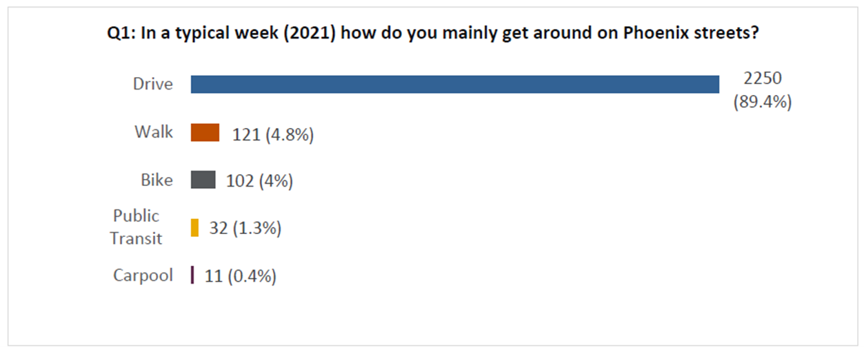
    By asking a few simple quantitative questions, they were able to quickly understand the participants’ preferences, including that the majority of them drive:


    SOTM_Phoenix road safety_Bar Graph
    Bar graph showing that 89 percent of survey respondents typically drive to get around Phoenix.


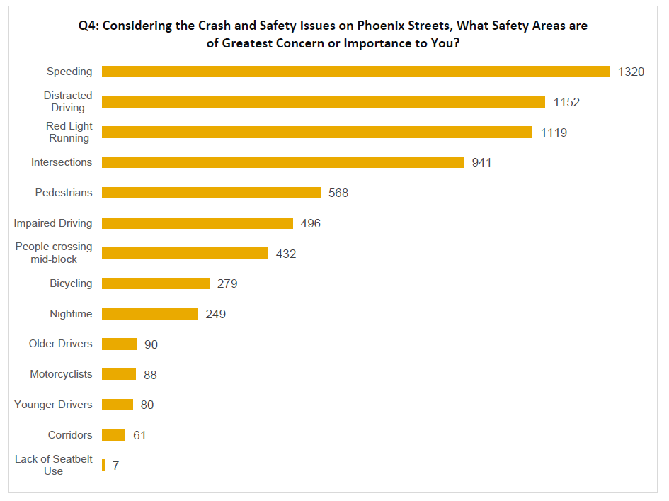
    They also learned that speeding, distracted driving and red light running were the top three safety concerns of residents:


    SOTM_Phoenix road safety_Bar Graph 1
    Bar Graph showing the greatest safety concerns.


    Screen 3: Priority Ranking

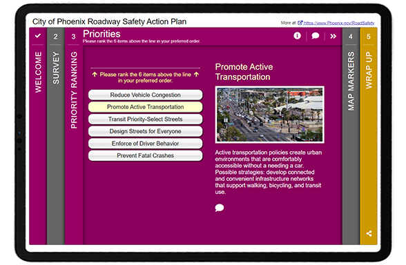
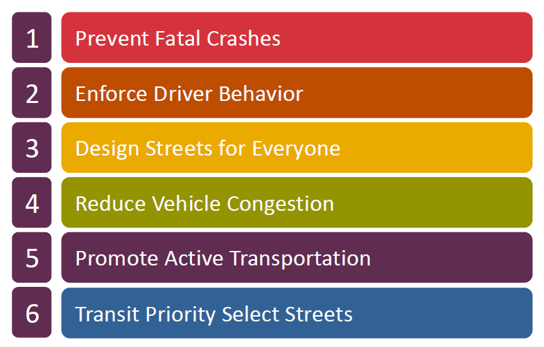
    The survey remained straightforward on the third Screen. Participants were asked to rank all six priorities:


    SOTM_Phoenix road safety_Survey Screen 3


    Following with the quantitative question format, they could quickly glean which safety actions were highest priority:


    SOTM_Phoenix road safety_fatal crash results
    Image showing that the top priority is to prevent fatal crashes.

    Did you know?
    The Priority Ranking Screen randomizes the order of the priorities every time a participant visits it, eliminating potential bias from the item sequence.


    Screen 4: Map Marker

    SOTM_Phoenix road safety_Survey Screen 4
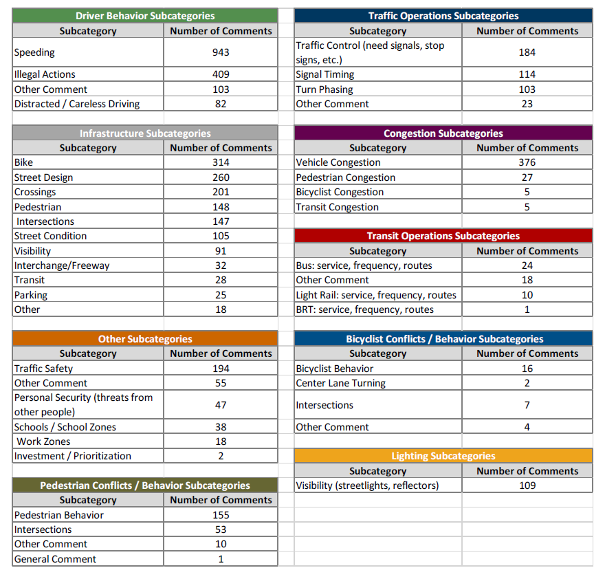
    List of categories and sub-categories based on open-ended Map Marker Screen data. The number of comments per category help quantify qualitative data.


    The Map Marker Screen was very well utilized to gather a wide variety of input on everything from walking/biking/driving concerns to transit, school and lighting concerns. They ended up receiving over 4,500 individual comments from the dropped markers.

    SOTM_Phoenix road safety_Engagement Phase Summary reportQualitative data analysis can be time-consuming but often worthwhile to gather nuanced data. Following a category-based approach, the project team analyzed the data by categories and grouped them into sub-categories. As shown in the image to the right, they pulled out key themes and organized them by comment—quantifying the qualitative data as much as possible.

    See pages 21-22 of the Engagement Phase 1 Summary Report for more details.


    Screen 5: Wrap Up

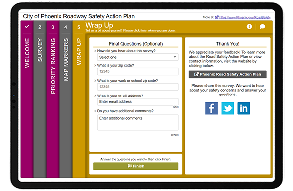
    Last but not least, the final Wrap Up Screen remained simple and quick with five key questions:


    SOTM_Phoenix road safety_Survey Screen 5


    As indicated earlier, the project team learned that most participants heard about the survey through social media. They also made sure to ask for ZIP code details to get a sense of which areas were represented through survey respondents.

    We can only highlight so much in this blog post; we recommend reviewing the project website and engagement summary report to learn more about the project. Then check out the demo link of the survey!

    To close, here are our five key takeaways you should consider for your next project!


    5 Tips from the City of Phoenix Roadway Safety Survey:


    1. Create an eye-catching branding package and stay consistent: The project team took the time to develop fun and striking project graphics. This makes such a difference, especially when tied in with the colors in the survey! People are visual, and you need something that stands out when someone scrolls through their feed. With longer-term projects and initiatives, having an instantly recognizable look adds a level of professionalism and ensures those you engage initially will be on the lookout for future materials and surveys.
    2. Consider your survey as an educational tool: Surveys are more than just a way to gather input; in many cases, they are the first time someone learns about an initiative. Consider your Welcome Screen content carefully and keep it light, fun and engaging. The better your community understands a project, the more impactful input will be.
    3. Track your social media and website impressions: Launching Facebook, Instagram or Twitter ads goes past the initial setup process. Ensure you check back regularly and assess campaigns after they close to determine their effectiveness. Use this data to inform future engagement endeavors and outreach.
    4. Use your project webpage to update the community continuously: We ALWAYS recommend developing a project webpage to house your project information, survey link, and any documents once your survey closes. MetroQuest survey links are not searchable online, so you need to create a webpage or site for the project. Consider updating your project website regularly as the project progresses. Showing a timeline can help participants gauge the scale of the project. We also recommend using maps, visuals and video to keep things interesting!
    5. Quantify your qualitative responses: Qualitative data is inherently more time-consuming to analyze but can elicit thoughtful, nuanced information. After reading several open-ended comments, you can learn a ton about overall community sentiment and opinions. When analyzing thousands of responses, tally comments by key themes and subthemes; this will help you quantify the responses, report on them fairly and get a sense of what matters most to the community.


    We are honored to feature this survey! As noted earlier, the transparency of sharing survey results and comprehensive amount of information on the project website truly sets this project apart.

    Congratulations to the City of Phoenix and WSP team for the excellent response, and kudos to Council for adopting a Vision Zero Strategy. Motor vehicle accidents sadly affect many, and we are always glad to see MetroQuest utilized for initiatives that will make roads safer.


    For more great tips on how to make the most out of MetroQuest reach out for more information or, if you are an existing subscriber, contact our Vice President, Norma Hogan.

    Check out our latest webinar where we discussed the most effective strategies for promoting and designing surveys that support diverse and equitable participation.


    Webinar_Optimizing Diverse and Equitable Public Engagement

    Optimizing Online Surveys for
    Diverse and Equitable Public Engagement


  • [SURVEY OF THE MONTH] Gathering Stakeholder Input for Future EV Infrastructure in Maryland

    [SURVEY OF THE MONTH] Gathering Stakeholder Input for Future EV Infrastructure in Maryland

    The Survey of the Month series is a monthly blog where we highlight the extraordinary work our customers are doing! We feature well-designed surveys and share takeaways that are relevant for anyone interested in making the most out of online engagement using MetroQuest’s survey platform. To see more in the series, visit the blogs here.

    Continuing with the theme from our recent blog post, The Future of Electric Vehicles in Transportation Planning: An Interview with Andrea Noel about Tennessee’s electric vehicle survey, this month, we are featuring a survey developed jointly by the Maryland Department of Transportation (MDOT) and the Maryland Energy Administration (MEA).

    Join us as we learn how MDOT and MEA gathered strategic input from key stakeholders and the public to inform their State Plan for National Electrical Vehicle Infrastructure (NEVI).


    What’s the story? Applying for EV Infrastructure Funding

    The NEVI Formula Program was established in 2021 as part of the Infrastructure Investment and Jobs Act (IIJA) and provides funding dedicated to implementing electric vehicle (EV) charging infrastructure. This major US-wide program comprises up to $7.5 billion total funding allocated between states.
    Every state is required to submit a deployment plan before using any of its allocated federal funding to develop EV infrastructure. Maryland, in particular, has been consistently listed as a leader in transportation electrification. As is evident with this survey and the plan, they put a significant amount of time and resources into collaborating and coordinating efforts for improved EV infrastructure.

    To directly inform the plan, MDOT and MEA sought input from stakeholders and the public through a MetroQuest survey launched in March 2022 that remained open for just over four months. The project team received input from 293 participants at the time of submitting the NEVI plan and ended up hearing from an additional 500 people before the survey closed. The survey results will continue to inform the development of the NEVI program.


    The MetroQuest survey helped us better understand where communities and stakeholders would like to see publicly available EV charging stations. This will help Maryland prioritize installations along corridors and will be useful in the future as we move from corridor-based charging installations and into communities. This information will help us communicate priorities with site hosts and other partners interested in installing infrastructure

    – MDOT Project Team


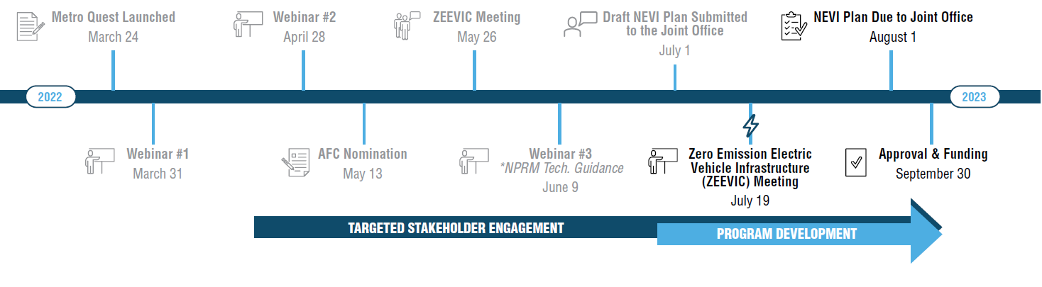
    NEVI Planning Timeline
    NEVI Planning Timeline


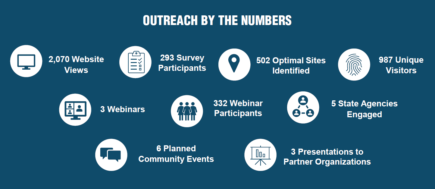
    MDOT and MEA were able to reach a broad audience through advertising on their existing websites and social media channels. Additionally, interagency consultation and coordination were instrumental in expanding the survey’s reach and contributed greatly to a boost in responses in July. As with many projects, the survey was just one aspect of a comprehensive outreach program:


    Community and stakeholder outreach key numbers.
    Community and stakeholder outreach key numbers.


    The ZEVIP survey was not MDOT’s first EV-related MetroQuest survey. In 2019 they engaged local governments  1 about EV infrastructure and gathered input from over 1,500 participants on their EV Workplace Charging survey in March 2020. These previous surveys identified EV-related challenges encountered by local governments and optimal charging locations—input that helped inform the ZEVIP survey and plan.

    Follow along as we share key aspects of MDOT’s ZEVIP survey below. We also encourage you to check out their fantastic project website and NEVI plan for more details.


    Anatomy of an Electric Vehicle Plan Survey: Gathering Key Criteria and Location-Based Data

    Given the need to directly inform a plan to access state funding, the MetroQuest survey contained very specific questions and asks. The combination of a Strategy Rating, Standard Survey and Map Marker Screen resulted in specific quantitative input and geographic data on preferred EV charging locations.

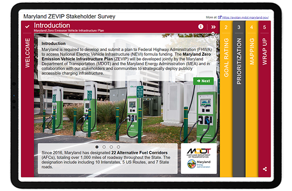
    The survey is identifiable from the start as it welcomes you with a photo showing electric vehicle charging stations. The color scheme matches the branding, and the concise but explanative introduction shares the purpose behind the survey and key facts such as, “as of February 28, 2022, there are over 43,700 EVs registered in Maryland. Over the last 12 months, Maryland has been averaging over 1,100 new EVs registered per month.”.


    MDOT ZEVIT Survey welcome screen


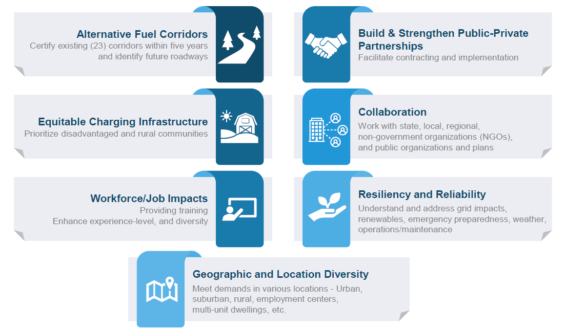
    Following the initial Welcome Screen, a Strategy Rating Screen was used to gather input on seven key goals, as displayed below. The Strategy Rating Screen is one of our most popular Screen options as it allows project teams to gather quantitative input on a series of statements such as goals or project priorities. It is an excellent choice for projects in the initial planning phase when you are determining priorities and overall sentiment.


    MDOT ZEVIP Goals


    For the middle Screen, they utilized the adaptable Standard Survey format. While Standard Survey Screens don’t offer the same interactivity and gamification as some of the other MetroQuest Screen options, in some cases they offer the flexibility needed to ask a series of varied multiple choice, checkbox and textbox questions.


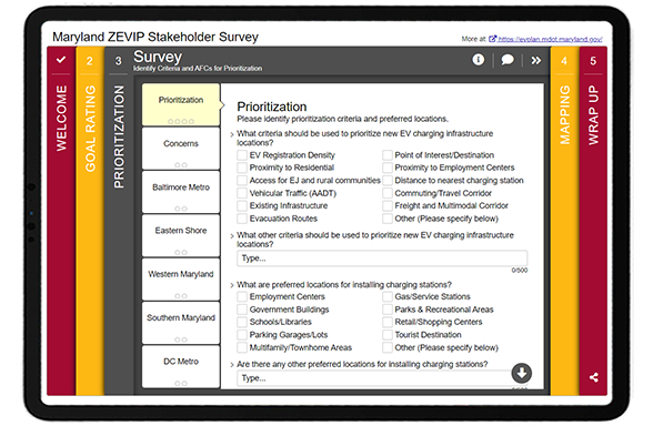
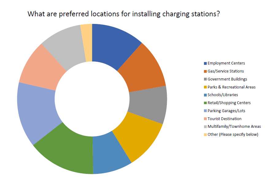
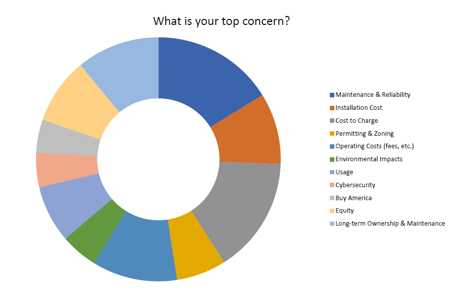
    As evidenced here, MDOT and MEA were able to gather a wide variety of input on prioritization criteria, preferred locations for charging stations, concerns, as well as preferred Alternative Fuel Corridors 2 (AFC).


    MDOT ZEVIP Criteria Data
    MetroQuest survey results for preferred charging station locations, identifying parking garages/lots and retail/shopping centers as top locations.


    MDOT ZEVIP Concern Data
    Participants were asked to identify any concerns that they thought could prevent Maryland from achieving the vision and goals of the ZEVIP. Buy America and maintenance/reliability came out on top.


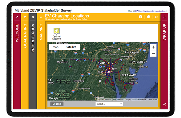
    Like many successful MetroQuest surveys, they used a Map Marker Screen where participants could drop pins at optimal locations for EV charging on a Google map. Participants were asked to indicate the type of site and provide additional details.


    Location zoom feature
    Location zoom feature

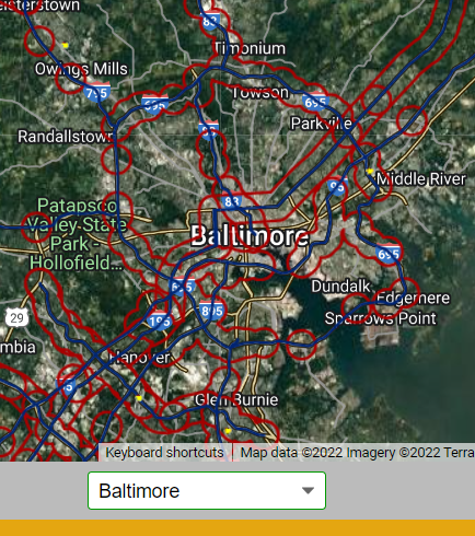
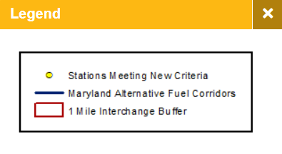
    MDOT ZEVIT Survey LegendNote the use of a legend to explain the KMZ layer markings and the pre-set location options allowing participants to quickly zoom into popular areas like Baltimore. These features make this exercise easier for participants, especially those taking the survey on their phone and ensures that participants are providing input in the appropriate map areas.


    MDOT ZEVIP Site identified
    EV sites identified through Map Marker Screen input.


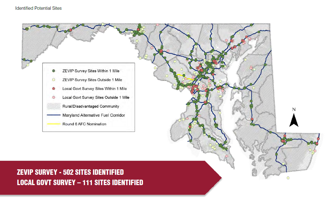
    As demonstrated in the above map, the Map Marker Screen provided valuable location-specific data for the team to understand exactly where EV infrastructure is needed. Since the survey remained open after the plan submission, they ended up with over 1,200 dropped pins!

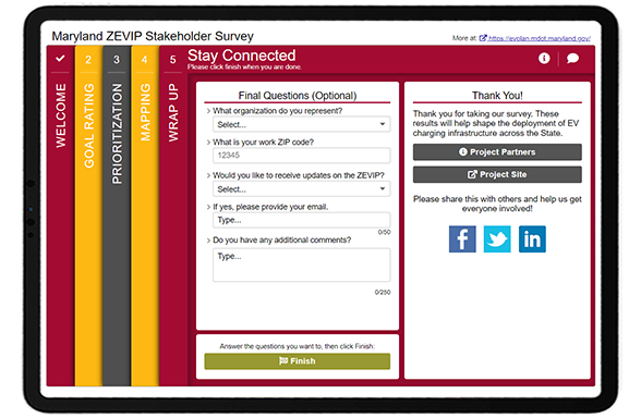
    To close, the team kept things relatively simple on the Wrap Up Screen with a question about their affiliation or organization, ZIP code, a place to sign up for email updates and a box for additional comments.


    MDOT ZEVIT Survey_wrap up screen


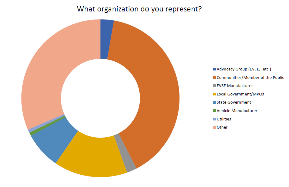
    Through questions such as, “what organization do you represent”, the project team had a good sense of who they heard from:


    MDOT ZEVIP representative Organizations
    Data showing the variety of stakeholders engaged.


    Click through this demo version of the survey to see exactly how MDOT and MEA sought EV input!


    5 Tips from the Maryland ZEVIP Survey: A perfect fit for
    a Map Marker Screen


    1. Work with partner agencies to broaden your survey’s reach: We’ve consistently seen surveys garner great response rates thanks to cross-agency coordination. Rather than relying on your organization’s networks alone, contact related agencies across your area and stakeholder organizations. It can help to provide pre-developed messaging and graphics, so they don’t need to put in any effort to spread the word about your survey.
    2. Make the most of your Welcome Screen: The Welcome Screen sets the tone for your survey. This survey is an excellent example of well-crafted background information that is informative yet concise. The background image is relevant, recognizable and the overall color scheme meshes well with the organization’s logo.
    3. Consider the Standard Survey Screen when you need to gather varied data: We generally recommend customers try to avoid the Standard Survey Screen due to its lack of context and interactivity, but occasionally, it can be a very helpful addition. This Screen allows you to ask a mix of checkbox, multiple choice and comment questions on a series of tabs. We recommend using a Standard Survey Screen near the end of your survey to keep the initial Screens as engaging as possible.
      Tip: boost the appearance by embedding an image in one of the text fields!
    4. Spend time developing a very clear KMZ/KML layer for the Map Marker Screen: This is one of the most intricate and well-implemented KMZ layers we have seen. It clearly shows the routes for alternative fuel corridors and ensures participants know to drop markers within the burgundy-colored one-mile buffer zone. Having a GIS expert at your organization create a quality KML/KMZ layer defining the project or area for input is worthwhile. No fret, it is easy to create this file even if you aren’t an expert with GIS files—our support site has a step-by-step guide (search “KMZ”).
    5. Make use of the additional features to increase the ease of the mapping exercise: If you are using a KMZ/KML layer in your map, it’s integral to include a clearly labeled legend to guide participants. Additionally, for statewide projects or initiatives covering a large geographic area, adding location dropdowns to zoom into sub-locations speeds up the exercise so participants can navigate to certain cities or sites quickly.

    Thank you to the MDOT and MEA team for the opportunity to highlight this unique and well-designed survey!

    We are delighted that we could feature another excellent EV survey! If you are a MetroQuest customer, keep an eye out for our EV survey template launching in October – you can use it as a base for your next EV survey.

    For more great tips on how to make the most out of MetroQuest reach out for more information or, if you are an existing subscriber, contact our  Director of Client Services, Norma Hogan.


    To learn more about how agencies like Tennessee DOT and Memphis MPO coordinate their public engagement efforts, check out our most recent webinar!

    TDOT & Memphis MPO_Webinar

    Exploring TDOT and Memphis MPO’s
    Next Level Public Involvement Strategy 


    In this webinar, we highlighted how local and state agencies are working together to engage the broader Tennessee community with a deep dive into the Memphis MPO’s Regional Transportation Plan, Moving Together 2050!


    Sources:
      1. 2019 and 2020 surveys were developed and launched with our previous software version, MetroQuest Classic. The design and some features will vary.
      2. AFC’s are national corridors designated for alternative fueling and charging infrastructure such as EV charging, compressed natural gas, liquid natural gas and hydrogen.
  • 5 Equitable Community Engagement Tactics: What to Expect from #VPET22

    5 Equitable Community Engagement Tactics: What to Expect from #VPET22

    The last two years have sparked important conversations regarding equity and equality in the planning industry. As the world increasingly leans more into virtual experiences, community engagement strategies should naturally become more creative, diverse and inclusive.

    At MetroQuest, we are interested in having critical and educational discussions surrounding the future of public engagement. We are living in a pivotal moment when conversations surrounding equity are being pushed to the forefront of community engagement projects. The use of in-person and online engagement strategies is more essential than ever.

    To support that ongoing conversation, we’re excited to host our second Conference on Virtual Public Engagement Planning for Transportation Planning (#VPET22), kicking off this month! We’ll have speakers from NCDOT, TxDOT, WSP, HDR, Broward Metropolitan Planning Organization and more share their case studies, challenges, and lessons learned around public engagement. As we look forward to the discussions and best practices for implementing ways to reach underserved and marginalized communities, I want to share 5 tactics that will help you better engage your community and achieve equitable results. Let’s get started…


    Valuable equitable community engagement tactics:


    Get To Know the People You Serve

    The key to equitable decision-making relies on knowing the priorities of the people in your community. Pay attention to all demographics in your community regardless of race, age, or gender identity, and create avenues to include their input meaningfully. Look into their preferred communication methods, whether it be online through social media or if they value face-to-face interactions through community meetings. Do they have their own meeting areas and networks in place? Going out of your way to engage with your audience is a great first step to establishing trust and transparency between both parties and leads well into other equitable community engagement tactics.


    Increase Accessibility

    Lack of inclusion leads to inequitable results. Consider the different types of people in your community and how to give everyone an equal opportunity to participate. Increasing accessibility means more than offering in-person and online surveys. Barriers such as language, disabilities, transportation, socioeconomic status, access to technology and time often prevent people from engaging. Look at your initial survey results, for example, and analyze the data to understand which parts of the community are underrepresented in your public engagement so far. Brainstorm alternative methods that allow more people to participate in ways that are best suited for them. As a result, your engagement will be more inclusive, and you’ll end up with more robust data from more of the community.


    Hold Yourself Accountable

    Reflect on past community engagement projects and review the responses. Do these results reflect all the demographics in your community? Were there unconscious barriers that prevented participation? The journey to inclusive outreach and equitable engagement means reflecting on missteps in the past to inform future strategies. Crafting a survey that is equally effective and comprehensible is important, but maybe the language was still too opaque for the audience you wanted to reach. Developing a culture of engagement in communities, such as diversified meetings, events and promotional campaigns, is another important tactic for equitable community engagement, but maybe the choices offered weren’t right for your area. Confronting flaws in past engagement projects and bettering them will lead to better outreach, input that’s more representative of your community, and ultimately more thoughtful planning and sustainable decision-making.


    Build Community Trust

    Building trust in a community that has been historically underserved or disadvantaged takes time. But, as always, actions speak louder than words. If underserved or marginalized populations in your community feel mistreated or neglected, prove to them that you are listening. Showcase your results so members can see firsthand how their input is implemented into transportation plans. Become a trustworthy presence in your community by showing their needs are being prioritized in official planning.


    Create New Traditions

    Planners can no longer rely solely on traditional public engagement methods and instead must be as adaptable as possible. Remember, community engagement tactics are never one-size-fits-all. Get creative and embrace the inevitable changes as we shift to more hybrid engagement planning, particularly as we strive for equitable community engagement. Equitable results are a sign of strong community engagement efforts. They are increasingly achievable as the planning industry develops more robust tactics and shares best practices during this crucial development period in virtual engagement.


    We’ll have case studies, best practices, and more tips for equitable community engagement, tools and techniques for success, and more at VPET22! For more information on the Conference on Virtual Public Engagement for Transportation Planning, check out our conference website.

    If you haven’t already, click here to register to attend! If you have any specific questions, please don’t hesitate to reach out directly to us at events@metroquest.com.

  • [SURVEY OF THE MONTH] Seeking Input on Transportation Improvements in York County, PA

    [SURVEY OF THE MONTH] Seeking Input on Transportation Improvements in York County, PA

    The Survey of the Month series is a monthly blog where we highlight the extraordinary work our customers are doing! We feature well-designed surveys and share takeaways that are relevant for anyone interested in making the most out of online engagement using MetroQuest’s survey platform. To see more in the series, visit the blogs here.


    This month, we are featuring a Transportation Improvement Program (TIP) survey! The York Area Metropolitan Planning Organization (YAMPO) designed a highly interactive five-minute survey that gathered over 9,300 unique data points and provided insightful data to inform future transportation improvements. Read on to see how measurable data will help inform future transportation investments in York County!


    What’s the story? Identifying Transportation Investment Opportunities

    Located in south-central Pennsylvania, York County is a historic area with a population of around 450,000 people. 1

    The TIP is updated every two years and proposes how transportation investments should be spent over the next four or more years. Often, TIP surveys will seek input on a list of projects to determine how funding should be spent. Investment decisions are then agreed upon by YAMPO, a decision-making body for all federally funded transportation projects in York County.

    In this case, rather than asking for input on certain projects, YAMPO opted to gather input on project types for future TIPs.

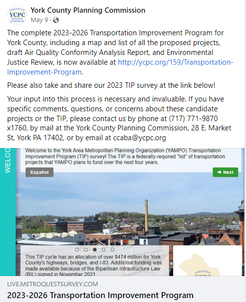
    Survey promotion on Facebook
    Survey promotion on Facebook

    To drive traffic to the survey, the project team used Facebook advertisements and posts as their primary outreach method – a strategy that always helps reach intended audiences. The project team also shared information about the survey with County Commissioners and other committees during the public comment period. Additionally, they put up printed posters in areas that were less likely to be reached digitally.

    Diverse outreach and an emphasis on social media led to YAMPO receiving over 600 survey responses!

    For more information on the York County TIP, visit the project website.


    Anatomy of a TIP Survey: Quantifiable Questions Yield Clear Priorities

    As mentioned earlier, this survey used a different approach for TIP feedback, focusing on community priorities and perspectives rather than prioritizing proposed projects.

    Open this survey demo link to follow along as we go through each survey Screen!


    Screen 1: Welcome

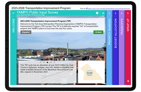
    The Welcome Screen concisely explains the purpose of the survey, what a TIP is, and how input will benefit residents. As with any survey featuring an additional language, the Spanish survey is linked on the top left so participants can navigate to that version, if preferred.


    YCPC Survey Welcome Screen


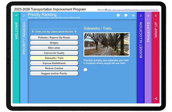
    Screen 2: Priority Ranking

    As with many quality MetroQuest surveys, the survey starts with the Priority Ranking Screen, collecting input on eight investment priorities to quantifiably identify what matters most to participants.


    From the graph below, it’s clear that the community would like to see potholes and old roads repaved, with 37 percent of respondents setting it as a top priority. 

    Participants also had the option to write “something else” and rank it as a priority – an excellent idea to allow residents to share their unique ideas.  


    Bar graph indicating the percentage of respondents that selected each item as a top priority.


    Screen 3: Budget Allocation

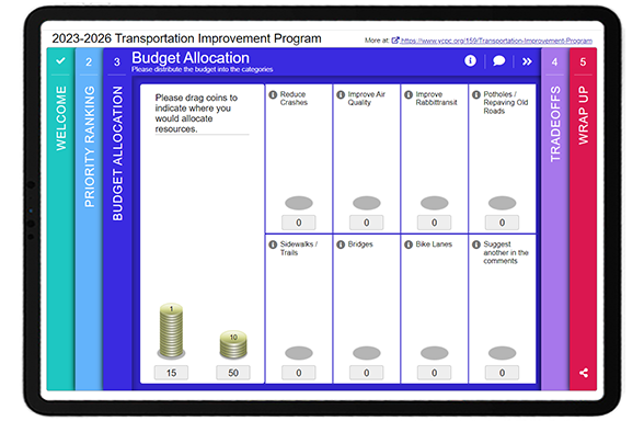
    Continuing with a similar theme, the third Screen asks participants to allocate budget to the same eight topics covered in the Priority Ranking screen. Rather than ranking each item comparatively, this game allows each participant to allocate coins worth either one point or ten points. Participants drag and drop each coin into a category to allocate the budget. This fun exercise is a great option if you are seeking input on investments as it makes the respondent consider how they would invest funds and demonstrates that budgets are finite.


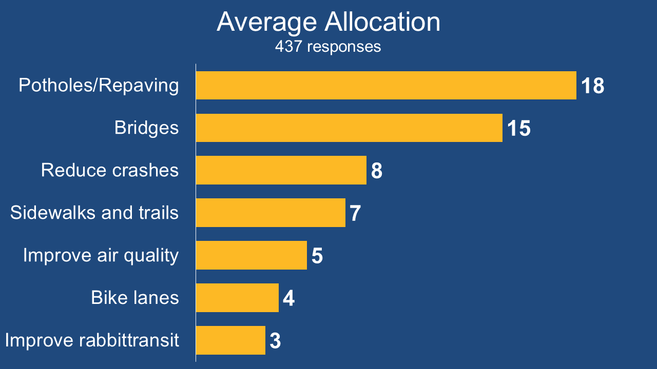
    The results of this Screen reconfirmed the findings from the initial Priority Ranking exercise, with the same three improvements coming out on top again: potholes/repave old roads, bridges and reduce crashes. This data provided a very definite conclusion on what matters most to the community and what types of projects should be funded. 


    Bar graph indicating the average total value of coins allocated to each category.


    Screen 4: Tradeoffs 

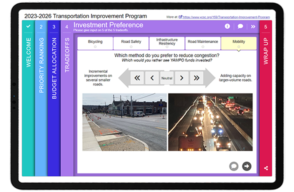
    The Tradeoffs Screen is an excellent choice if you want participants to compare two circumstances against each other. Respondents go through a set of questions and can indicate which one out of each set of two they prefer.  


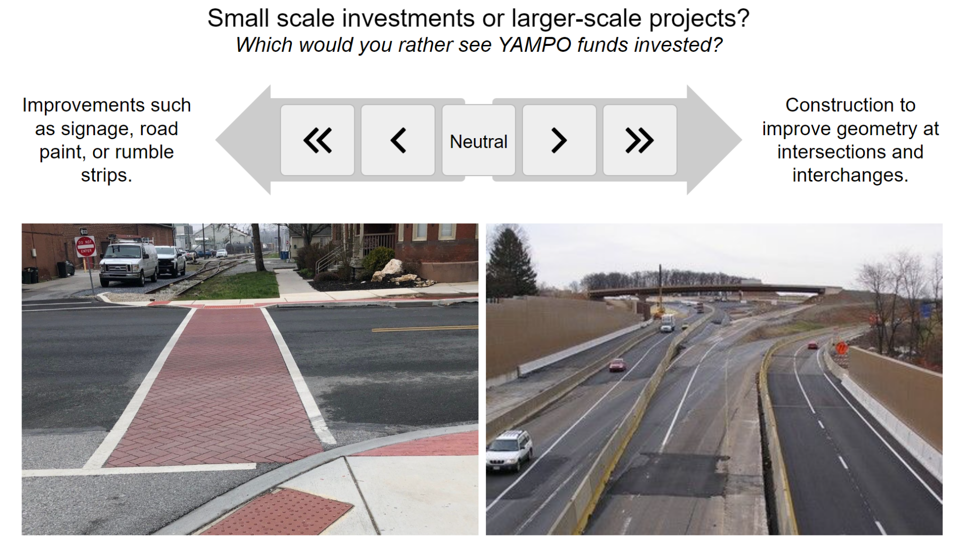
    YAMPO asked participants to evaluate five scenarios. For instance, comparing the scale of projects: 

    Example scenario on Tradeoff Screen, asking whether participants prefer small scale investments such as visual improvements, or larger scale projects such as geometric improvements at intersections/interchanges.


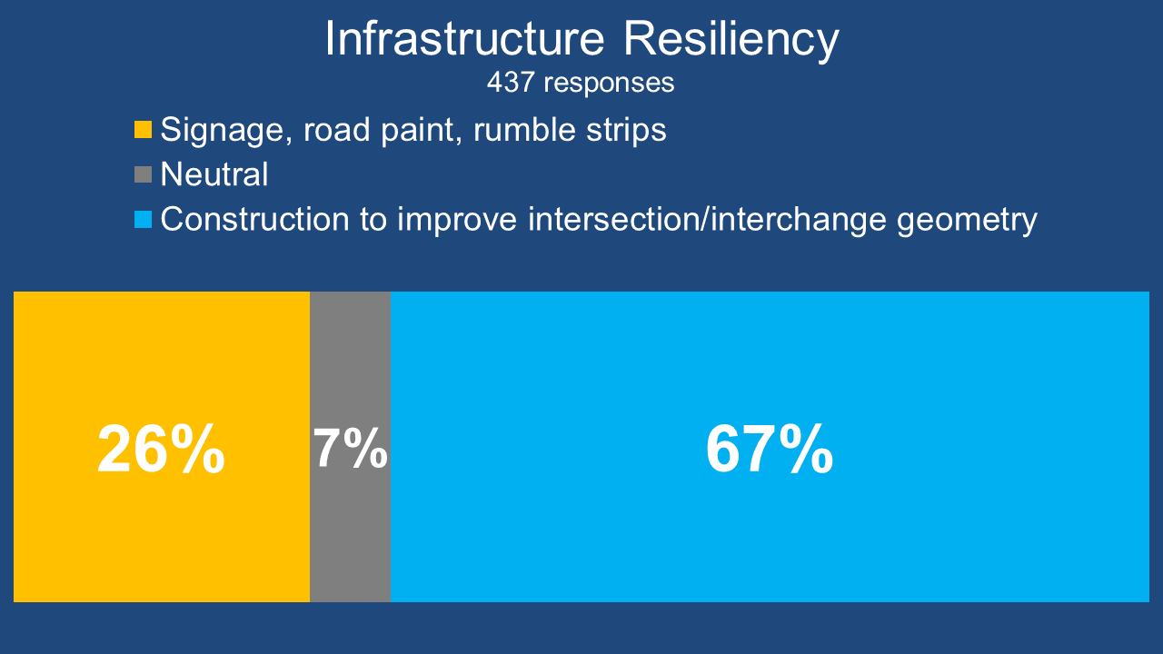
    In response to the tradeoff above, 67 percent of respondents indicated they preferred construction to improve intersection and interchange geometry rather than improvements to signate, road paint and rumble strips: 

    Segmented bar graph showing that 67 percent of participants preferred construction to improve intersection/interchange geometry.


    Screen 5: Wrap Up 

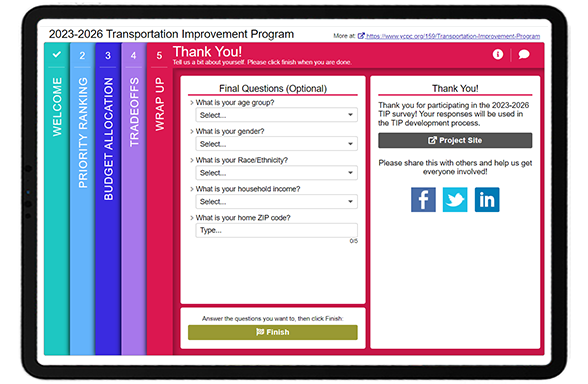
    On the final Wrap Up Screen, the team kept things simple by asking five demographic questions: quantitative dropdown questions about age, gender, race/ethnicity and income, as well as a spot to enter a ZIP code.  


    By asking standard demographic questions, they could compare respondent demographics to the median ages, income and ethnicities in the county.  

    The quantifiable nature of the survey allowed the team to quickly tabulate the results and share them at the MPO Board meeting, with an incredible turnaround time of just four days after the survey closed! This truly exemplifies why it’s so beneficial to collect close-ended data. The emphasis on quantitative questions allowed for an efficient analysis of data, and participants still had many opportunities throughout the survey to share comments in the comment bubbles.


    Make sure to check out this demo version of the survey!  


    5 Tips from York County’s TIP Survey: Simple and Quantifiable Questions  

    1. Significant, long-term projects don’t require complex surveys: It’s logical to think that the broader and more significant the investment, the lengthier the survey needs to be, but that is not usually the case. The York County TIP survey exemplifies how a survey about funding and planning for the next four years didn’t need to be complicated. Rather than requiring the community to evaluate many projects, the team took the opportunity to determine what priorities and improvements matter to residents. This approach ensures that future investments reflect the broader opinions of the community rather than preferences based solely on project location or benefits to certain residents.  
    2. Stick to primarily quantitative questions: We know we are repeating ourselves but collecting quantitative data pays off. As mentioned above, the project team was able to compile results and create a presentation to share at their MPO Board meeting only a few days after the survey closed. Surveys don’t have to interfere with project timelines and can yield insightful findings quickly!  
    3. Consider budgetary Screens for investment-related topics: Our Budget Allocation and Funding Balance Screens put participants in your shoes with regards to your agency budget. Participants are forced to make choices within budgetary constraints to allocate funds as if they were in your situation. These types of questions not only provide a fun exercise but also help the community understand that tradeoffs are necessary when determining how to allocate funds for transportation improvements. 
    4. Digital advertising goes a long way: Predominantly, surveys that garner hundreds or thousands of responses include some form of social media advertising. Facebook, Instagram, Twitter and LinkedIn offer platforms to easily spread the word about the survey, and target who you are hoping to reach geographically or demographically with minimal investment required. It’s never been easier to inform the community about a survey. 
    5. Final questions should take just a few seconds: When someone has spent at least five minutes on a survey, the last thing they want to encounter is a long series of personal questions at the end. Respect your participants’ time by keeping things simple. YAMPO asked about age, gender, race/ethnicity, income and location in just five questions; this is plenty of information to determine if you are reaching a diverse audience and provides various options to cross-tabulate the data to see potential demographic trends. 


    Thank you to the team at the York County Planning Commission for taking the time to share key details and the survey results/graphics featured in this post! We commend them on this superb survey! 


    For more great tips on how to make the most out of MetroQuest reach out for more information or, if you are an existing subscriber, contact our  Director of Client Services, Norma Hogan. 

    To learn more about how agencies like Tennessee DOT and Memphis MPO coordinate their public engagement efforts, check out our most recent webinar! 


    TDOT & Memphis MPO_Webinar

    Exploring TDOT and Memphis MPO’s
    Next Level Public Involvement Strategy


    In this webinar, we highlighted how local and state agencies are working together to engage the broader Tennessee community with a deep dive into the Memphis MPO’s Regional Transportation Plan, Moving Together 2050!  


    Sources
    1. 2020 United States Census.