[SURVEY OF THE MONTH] Over 90,000 Data Points Inform Mobility Improvements for the US 27 Corridor

The Survey of the Month series is a monthly blog where we highlight the extraordinary work our customers are doing! We feature well-designed surveys and share takeaways that are relevant for anyone interested in making the most out of online engagement using MetroQuest’s survey platform. To see more in the series visit the blogs here.
This month we highlight a survey developed by long-time MetroQuest subscriber Kimley-Horn in collaboration with RS&H, on behalf of the Florida Department of Transportation (FDOT).
We are eager to share this success story of a survey that played a big part in helping a study team understand transportation issues along a corridor and prioritize areas for mobility improvements. At MetroQuest, we love hearing of projects where survey feedback is considered alongside technical data to define project priorities and identify infrastructure improvements. It’s proof that gathering actionable data and informed input is possible! When millions of dollars are being invested in transportation improvements, understanding issues impacting commuters and the needs of community members and stakeholders is critical.
What’s the Story? Representative Feedback and Thousands of Data Points
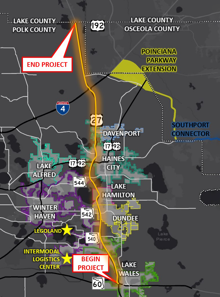
Map showing the project area along US 27. The project begins at SR 60 near Lake Wales and ends at US 192 at the Polk/Lake county line.
From late May to early September 2019, the On Time with 27 Survey was launched to gather input to inform the Northeast (NE) Polk US 27 Mobility Study. The study sought to define a multimodal program of projects and strategies to improve mobility, safety and livability within the US 27 corridor and adjacent areas.
The project area, outlined in this map, included the US 27 regional north-south corridor extending 32 miles within the Polk County area in southwest Florida. Every day, approximately 60,000 vehicles use this portion of the US 27. Given the large area and varied use of this corridor, it was essential that a diverse group of community members and stakeholders were consulted to identify issues and brainstorm potential improvements.
Achieving high impressions and low cost per participant
As we often see with surveys that garner many responses, the project team implemented a geographically targeted social media campaign to capture anyone passing through the corridor area. This approach was fundamental for reaching a diverse range of commuters and residents as many people who use the corridor do not live nearby. They supplemented social media content and advertisements with email list outreach, city website posts, and more traditional tools, such as rack cards distributed at popular locations, utility bill inserts, a banner at Florida hospital and distribution at city hall.
Social media advertisements focused on promoting the survey with clear instructions and messaging to resonate with commuters. For example, the social media campaign below was shared by the project team, and garnered over 139k impressions.
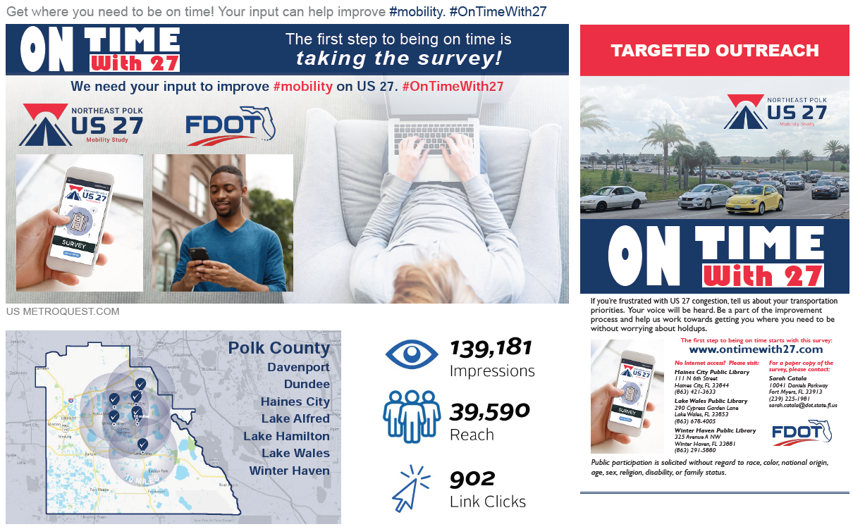
The project team analyzed their outreach cost for promoting the online survey and compared it to the typical cost of hosting a public meeting. With the online survey, the cost per participant was just $15.68; 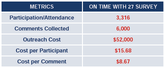 significantly more cost-effective and accessible than a typical public meeting where the average cost per participant can be upwards of $1,000 – $2,000. Additionally, online surveys typically yield significantly more data compared to input gathered at public meetings.
The below graphic shows the progression of survey responses during the time the survey was open for input. As with most surveys, the majority of responses were received within the first few weeks of the survey being live. The additional peaks correlate to times when the project team launched advertisements, demonstrating how important it is to develop a varied campaign with multiple strategic outreach points throughout the engagement period.
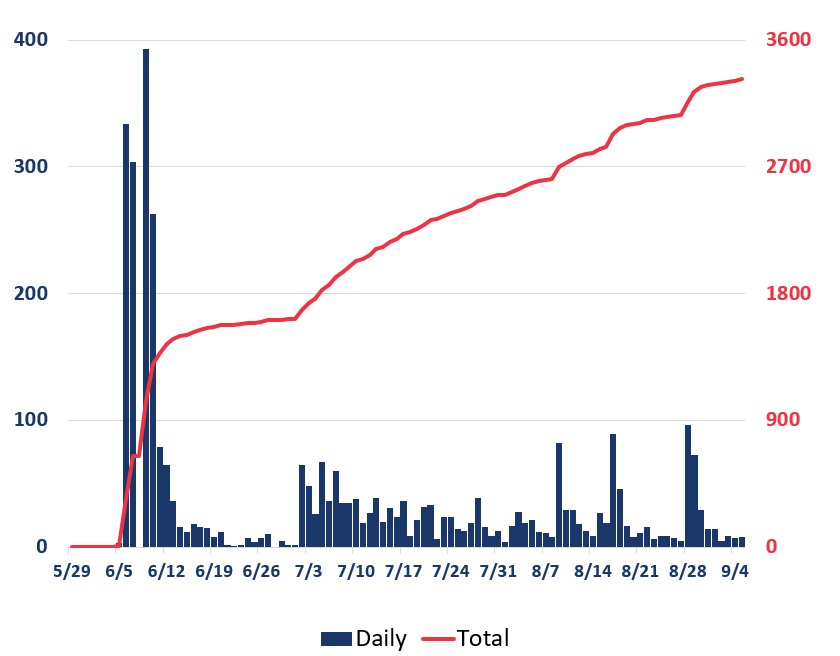
Bar and line graph showing survey participation levels during the engagement period. Participation was highest during the weeks of June 5 and 12. Later on, participation increased on days with more outreach but remained relatively steady.
Gaining key insight into transportation issues with survey results
Following an extremely successful engagement period, the study team analyzed the survey results and was able to gain key insights into transportation issues in NE Polk County. With feedback from over 3,000 participants resulting in 96,000+ unique data points and more than 6,000 comments, the team had an extensive amount of data to review and incorporate into their study.

Graphic showing the project logo and icons representing 3,322 participants, 96,000+ data points and 6,000+ comments.
The survey results were mapped, analyzed, and compared to technical study results to identify commonalities and differences. The additional data from the survey helped the project team reaffirm areas in need of improvement and identify any other potential issues to address. In the end, the volume of survey participants and data was a critical factor in helping FDOT and the multi-jurisdictional stakeholders embrace the outcomes of the corridor study, decide where improvements are most needed and move forward with planning future improvements to the corridor.
To learn more about the study, visit the NE Polk US 27 Mobility Study page.
Anatomy of a Corridor Mobility Survey: A Personalized Approach Gathers Great Feedback
Now that we have shared the great impact this survey had on the study, we will cover the survey layout and some key features.
With traffic congestion being a known issue, the survey asked for input on a number of priorities and strategies to improve mobility. This simple yet specific survey format allowed the project team to gather valuable data while keeping the survey quick to complete.
Additionally, the Priority Ranking Screen was connected with the Strategy Rating Screen, a feature unique to MetroQuest where the information on the following Screen is customized for each participant based on the priorities they select. We will go into more detail about this later.
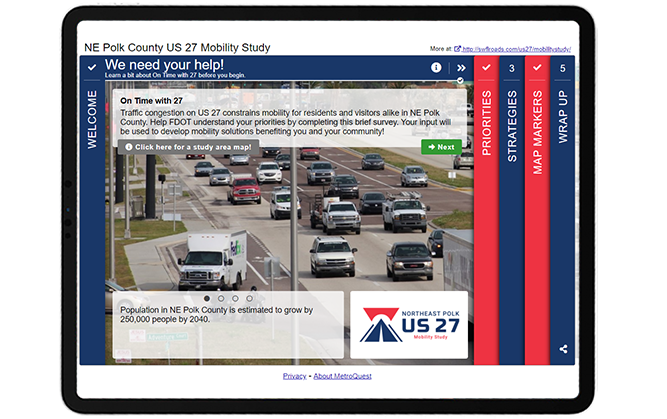
Screen 1: Welcome
The Welcome Screen of this survey is concise and simple, following many best practices:
- A clear call to action headline
- The top paragraph states the purpose of the survey and how input will be used
- The study area map is embedded in the info pop-up and clearly shows the location
- The rotating sliders at the bottom highlight some key facts
- The logo and overall branding of the survey is cohesive and properly formatted, contributing to a professional look
As we go through the survey, notice how the titles at the top of each Screen help tell a story:
- We need your help!
- What’s most important to you?
- How do we get there?
- Let’s pinpoint the problems!
- Tell us about yourself!
The survey stays engaging and relatable by addressing the participant directly while clearly outlining each portion of the survey. We highly recommend considering using phrases like this when writing your survey titles to help make the survey language more inviting.
Screen 2: Priority Ranking
Following the 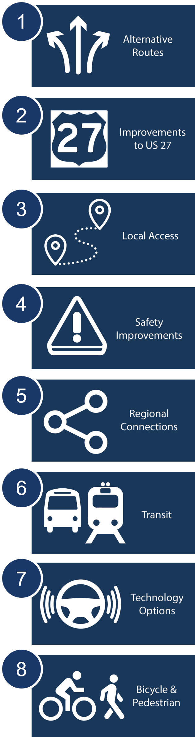 Welcome Screen, the survey asks participants to rank which priorities are most important to them through our popular Priority Ranking Screen. This simple exercise is a great starting point to introduce key options and understand what matters most to your participants.
This survey took advantage of the Connected Screens feature unique to the Priority Ranking Screen which allows you to connect your survey’s Priority Ranking Screen to one of five other Screen types. Once this is set up, the Screen that follows the Priority Ranking will be customized for each participant, asking for input on the items they ranked as most important to them. This allows you to present a wider variety of questions while keeping the survey relevant and of interest to your participant yet quick to complete. This ensures that participants are not asked to provide input on topics irrelevant or unimportant to them. For example, if a participant has no interest in public transit and doesn’t list it as a priority, they won’t be asked for further input on public transit.
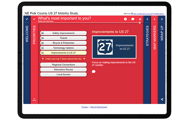
To demonstrate this feature, consider a scenario where a participant prioritizes the following five options:
- Safety Improvements
- Transit
- Bicycle & Pedestrian
- Technology Options
- Improvements to US 27
The Strategy Rating Screen that comes next only presents the strategies linked with the participant’s priorities, as shown below in Screen 3. Read tip number two near the end of this blog post to learn why this feature is so beneficial.
Screen 3: Strategy Rating
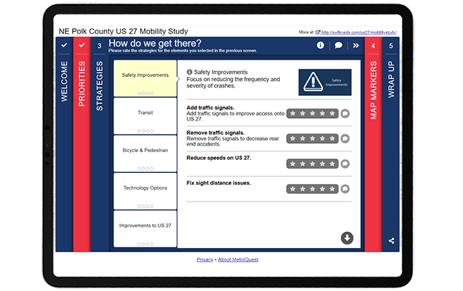
Note how the category headers on this screen match the priorities selected in Screen 2, Priority Ranking. When connected, this screen will automatically match the priorities that the participant selects!
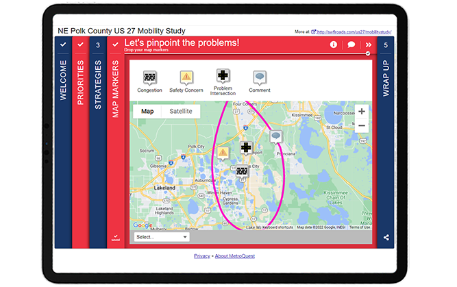
Screen 4: Map Marker
The fourth Screen utilized the Map Marker Screen and asked participants to “pinpoint the problems” by dropping markers for areas with congestion, safety issues, problem intersections or any other issues.
This data was imported into a Geographic Information System (GIS) to create heat maps based on each marker type (see example below). The different color areas indicate parts of the map where larger numbers of participants indicated a potential safety concern.
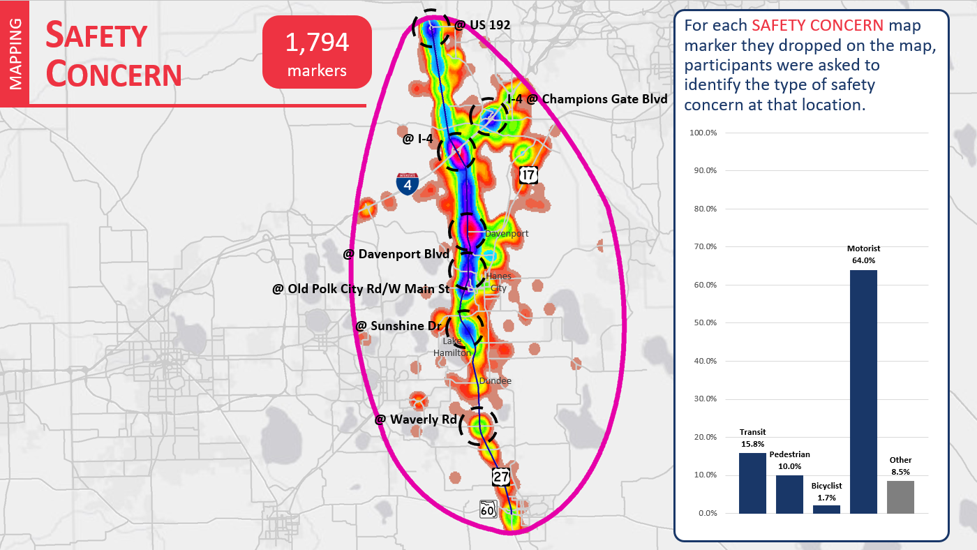
Heat map showing areas where Map Markers were dropped to indicate safety issues. The colors relate to the density of markers dropped in each area. 64 percent of safety concerns raised related to motorists.
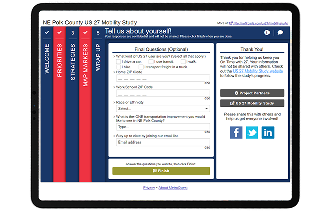
Screen 5: Wrap Up
To close the survey, the Wrap Up Screen included six simple questions, including three demographic questions: home ZIP code, work/school ZIP code and race or ethnicity. By keeping personal questions to a minimum, you are less likely to scare off participants who may have concerns about sharing personal details.
Try the US 27 Mobility Study Survey Yourself!
Check out this demo version of the survey to try out the connected Screens feature and see how simple this survey is to complete! You can toggle the green icon on the top right to view the survey in mobile or desktop view.
5 Tips from the NE Polk US 27 Mobility Study Survey: Targeted Ads and a Straightforward Survey
- Promote with targeted location-based social media ads: Many people rely on this highway corridor, but the project team knew that many of those impacted didn’t live within the immediate vicinity of the project area. They were able to catch the attention of those passing through by using location-based paid social media advertisements on Facebook, Twitter and Instagram. This is a great approach when you are working on a project that crosses many different jurisdictions. We notice that surveys using targeted social media advertising often achieve the best participation results.
- Connect your Screens: The Priority Ranking Screen is an excellent Screen choice for the start of your survey and our Connected Screens feature allows you to link this Screen to several other Screens. As the NE Polk County US 27 Mobility Study Survey demonstrates, connecting the Priority Ranking with a subsequent Screen keeps the survey concise and, most importantly, relevant for your participants. Rather than listing out strategies for all eight priorities, this survey only needed to present five concepts based on the participant’s indicated priorities. This gives the survey a tailored feel for every participant and ensures that they are providing feedback on what they identified as important to them which in turn maximizes their input.
- Consider the data needed: We touched on this in our write up of the Texas DOT i20 Corridor Study and the NE Polk County US 27 Mobility Study Survey is another great example where simplicity achieved excellent results. The NE Polk survey received over 96,000 data points, yet the questions and exercises that gathered this actionable data were straightforward to complete. It is clear that Kimley-Horn, and the broader project team, took the time to consider the data they needed to gather before developing their survey questions. Keeping your survey concise and focused will always elicit better quality data.
- Include a study area map: If your survey focuses on a specific corridor or area, it can be extremely helpful to include a project map that clearly defines the study area and labels nearby cities, towns and arterial roads. In this case, the map was linked on the Welcome Screen so participants instantly understood the area in question.
- Keep it simple at the end: This survey is another great example of a Wrap Up Screen done well. The questions are relevant to the study and concise. When planning questions for your Wrap Up Screen, consider what type of information is crucial to understand about your participants. In this case, home and work/school locations were important to get a sense of the average commute of each participant and whether they use the corridor for their daily commute. The final open-ended question: “What is the ONE transportation improvement you would like to see in NE Polk County?” helped keep additional comments focused on what matters most for each participant compared to a generic additional comments prompt.
Once again, the Kimley-Horn team developed an outstanding survey alongside Florida DOT that achieved great results! This initiative is another superb example of a survey where simple asks and a clear purpose combined with a targeted social media campaign helped bring in thousands of responses and ultimately generated very crucial data to improve mobility across the corridor.
For more great tips on how to make the most out of MetroQuest, contact our Customer Experience team or reach out for more information!

Optimizing Virtual Community Engagement to Build Public Support
A well-designed survey and an effective outreach campaign are two elements critical to public engagement success. Watch this webinar for case study examples from successful projects!