[INSIGHTS] Tip of the Iceberg: Seeking Real Accessibility in Community Engagement

Ensuring that community engagement opportunities are open to all residents is not only the law, it’s also good for planning. Incorporating a diversity of viewpoints improves plans, facilitates implementation, and frankly leads to better communities that meet the needs of all residents. Unfortunately too often the accessibility discussion doesn’t get out of first gear.
When it comes to ensuring open and inclusive public engagement, it’s critical to understand the needs of residents as broadly as possible. When examining a range of possible methods that agencies can employ to gather public input, it quickly becomes evident that it’s far more than the visually-impaired that are at risk of being excluded.
The importance of this topic became evident when registration for the webinar on “Engaging Vulnerable & Disadvantaged People in Planning” grew to over twice the maximum capacity in a few days. Here is a snapshot of the most important lessons of the research that led up to that session.
A Toolkit Approach to Web Accessibility
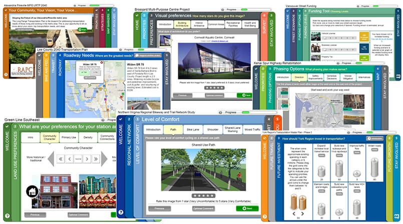
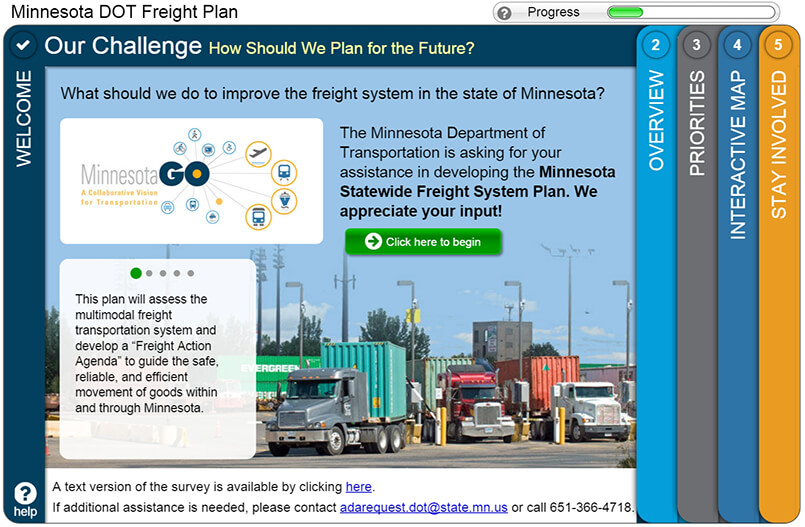
It’s true that much of the accessibility guidelines focus on people living with disabilities, so naturally that’s a great place to start. The movement toward online engagement tools has meant that the discussion has become focused on web accessibility standards. Online accessibly introduces a critical fork in the road. Best practices in online engagement lead us toward highly visual and interactive elements that can be awkward to deal with using screen readers and other assistive technology. Engaging the public using visual preference surveys, allowing people to place comments on an interactive map, or offering fun and interactive interfaces like drag and drop coin allocation screens are some of the many elements that make online engagement software tools popular and effective. These tools are visually appealing and fast for users. They also allow planners to better inform planning projects by quickly collecting a vast amount of public input.

These same elements present a challenging test when it comes to the web accessibility criteria. While it’s easy to ensure that fonts are large enough for those with less than perfect vision and colors are not used in a way that put people with color blindness at a disadvantage, providing a workaround for people using screen readers to place comments on a map is a bigger challenge. It’s true that even visually rich and interactive online engagement tools can technically meet the requirements by, for example, including text descriptions of images and other screen reader accessible options. It’s also naïve to think that these options are equivalent to the experience provided to those without special needs. Furthermore, depending on the needs of both the project and community members, they may not even be the best alternatives for those with visual disabilities.
From May to July 2015 we conducted a review of case studies of planning projects using online engagement as a significant source of community input. The review compared the results of the online engagement processes to look for patterns and identify best practices. So what did we learn about these kinds of interactive elements? Should interactive elements be avoided? Based on the case studies we examined, certainly not. In fact, many of the most successful projects attribute much of their success to these visual and interactive features. The leading planning and engagement experts recognize that not every tool in their toolkit will necessarily meet the most stringent online accessibility standards. That said, they know, and have demonstrated, that to optimize overall engagement results, they need a strategy that provides options for all people to participate. And that may include a mix of technologies and approaches, even if some of the visually rich online tools don’t meet certain web standards for accessibility. Here an analogy may help. The entrance to our office building has both a ramp and stairs. To accommodate the needs of people on wheels, the architects didn’t remove the stairs. They added a ramp. No one approach is going to be best for everyone. It’s about a variety of options to meet a diversity of needs.
Ashley Ver Burg from HDR in Minnesota deals with accessibility issues head on as she seeks to create the most effective digital engagement strategies for her clients. In a telephone interview we conducted in February 2016 she put it this way:
“When we pull together a digital engagement strategy, we start with accessibility. We strive for design that doesn’t impede accessibility and accessibility that doesn’t impede design. Visual elements are essential to making information easier to understand. This is the foundation of accessibility. The reality is that we often need to use multiple tools to reach different audiences.”
Naturally, people with visual difficulties have every right to participate, and practical options for them must be part of every engagement plan. Indeed, planning agencies can benefit greatly from the insights provided by people with special needs. In reviewing leading case studies, the best practices that emerge look beyond the minimum requirement spelled out in legislation, toward a goal of providing a range of options that allow people to select the one that best meets their needs. For some people, providing a parallel screen reader accessible site is an attractive option for online access. For those with visual difficulties who choose not to use screen readers or those who would appreciate a more personal experience, providing an opportunity for people to speak to someone by phone or attend a session in their community may be better options. A wide range of choices will serve your community better and will open up the opportunity to participate to a broader audience.

Let’s Broaden the Dialog about Accessibility
Thinking more broadly about accessibility leads us to consider a wider range of factors that could hamper people’s ability to participate. Looking beyond the ADA guidelines, the environmental justice regulations in the United States call for the “meaningful involvement of all people regardless of race, color, national origin, or income.” While environmental justice applies specifically to environmental laws, regulations, and policies, Title VI applies more broadly to Civil Rights and addresses similar demographic groups.
Groups that have been traditionally underrepresented in public participation activities for planning projects include youth, people with less formal education, residents who are new to the community and may not have social networks to learn about initiatives, and, perhaps most significantly in terms of numbers, people whose busy schedules or responsibilities limit their ability to get involved.
Each of these groups present unique but in most cases, manageable challenges. In some cases, online engagement can be an important part of the solution. It can provide an opportunity to engage people with busy schedules quickly and conveniently and when done well, can benefit from the viral nature of social media. Online engagement can be offered in multiple languages and by leveraging visuals and minimizing text it can accommodate people of various national origins and reading comfort levels.
In other cases, a mix of other community engagement tactics is needed such as:
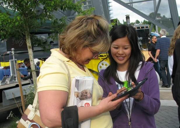
- Pop-up engagement events allowing planners to target specific communities,
- Add-on events allowing planners to engage a specific group as a part another group’s event,
- Touch-screen kiosks in community centers for participants to “stumble on,”
- Mobile-friendly engagement options for smartphone and SMS users, and, yes,
- Public workshops and open houses for people who prefer a face to face opportunity to speak with planners and neighbors about the issues.

The best projects we examined used a wide variety of engagement and promotional strategies to reach a broad audience. Many planners and engagement experts also commented that while it’s best to plan a multi-pronged engagement strategy at the outset of a project, it’s also very difficult to know precisely who will respond to each option. By collecting demographic information from participants, planners can monitor the reach of their community engagement and adjust tactics accordingly. Leaving room for creativity and fine tuning midway into the engagement period also appears to be emerging as a best practice. Ashley Ver Burg confirmed these findings:
“We need to consider all audiences. That’s why we are now routinely using demographic data of project participants to inform and update public involvement strategies. Not every meeting, event, workplace, social media platform, or email list will reach the same audience. It’s important to develop a strategy—and continuously update that strategy—based on data.”
To borrow an old line, “different strokes for different folks.” Based on our dialog with planners and engagement experts, the time might be right to widen the definition of accessibility based on a more inclusive and nuanced understanding of the varied needs of our community members.
This article was published in Planetizen here.
Although the ADA does not mandate the use of specific standards to ensure that websites and other technologies are accessible to people with disabilities, places of public accommodation are required to ensure equal access to the services they provide-including the option to conduct business online through the use of accessible websites. But doesn’t it also make good business sense since to create an accessible website designed to meet the needs of the public.
Absolutely, providing accessible options is critically important. The point being made is that there needs to be a suite of options available that provided the richest and most appealing experience to each audience as opposed to offering only one option that is usable for all but not particularly well optimized for the best results.