[INSIGHTS] The Evolution of the Scenario

Scenarios aren’t new but they certainly have evolved. While the concept of scenario planning can be traced back to the military, planners have been using scenarios for decades. In a nutshell, scenario planning involves creating a variety of possible alternative futures and using them to inform dialog about choices and then ideally, decision making. It’s a kind of “what-if?” exercise.
Having been involved in scenario planning academically and professionally for 25 years, I’ve seen more than my fair share of scenarios. It strikes me that they have changed in really interesting ways – and many of these changes have made them more useful for public engagement. For simplicity I’ve divided the history into three eras.
The Mainframe Era (1988 – 1997)
When I first started working with scenarios, most were extremely complicated and sought to simulate the real world as closely as possible. They took days to compute, weeks to decipher and there was virtually no chance that the public could absorb them quickly. Despite efforts to synthesize the main messages in each scenario, they were still far to complex and multi-faceted to engage all but the most dedicated participant. We used a mainframe computer that required its own air-conditioned room and produced a stack of printouts several feet high. In one project, we worked for 2 years creating a single scenario and wrote a book about it called, “Life in 2030.” Ideally this scenario would have been compared with a few other alternatives but frankly we were exhausted after creating just one. And we weren’t the only ones. The Global Scenarios Group, for example, was also creating elaborate scenarios of the future of the world. Who can forget, “Fortress World?”
The GIS Era (1998 – 2007)
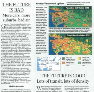
As personal computers became more readily available and GIS software grew in popularity with planning agencies, scenarios became suddenly more visual, though pixilated. Maps of alternatives along with graphs of indicators became the go-to way of presenting scenarios. Here are a few scenarios we created for a newspaper section for Vancouver, Canada.
READ THE FULL ARTICLE
These scenarios are better than those of the early days. They at least showed visually what it might look like and could be explained to the general public, though I’m not sure how many people took the time to read the rather long article. So, in terms of usefulness for public engagement, scenarios had come a long way but they required more effort to understand than the average citizen was willing to put in.
The iPhone Era (2008 – 2017)
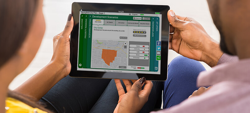
Something profound started happening in the late 00’s. The focus turned to simplicity and brevity. Life sped up, computing became more ubiquitous, and there was no time for reading. For technology, if instructions we’re needed, forget it. Instant gratification, rounded corners, colors everywhere, simplicity – the iPhone nailed it all. People’s expectations for everything shifted – and for planners wishing to engage the public – they needed to change too. And some did.
We are starting to see more and more of these kind of scenarios used for public engagement and it’s easy to see why. When dealing with such short attention spans, it’s really our only hope. If the goal is informed input from a broad demographic, we have to pack a lot of learning into a tight timeframe. If a picture is worth a thousand words, looking at this scenario must be like reading 200 tweets in 30 seconds!
I’m encouraged that the scenario planning industry is making good progress. What does the next era for scenarios look like? I’ve never been more optimistic about the marriage of scenario planning and public engagement.
