![[INSIGHTS] Do Republicans Avoid Public Participation?](https://metroquest.com/wp-content/uploads/United-States-Democate-and-Republican-Map.jpg)
Over the past few years, MetroQuest has grown to become the most widely used digital public engagement platform in North America. But its use is not as evenly distributed as you’d imagine.
As our clients and projects grew over the past few years we suspected that clustering was happening, but with our heads down it was difficult to see the forest for the trees. It wasn’t until we plotted the number of projects in each state on a map that we were able to visualize this effect. It didn’t take long to realize that we’d seen that pattern before. It was the map of red states and blue states! We discovered that MetroQuest is used 3 times more frequently in blue states than red states. This is especially puzzling since the results have been excellent when we have the opportunity to work in Republican-dominated areas and we’ve found the leaders to be highly supportive.
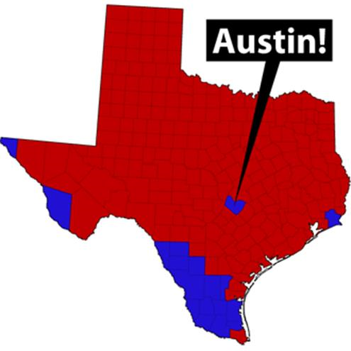
There were just a few anomalies that didn’t fit the pattern such as Texas. When we drilled a little further into the regional data we discovered that the frequency of projects in blue regions like Austin was skewing the results for the state.
What’s going on? The majority of clients use MetroQuest specifically to engage more people from a broader demographic than typically participate in the planning process. Does this mean that, on average, Republicans are less interested in promoting greater participation in the planning process than their Democrat counterparts? This explanation doesn’t fit with our project experience. So is there another explanation? Could it be explained by population density and urbanization alone?
So now it’s over to you. What do you suppose is behind this pattern? What have you seen in your practice?